Review: Visual flow, mastering the art of composition, by Ian Plant w/George Stocking

Book review

Visual flow, mastering the art of composition, by Ian Plant w/George Stocking

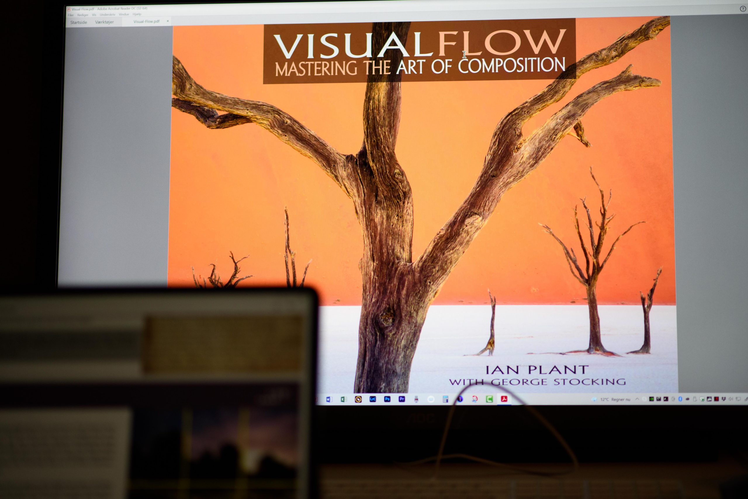
Ian Plant certainly knows a thing or two regarding composition, and in this book he and his mate George Stocking give us all there is to know about composition in this 287 pager PDF based e-book. The price is around 30 USD (October 2021) and to make the review short: I find that it is worth every dime.

The book is filled with great examples and lots of them. Albeit both Ian and George are landscape photographers, the principles are easily applicable to other kinds of photography. As you may have guessed when I mentioned the number of pages, the book is much more comprehensive than the usual presentation of leading lines and rule of thirds. Much more. There are many examples from both Ian and George’s own work, but maybe even better, also examples picked from classic paintings for both East and West.

There are a few things about the book that bugs me. Not senseless, but nonetheless:

  • The examples are supplied with elaborate text. Text that I feel compelled to read, but it is often the same text as in the body text. And I keep jumping back and forth between the body text and the text below the examples, finding it hard to ignore the image text, which constantly interrupts the flow and line of thought in the body text.
  • The first 150 pages are filled with remarks like “I will get back to this subject later” or something along those lines. Although it is a good tool for organizing the way things are presented, the sheer number of times this remark is made simply drove me nuts after mentioning number 20+.
  • I cannot really tell if it is a stack of PowerPoints that have been converted into a so-called book. I have a suspicion that it is more a presentation with elaborate text than it is a book as such I am reading. Maybe it is the format with me reading the text on a iPad that bugs me, but it is not a pleasure to read as many other books are.
  • And finally I am puzzled why people that knows so much about composition knows so little about text and how we humans like to read. The fact that the text is right aligned and the words hence do not flow equally positioned on the line simply makes it harder to read. Also the font is absolutely horrible – if you know just the most basics about how we read and recognize words (as images actually) you would never have chosen this font. This again gives me more a feeling of reading a PowerPoint presentation than a book.

So don’t get me wrong, it is a vital book about photography and I absolutely recommend that you get it and read it. But that these guys in terms of readability knows so little and makes so basic mistakes in their production of this so called e-book simply bugs me to a degree where I could not let it pass unnoticed.

Related reading

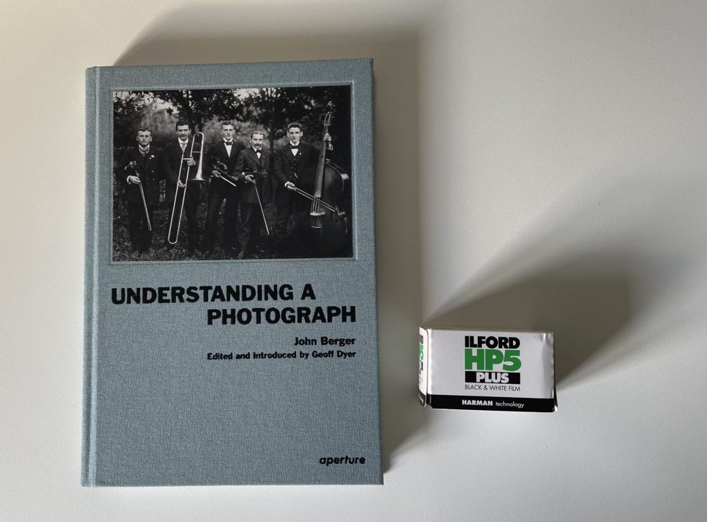
Understanding a photograph by John Berger

Landscape photographer of the year, collection 10

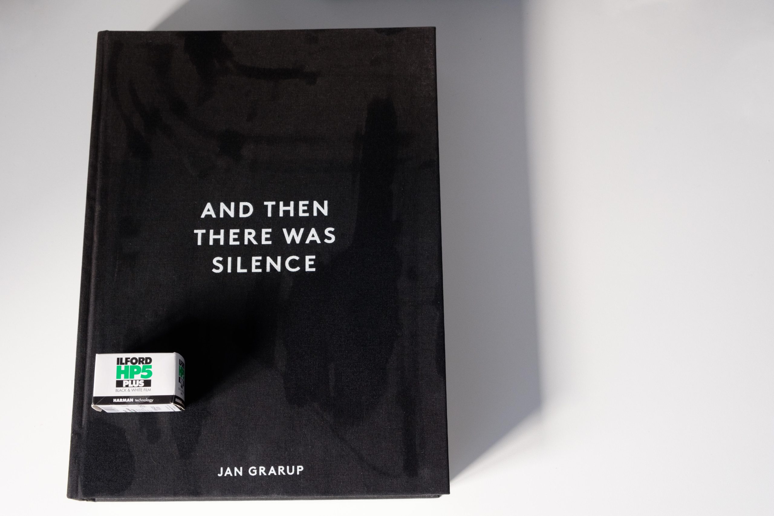
And then there was silence, by Jan Grarup


Review: Understanding a photograph by John Berger

This is probably as academic as it gets! If you want to learn the basics about photography like exposure, composition, etc, then this book is not for you at all! The title is to be taken very literally.

It is an interesting read. You really understand how much goes into interpreting a photograph. Maybe not your ordinary picture of your pet or your new car, but a picture used to document the death of Che Guevara, or the first day in the camp for the Rwandan Tutsi and Hutu refugees.

The chapters do not make up a nice red thread. Instead, it seems like a collection of articles that take their own angle irrespective of the other chapters. Analysis of an an image. Tribute to a photographer. Meet and dialogue with a photographer. Sometimes it is an analysis of a specific picture, other times a photographers work.

It is not an easy read. It is super academic. I will not claim that I understood all that John Berger writes, nor that I read it all. It is simply too demanding for little me. Consider yourself warned.

Related reading

Photo work: Forty photographers on process and practice, edited by Sasha Wolf

What is symmetry in photography?

Symmetry is about balance. It is one of the more extreme versions of balance, but about balance it is. You can both use symmetry as a way to position your objects in the frame, or it can be given to you by the subject you are photographing.

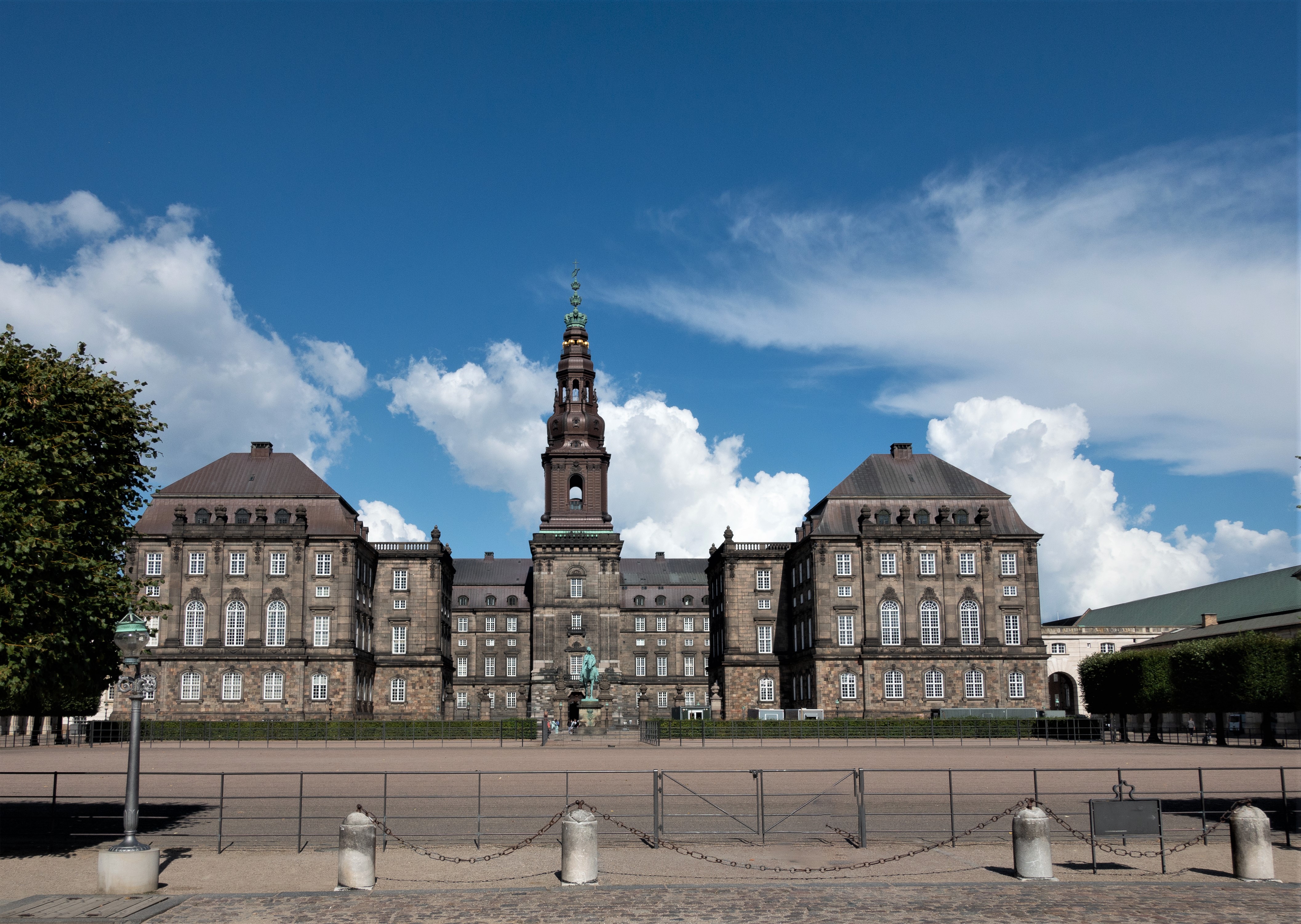
In architecture symmetry is used as a tool to signal power and influence. You will see that many government buildings are symmetrical like the Danish parliament below. This is what I call left to right symmetry, as it is symmetrical over a vertical axis:

Danish Parliament, Copenhagen, Denmark

You can also find it in many other kinds of buildings like a library with a Harry Potter feel:

Trinity College Library, Ireland

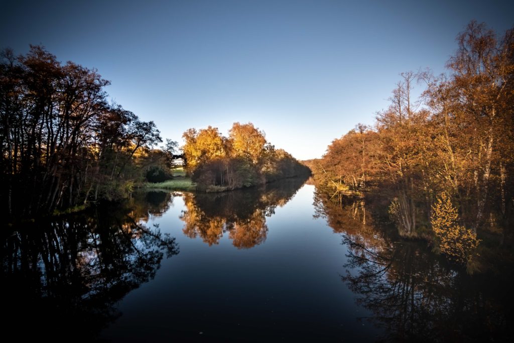
Symmetry can also be top to bottom, i.e. the axis over which the symmetry works is horizontal. Reflections are the classic example of top to bottom symmetry:

Lake reflections on a quiet morning. Lyngby, Denmark.

And finally you can combine the two to give you symmetry both vertically and horizontally, a model mother nature often uses:

A rose with early morning dew.

But we human beings also like this kind of symmetry:

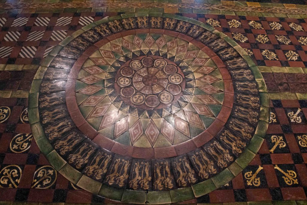
Tiles in a floor in Milano, Italy.

So what is the point with all this? When you start to become aware of symmetry within the images you see, you will notice symmetry and the effect more and more as you study other photographers work. This is a great way to enhance your skillset and build symmetry into your composition toolbox and hence start using symmetry in your own work.

Symmetry, like rhythm and repetition, makes the image more likeable and pleasing, and that may be exactly what you need to make your photo work. But be careful with symmetry: a little is great, too much is boring in the long run. So use it sparingly.

Related reading

What are leading lines in photography?

What are frames and framing in photography?

Review: And then there was silence, by Jan Grarup

Book review

And then there was silence, by Jan Grarup

This is a horrible book.
And an amazing book.

It shows what human beings can do to each other in a warzone. It is not pleasant reading, but Danish photographer Jan Grarup has never been a crowd pleaser.

The table of content gives the scope of the locations that Jan has photographed over the years: Kashmir, Sierra Leone, Chechnya, Rwanda, Kosovo, Roma, Ramallah, Hebron, Iraq, Iran, Darfur, Central African Republic, Afghanistan, Gaza, Haiti, Somalia and Mosul. More than 400 pages in coffee table book size, filled with black and white images from the horrors of war. People killed, people on the run, people in despair, people crammed together in refugee camps. Weapons, corpses, soldiers,  dust, blood, poverty.

Jan has been a warzone photographer his hole life. And he has paid and continues to pay a high price for his work. PTSD to mention one.  You can’t dispute Jan’s capabilities as a photographer – every image is carefully selected, the composition is impeccable, the technical quality of the images is from the top shelf.

In the foreword Jan quotes Dr. Martin Luther King jr. saying “The ultimate tragedy is not the oppression and cruelty by the bad people, but the silence over that by the good people.” – I think this sums up the mission Jan is on: to wake up the good people.

PS: I don’t think this book is available anymore from new. With a bit of good luck you may find a used copy. You won’t get mine. Good luck hunting.

PS: It is a BIG book. Even for a coffee table book sized book, it is bigger than most: 39cm tall and 28 cm wide, and with a weight around 3,2 kilo!

Related reading

Landscape photographer of the year, collection 10

The Photography Bible by Michael Freeman

What are frames and framing in photography?

Framing used as a composition tool in photography

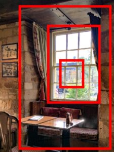
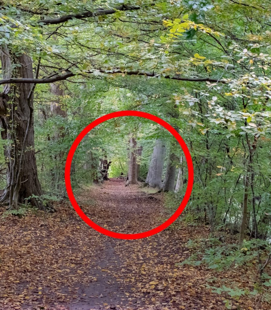
Frames  are a tool in the photographers composition toolbox. Frames help the viewer by creating structure that gives a sense of order and calm, other than guiding the viewers attention.

On top of the image itself being a frame, you can have frames that sub-divide the image frame into smaller areas that are easier to digest. The subjects that act as frames can be positioned in a way that give a sense of depth or 3D to the image – see the image above. Frames within frames can really compensate for the lack of a 3rd dimension in an image.

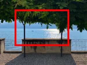
A frame does not necessarily have to be a square or a sharp edged object, it might as well be made up  of several objects that together make up a frame – in the example below the leaves on the top, the concrete at the bottom and the steel pillars to the sides make up a frame that leads the attention to the boat and the sun in the middle.

Framing used as a composition tool in photographyA frame does not need to be square or symmetrical or complete: circles, triangles, L-shapes and even just a line can help the viewer read your picture.

Framing used as a composition tool in photography

When you start to become aware of frames within the images you see, you will notice frames and their effect more and more as you study other photographers work. This is a great way to enhance your skillset and build both implied and explicit frames into your toolbox as a photographer.

If you ask me, one of the masters of using framing in photography is Saul Leiter. In most of his images he uses framing as a very dominating tool to tell a story and guide the viewers attention. Have a look at these color images for inspiration: Saul Leiter.

Related reading

What is the rule of thirds in photography?

What are leading lines in photography?


What are leading lines in photography?

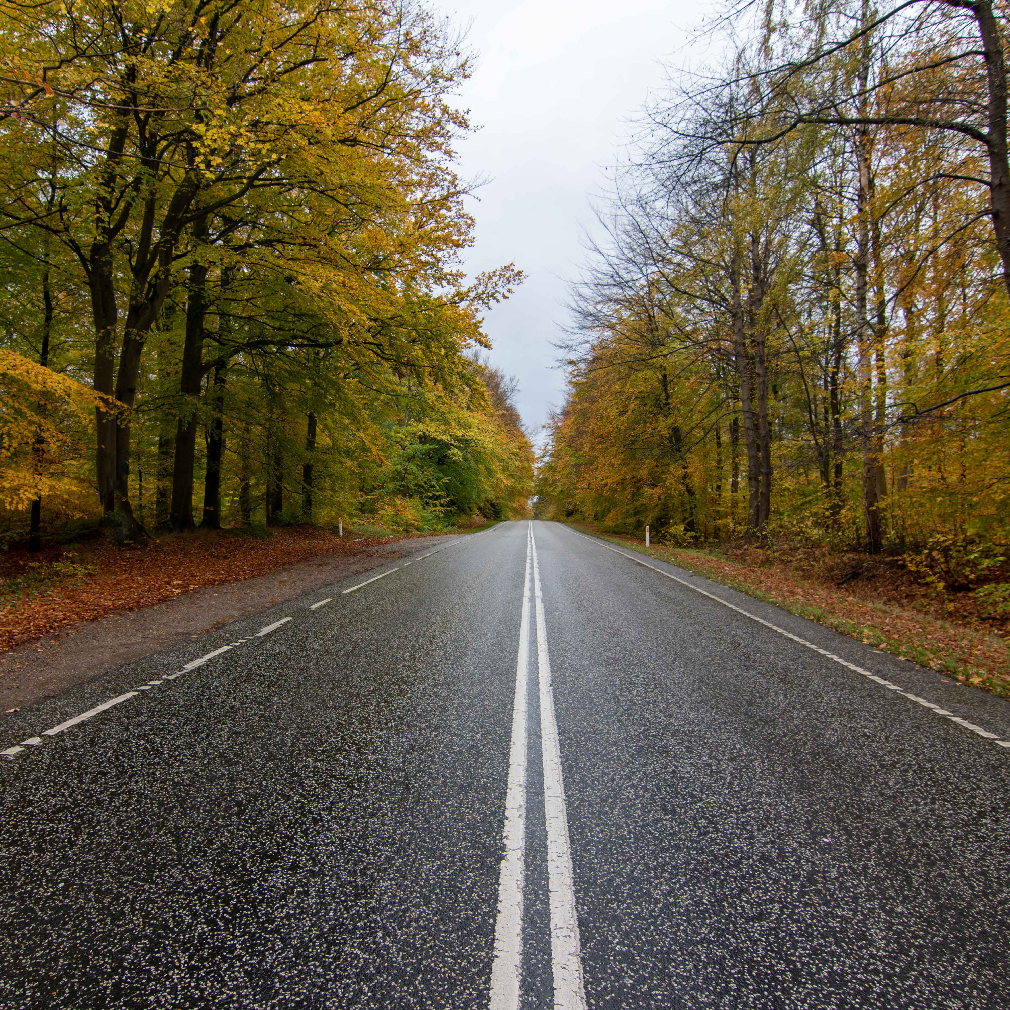
Leading lines are a tool in the photographers composition toolbox. Lines help the viewer by literally leading the eyes into the image, create structure, aid the storytelling, or a bit of it all.

Leading lines do not need to be straight – they can be curved as shown in the small bridge below. The point is that the eye naturally follows the lines no matter what structure they have.

As a photographer you are the director of the viewers attention and leading lines can be a powerful tool. The lines need not be explicit, they can be implicit as well – for example objects that due to their order and rhythm create a “virtual” line like the poles in the water below:

When you start to become aware of lines that lead and guide the viewer, you will notice leading lines more and more as you study other photographers work. This is a great way to enhance your skillset and build lines and leading lines into your toolbox as a photographer.

Related reading

What is the rule of thirds in photography?


What is ILC and MILC in photography?

ILC is Interchangeable Lens Camera, basically meaning that you are able to shift between different lenses. The opposite to an ILC is a camera that comes with the lens fixed – as you know it from your smartphone or a point and shoot camera like the Sony RX100.

Although ILC judging from the name should cover all types of cameras with interchangeable lenses, the term ILC for reasons beyond me often is used to describe mirrorless cameras with interchangeable lenses. If the camera has a mirror built into it, the term DSLR is more frequently used.

To mitigate this confusion, some use the term MILC instead of ILC to underline that it is a Mirrorless Interchangeable Lens Camera they are talking about.

Related reading

What is a DSLR?

What is Live View on a DSLR?

What is the rule of thirds in photography?

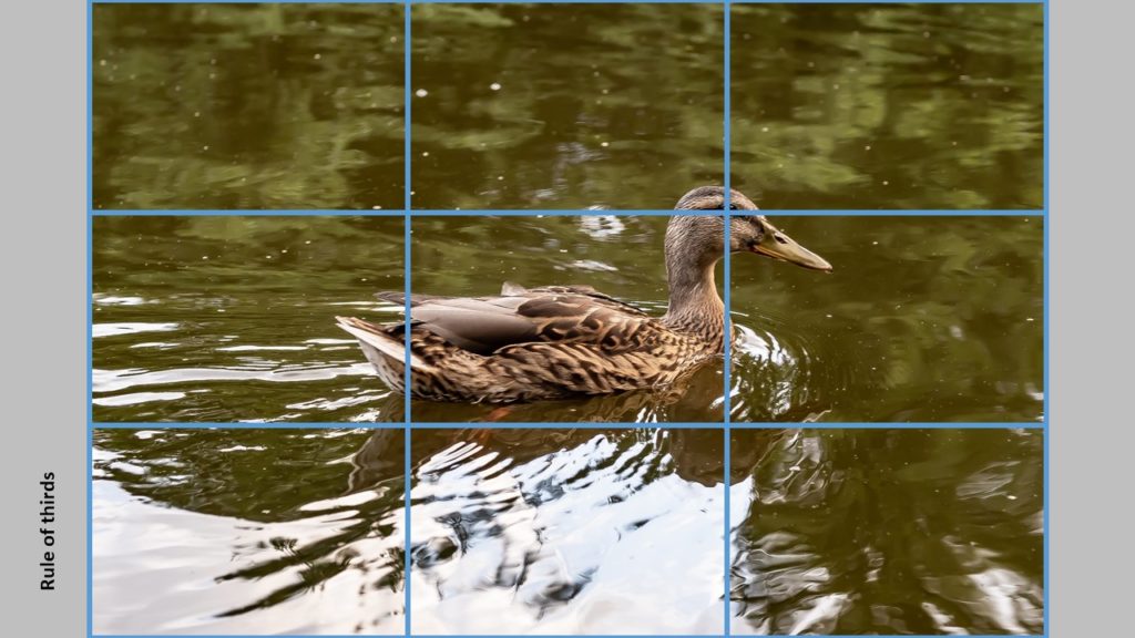
The rule of thirds says that you should divide your frame by to vertical and two horizontal lines at equal distance, so you get 9 equal size areas:

The “trick” is now to place your subjects and whatever you want the viewer to focus on along these lines. Here you can see that the eye of the duck (we automatically go to the eyes of both humans and animals) is positioned at the intersection of two of the lines from the rule of thirds.

Nobody really knows why this works and gives better images. Maybe it really does not, but it seems we better like images where the subject is not smack in the middle, or landscape images where the horizon does not divide the image exactly in two. So give it a try and see if it works for you.

All composition rules are rules of thumb. Use them when you see fit, and break them when not. It is not intended to be a straightjacket, just a guide you can use whenever you see fit. As the photographer, you are the boss and the director when it comes to what you put in your frame.

Related reading

What is negative space in photography? And why use it?

What is the golden ratio in photography?

What are aperture blades?

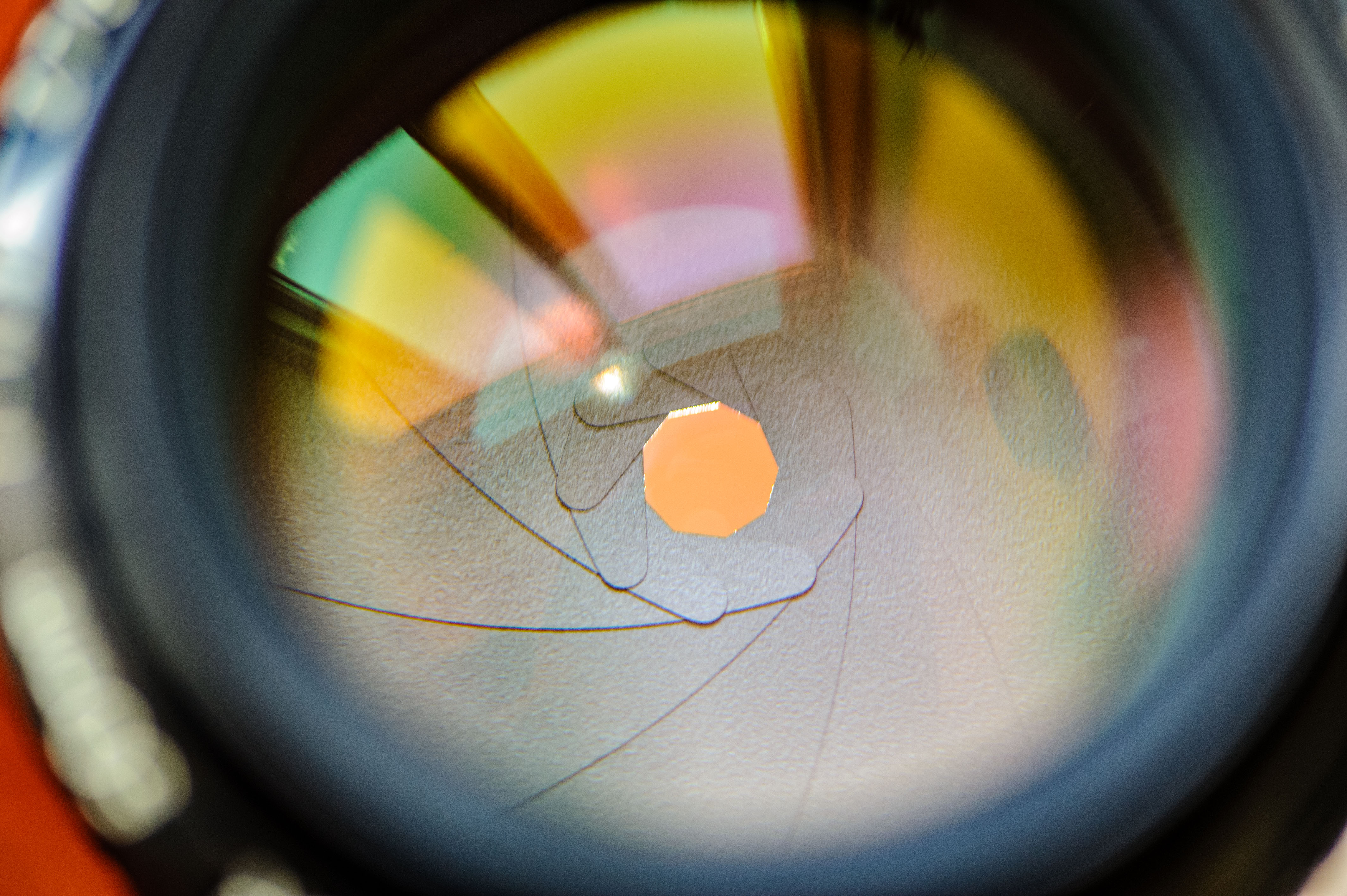
Aperture blades sit inside the lens and are small pieces of fabric that move to reduce the size of the area that lets light pass on to the senor or film in the camera. The aperture blades and their position determines the aperture setting of the lens. In the picture below, you san see how the blades form a small circle:

On many lenses you can actually manually move the aperture ring back and forth and see how the size of the aperture changes. Take the lens off the camera and look into the lens the same way the light travels, as you move the aperture ring from min to max aperture. This is probably one of the best ways to understand how the blades work and what they do.

It may seem silly to not use all of the lens now that you have it available! Why reduce the amount of light that travels through the lens? The answer is can be that you want to control the depth of field that the lens produces: reducing the aperture size increases the depth of field. Or maybe you are outside on a bright day, and simply have to reduce the amount of light that the lens takes in to avoid over exposing the  images. The pupil in your eye does exactly the same!

Blades come in 2 versions basically: straight and rounded. In the image above, the lades are straight, as this is a very old lens design – the Nikon 50mm 1.2 AI lens. Straight blades gives great sun stars but may also give bokeh balls that are not round – rather they have small edges. Rounded blades have the opposite effect – great bokeh, but less great sun stars.

When a lens is at is maximum aperture (lowest f/stop number) it is termed to shoot wide open. When a lens is wide open, the aperture blades are not engaged, and the bokeh shape is the same irrespective of straight versus rounded bladed.

When a lens is at its minimum aperture (highest f/stop number) it is closed down. Some lenses can close down to such a degree that the light almost find is troublesome to travel through the small hole that the blades leave open. When that happens, the image appears a bit out of focus (soft) and this is due to diffraction. So be careful not to close down the lens too much (f/16 and higher f-stops is typically where you see diffraction to set in).

The number of blades also varies. Typically older designs had fewer blades than what we see today. You can find the number of blades in the lens specification. In the image above there are 9 blades, which is quite high for a lens that old.

Related reading

What is aperture? And why important?

What is lens vignetting?

What is bokeh? What is OOF?

What is diffraction?

What is bokeh? What is OOF?

Bokeh is just another word for out of focus, often abbreviated to OOF!

But why is that suddenly important in photography when everybody talks about sharp images and getting the subject in focus? It has to do with the isolation of your subject – to make sure that the background does not steal the attention from your subject,  be it a flower, a tree or a model just to name a few examples. Just like in a movie where you want the main actors to stand out and shine, your supporting actors should be support the main actor without stealing the limelight.

In the example below the birch stem is the star, albeit not a very interesting one, but it illustrates background blur or bokeh very fine. What you see to the right of the birch stem is actually sun lit leaves, but because of the strong element of bokeh, it appears to be just a soft backdrop of white and brown colors.

There are several factors that determine the bokeh, but most notably the aperture you shoot at and the distance from your subject to the background. Larger apertures (smaller f/stop numbers) gives a more so called depth of field, i.e. the depth of the interval that appears to be sharp. So if you shoot at a very wide aperture, the depth of field is narrow and if you have focused correct on your subject, the background is more likely to be OOF Similarly, if there is a big distance from your subject to the background, then it is more likely the background is OOF as the depth of field cannot reach so far.

Photographers can study out of focus elements for hours and comment on their shape and size. In the example above the light behind the coffee mug is certainly out of focus, and the light appears as round balls. You can see that the rightmost ball is very round whereas the ones to the left are more oval – it has to do with how close you are to the corner of the image. Also, sometimes bokeh balls like these appear square rather than round – that is because the aperture blades are in use and determine the shape of the bokeh.

As a rule of thumb you want the bokeh to be creamy and pleasing to look at. In other words, the edges of the bokeh balls should not have rings or hard transition to the areas outside the bokeh.

Related reading

What is aperture? And why important?

What is lens vignetting?

What is lens flare?