Colors and emotions go hand in hand like horse and carriage from that famous song by Frank Sinatra. And as such it can be used as a tool for your photography and the emotions you want to induce.
Think of a midsummer morning where the sun is just rising, filling the room you are in with warm light and long shadows. What colors do you think of? Probably yellow, orange and red. If I had asked you to think of a frosty windless winters morning, what colors would then spring to mind? Probably more cool blue or white. Filmmakers are exceptionally good at using colors to underline or emphasize a mood using colors – I often notice the color coding they use (and the music of course) to create a certain mood. In dystopian movies like Blade Runner the blue and brown colors are often dominating to underline the unsettling look into the future.
The warm and golden colors of the beech leaves are a stark contrast against the dark background made up of the trees in the wood. The effect is achieved using a flash and the effect of light falloff.Blue and orange are complementary colors and gives a pleasing contrast.
Colors not only induce emotions, but can also be used to create patterns and connect objects that would otherwise seem without relation.
Green is often associated with nature and harmony which is probably why this image signals a calm atmosphere more than anything.Sometimes less is more. The cat here is by nature black and white, and the colors of the eyes hence makes a big contrast.The colors here are desaturated and underline the tranquil scene. The stronger the colors, the stronger the effect. Desaturated colors calm the mind.Here the color of the leaves help bring them together despite the more structural elements in the composition pull in the opposite direction.White and blue are often associated with calmness and clarity. Also sterile and purity, which is why these colors are often used in bathrooms!By altering the color temperature to a colder tone, the freezing cold winter day is emphasized.
Next step
One way to study the effect of colors using your own reaction as guide, is simply to make both a color and black and white version of an image and see how the different versions work for you. You can also try to alter the colors in post processing and play with saturation, hue and brightness.
The point with this post is not that there is a right and a wrong when it comes to colors. If you learn how to use the colors to achieve a certain effect, then your images will have a much bigger impact. And of all the tools in the photographers toolbox (composition, exposure, etc), color is the strongest of them all.
The title of the book as per the headline is a very precise description of what this book is all about. It “puts some of the most important photographic landmarks under the microscope” as it says on the cover. And very much so.
Photo icons, 50 landmark photographs and their stories, by Hans-Michael Koetzle.
The 50 images are presented and analyzed over the 400+ pages of the book, giving an average of 4 pages per iconic photograph. Enough to cover the basics and tell the story around each picture.
The table of content has an excellent overview with each picture in icon size and annotated with the relevant year and page to look up. The 50 images range from year 1827 to 2001. So you can quickly dive into the images of interest (I doubt you will read the book from front to back unless you are equally interested in each image).
Photographer Peter Leibings picture “Leap to Freedom” from 1961, just after the wall between East and West Berlin was in effect.
As I “cherry picked” the images of most interest, I have not read every single page in the book, but many of them, and I really enjoyed the “behind the scenes” view that you get to each image: What was the story, the photographer, what was going on in the world at the time the shot was taken, was it staged or candid, etc. Hans-Michael Koetzle really packs a lot of information into very few pages for each picture – it is a condensed read, but certainly worth the while.
So as a photographer it is not a book that will make you wiser in terms of photo technique (f/11 vs f/5.6), but it really documents how a photograph – even with all the videos and movies available today – can be powerful and influence what we remember and how we see history. And as such it for me adds a layer to my motivation to shoot the best pictures I possibly can.
This is probably as academic as it gets! If you want to learn the basics about photography like exposure, composition, etc, then this book is not for you at all! The title is to be taken very literally.
It is an interesting read. You really understand how much goes into interpreting a photograph. Maybe not your ordinary picture of your pet or your new car, but a picture used to document the death of Che Guevara, or the first day in the camp for the Rwandan Tutsi and Hutu refugees.
The chapters do not make up a nice red thread. Instead, it seems like a collection of articles that take their own angle irrespective of the other chapters. Analysis of an an image. Tribute to a photographer. Meet and dialogue with a photographer. Sometimes it is an analysis of a specific picture, other times a photographers work.
It is not an easy read. It is super academic. I will not claim that I understood all that John Berger writes, nor that I read it all. It is simply too demanding for little me. Consider yourself warned.
Symmetry is about balance. It is one of the more extreme versions of balance, but about balance it is. You can both use symmetry as a way to position your objects in the frame, or it can be given to you by the subject you are photographing.
In architecture symmetry is used as a tool to signal power and influence. You will see that many government buildings are symmetrical like the Danish parliament below. This is what I call left to right symmetry, as it is symmetrical over a vertical axis:
Danish Parliament, Copenhagen, Denmark
You can also find it in many other kinds of buildings like a library with a Harry Potter feel:
Trinity College Library, Ireland
Symmetry can also be top to bottom, i.e. the axis over which the symmetry works is horizontal. Reflections are the classic example of top to bottom symmetry:
Lake reflections on a quiet morning. Lyngby, Denmark.
And finally you can combine the two to give you symmetry both vertically and horizontally, a model mother nature often uses:
A rose with early morning dew.
But we human beings also like this kind of symmetry:
Tiles in a floor in Milano, Italy.
So what is the point with all this? When you start to become aware of symmetry within the images you see, you will notice symmetry and the effect more and more as you study other photographers work. This is a great way to enhance your skillset and build symmetry into your composition toolbox and hence start using symmetry in your own work.
Symmetry, like rhythm and repetition, makes the image more likeable and pleasing, and that may be exactly what you need to make your photo work. But be careful with symmetry: a little is great, too much is boring in the long run. So use it sparingly.
It shows what human beings can do to each other in a warzone. It is not pleasant reading, but Danish photographer Jan Grarup has never been a crowd pleaser.
The table of content gives the scope of the locations that Jan has photographed over the years: Kashmir, Sierra Leone, Chechnya, Rwanda, Kosovo, Roma, Ramallah, Hebron, Iraq, Iran, Darfur, Central African Republic, Afghanistan, Gaza, Haiti, Somalia and Mosul. More than 400 pages in coffee table book size, filled with black and white images from the horrors of war. People killed, people on the run, people in despair, people crammed together in refugee camps. Weapons, corpses, soldiers, dust, blood, poverty.
Jan has been a warzone photographer his hole life. And he has paid and continues to pay a high price for his work. PTSD to mention one. You can’t dispute Jan’s capabilities as a photographer – every image is carefully selected, the composition is impeccable, the technical quality of the images is from the top shelf.
In the foreword Jan quotes Dr. Martin Luther King jr. saying “The ultimate tragedy is not the oppression and cruelty by the bad people, but the silence over that by the good people.” – I think this sums up the mission Jan is on: to wake up the good people.
PS: I don’t think this book is available anymore from new. With a bit of good luck you may find a used copy. You won’t get mine. Good luck hunting.
PS: It is a BIG book. Even for a coffee table book sized book, it is bigger than most: 39cm tall and 28 cm wide, and with a weight around 3,2 kilo!
Frames are a tool in the photographers composition toolbox. Frames help the viewer by creating structure that gives a sense of order and calm, other than guiding the viewers attention.
On top of the image itself being a frame, you can have frames that sub-divide the image frame into smaller areas that are easier to digest. The subjects that act as frames can be positioned in a way that give a sense of depth or 3D to the image – see the image above. Frames within frames can really compensate for the lack of a 3rd dimension in an image.
A frame does not necessarily have to be a square or a sharp edged object, it might as well be made up of several objects that together make up a frame – in the example below the leaves on the top, the concrete at the bottom and the steel pillars to the sides make up a frame that leads the attention to the boat and the sun in the middle.
A frame does not need to be square or symmetrical or complete: circles, triangles, L-shapes and even just a line can help the viewer read your picture.
When you start to become aware of frames within the images you see, you will notice frames and their effect more and more as you study other photographers work. This is a great way to enhance your skillset and build both implied and explicit frames into your toolbox as a photographer.
If you ask me, one of the masters of using framing in photography is Saul Leiter. In most of his images he uses framing as a very dominating tool to tell a story and guide the viewers attention. Have a look at these color images for inspiration: Saul Leiter.
The rule of thirds says that you should divide your frame by to vertical and two horizontal lines at equal distance, so you get 9 equal size areas:
The “trick” is now to place your subjects and whatever you want the viewer to focus on along these lines. Here you can see that the eye of the duck (we automatically go to the eyes of both humans and animals) is positioned at the intersection of two of the lines from the rule of thirds.
Nobody really knows why this works and gives better images. Maybe it really does not, but it seems we better like images where the subject is not smack in the middle, or landscape images where the horizon does not divide the image exactly in two. So give it a try and see if it works for you.
All composition rules are rules of thumb. Use them when you see fit, and break them when not. It is not intended to be a straightjacket, just a guide you can use whenever you see fit. As the photographer, you are the boss and the director when it comes to what you put in your frame.
I think a few quotes from other reviewers to start with will set the scene just beautifully:
DXO Mark 2013: “[it] has no significant weaknesses and is the best zoom lens you can mount on a Nikon Full Frame body. If your photography demands a medium telephoto zoom with a fast maximum aperture that will deliver across the board, but particularly at 200mm, and your budget holds no bounds, go get yourself a Nikon 70-200mm f2.8G ED VR II. It’s one hell of a lens.”
Ken Rockwell: “I hate this lens because it is so good than now I want to buy one. I borrowed one to test, and it turned out so subtly excellent that it surprised me.”
DP review 2009, gold award: “Overall, though, it’s impossible to conclude anything other than that the AF-S Nikkor 70-200mm F2.8 G VR II is one of the most accomplished lenses of its type, and a perfect companion to Nikon’s top-end bodies such as the D3S and D3X. It’s an equally accomplished performer on both DX and FX that will satisfy the most demanding of photographers.”
Despite this lens certainly not getting any younger (production started back in 2009) it still today is a great lens, and as far as I know, still in production.
Price
I bought my lens for 900 EUR used (2020), and it came in good condition. Even though prices fluctuate over time, it is a rather expensive lens also used, but certainly much more within reach than the original list price of 2400 USD in 2009.
Build and layout
The lens comes with 4 buttons, two to control the AF, and two to control the VR. In addition good wide rubber grips are there for manual focus and zoom (just left of the buttons).
The full frame 70-200mm lens is packed with features:
ED: glass to control Chromatic Aberrations
AF-S: Built in auto focus motor, that also works on ML with FTZ adaptors plus on entry level Nikon cameras (!)
VR: Vibration Reduction so you can get more keepers with slower shutter speeds
1:2.8G: Constant fast aperture at f/2.8 throughout the focal range
IF: Internal focus, makes focus faster and allows filters to be mounted on the lens
You will have to accept a pretty high weight at 1.5 kilos, it takes Ø77 mm filters and you won’t be able to go closer to your subject than 1.4 meters.
The focal range from 70-200 makes lenses like this one a workhorse for portrait photographers, sports, some wildlife, photo journalists and wedding photographers. It is simply a super important range for many pros, and hence a lens that major lens manufacturers work very hard to get it absolutely right.
The lens features the golden ring that we know from pro grade glass from Nikon, but the jury is still out as to what exactly the gold ring signifies. Some think it is the ED glass, others that it is the weather sealing and yet others that it is pro grade glass. No matter what the right answer is, the lens is built very solid in most metal and some rubber (focus ring and zoom). And a bit seldom in this day and age, it is made in Japan (at least my copy is!).
All in all, you get the impression from handling this lens that it is built for professional use and designed to withstand a lot of beating from daily use in all kinds of weather.
Sharpness / contrast
There are many reservations to make before studying an MTF chart, and one of them is that your lens and your camera team up to produce the images, and hence studying a camera agnostic MTF chart may not reveal how your specific camera performs with this lens. And then Nikon does not provide data other than wide open and at the far extremes of this lens (wide and tele respectively), so we cannot see from the MTF chart how it performs in between.
The MTF chart as provided by Nikon.
However, as you can see, the red contrast line sits very high in the diagram and the blue sharpness is also impressive for center sharpness at least. Then it drops towards the edges, as is the case for so many other great lenses, but it remains over 0.7 close to 15mm from the center, and I find that impressive.
Just for the fun of it, and because people often tell me that primes are sharper than zooms, I made a little test where I looked at the center and corner sharpness and contrast, to see which one came out on top:Although the 180mm AF may not be the sharpest lens Nikon has ever produced, it certainly is a good lens and the 70-200mm won the center sharpness stopped down, whereas the prime won when going wide open. Maybe not a surprise, but to me this clearly shows that the lens in review here has very good contrast and sharpness.
Chromatic aberrations
Some chromatic aberrations can be seen in the treetops where the contrasts are the strongest.
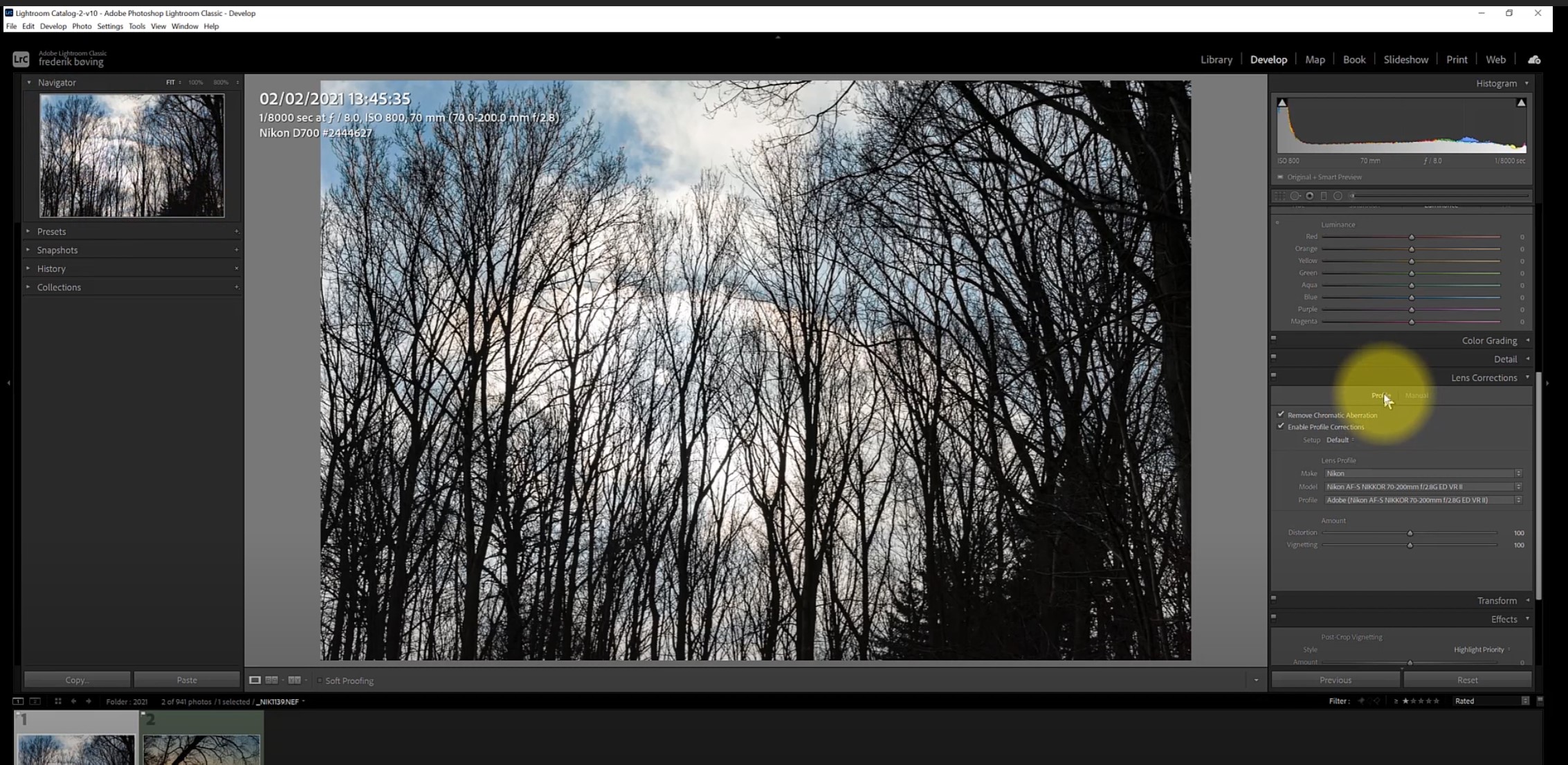
This lens does suffer from chromatic aberrations, but I seldom come across them. In the image above with a high contrast image, the trees top left have a purple line where dark meets white. It is easily removed with the “remove chromatic aberrations” option in Lightroom. You may in stubborn cases need to also work with the manual sliders in Lightroom, but that is even more seldom. So I would not consider CA an issue for this lens.
Flare and ghosts
I shoot a lot into the sun and hence both flare and ghosts often materialize. I find that both flare and ghosts are well controlled with this lens, and often to such extend that even when it is visible in the picture, either I don’t notice it or it is not a disturbing element. Much is still dependent on the lens hood and the photographer’s skills, but this lens gives you all that modern technology has to offer in terms of minimizing flare. I would even argue that if you are a videographer (they love flare!) you may find that flare is too well controlled for your liking!
Focus breathing
This lens suffers from serious focus breathing! The former version of this lens and the successor has much less breathing, as does the f/4 version, so if you are into focus stacking or a videographer, then this could be an issue for you.
Vignetting & distortion
This version of the lens is known to have both vignetting and distortion under very good control and apparently the engineers at Nikon did a really good job here. However, I do see some big shift when I push the profile compensation button in Lightroom, but it is not an issue as such, just interesting to see how big the change is at several apertures. I doubt you will be shooting architecture or other things with this lens where straight lines are important.
Vibration reduction
I don’t have much to say about the vibration reduction other than it works! I have been shooting at 200mm down to 1/80th of a second with no camera shake and it works in a way so I don’t notice it is on. When shooting ICM it is of course turned off!
Sun stars
Sunstar example: the iPhone in the dark!
I am not a big fan of the sun stars this lens produces and it comes down to the 9 rounded blades. The peaks in the sun star as you can see above are split and look messy to me. I much more prefer the sun stars that straight blades gives, but I also understand why Nikon has made the rounded blades, as most users in their target group prefer bokeh over sunstars.
Bokeh
The lens comes with 9 rounded blades that start to get to work as soon as you stop down the lens. I find the bokeh absolutely beautiful and have no complaints whatsoever.
Bokeh example from a fall day with a bit of sun coming through the trees in the background.
Color rendition
Beautiful sunlight providing backlight to the straws.
I often get questions why I don’t comment on color rendition or color science when I review lenses and cameras and the answer is that I have seen the eye opening video by Tony Northrup where he documents that most of us are unable to consistently pick our favorite camera in a blind test and that we are influenced by brand loyalty when assessing color rendition and your WB settings are much more important.
Silhouettes of trees.
So that is why I am hesitant to cover this subject. For this lens I will say that when I put in front of my D4, the pictures and colors it produces are absolutely stunning. If you want to have a closer look, I have a flicker album with these pictures. Link here. There you’ll also find the EXIF information, but please look at the pictures first and foremost.
Auto focus
You can limit the autofocus so that is does not search in the interval from minimum focus distance to 5 meters out.
It is fast and silent. Period. And it is so fast that I do not use the option to limit the AF range from 5 meters and out. Only if you are an extremely nerdy guy like me that likes to shoot lampposts at night will you sometimes experience the AF gives up in low light and you have to switch to manual, but for most normal uses the AF simply just works fast, silent and reliable. As you would expect from a pro grade lens.
Conclusion
My overall conclusion is that this lens probably is as good as it gets when we are talking lenses where the price point is within reach for normal human beings. Is it a perfect lens? No, you can find things that are not perfect for example the focus breathing. But it is a lens where I find that Nikon has made some very good compromises that add up to a very attractive package.
I can fully understand why working Nikon professionals 10 years ago had this lens sitting on their cameras. It is a pleasure to work with. It gets the job done. The vibration reduction just works silently in the background. The auto focus is fast and reliable. It produces great images.
My advice to you is consider if alternatives with more reach or maybe some lighter primes. There are also alternatives in the same range from Sigma and Tamron – or the not so fast f/4 version from Nikon.
This is exactly where I cannot help you, as only you know your personal preferences. This shoe fits my foot well, but that does not mean it will fit your foot well.
I believe they produce a book similar to this one every year, or at least regularly. This is the edition 10, with 1-9 preceding obviously. So it is not the latest and greatest I am reviewing here, but the images are timeless and hence the edition number is of less interest.
It is VisitBritain as sponsor amongst others, so there is an agenda here other than just distributing some absolutely lovely award winning British images.
And I am happy to see that one of my favorite ocean photographers Rachel Talibart is one of the winners that made it into this book (the Sunday Times magazine award), but there are simply so many other talented British photographers that you have to see it to understand it. This is only the top of the iceberg – there must be so many hard working photographers out there that are not on display in this book.
One of the things I really enjoy about this book – other than the beautiful images – is that the photographers tell a little story about each image and in the back of the book they document what camera, settings and lens they used, and in addition briefly describe their post processing work. This is valuable insights, and shows that cameras of different make and price range are all able to produce beautiful images. It is the photographer that makes the big difference. A decent quality and camera is merely the means to an end.
The two Danish photographers Helle and Uri have captured images of wildlife that are nothing short of astonishing. This 200+ page coffee table book is filled with one wonderful image after another. Their passion for wildlife and nature shines from every single image, carefully selected from numerous journeys into the wild: South America, Greenland, New Guinea, Antarctica -the list goes on and on.
It is seldom that I am blown away by even a single image, but in this case I was blown away by almost every single image in this giant of a book. Their work is truly impressive. It is the combination of their love for nature that shines from each page and the technically impeccable images that lifts this book to a level that I have seldom seen. There are a few introduction pages and forewords, but other than that the book is filled with one wonderful image after another.
I can only recommend this book wholeheartedly, even if you are not a nature lover, you will be impressed by the sheer quality of the images presented.