Focus stacking is a post processing technique where several images of the same subject and scene is combined in post processing, to make all of the image sharp rather than having the sharpness defined by the depth of field.
Focus stacking is especially useful for macro photographers, because the depth of field becomes very very shallow when the lens focuses extremely close to the subject, but also landscape photographers and architecture photographers can benefit from focus stacking.
Example
Look at the silly picture below, taken in my office. In the foreground and in focus you have the mad cow and in the background and out of focus, my glasses, a computer screen and a lamp with a bright light.
Below a picture of exactly the same scene. Nothing has changed, other than the focus has been moved from the foreground, the cow, to the background, my glasses. Notice how blurred the cow in the foreground is.
The trick is now to combine the two so that you pick the parts that are sharp and use these in a combined picture. You can do this in post processing software like Photoshop. I open the two images as layers in photoshop.
First step is to make sure the pictures sit right on top of each other, and Photoshop has a function to secure this (edit, auto-align layers).
Second step is to ask Photoshop to create masks to combine the two images into one (edit, auto-blend layers, stack images). You can see in the two images below how the top one selects the cow, whereas the bottom one selects large parts of the background including the glasses. What is white is included and what is black is masked out.
The resulting image is shown below. As you can see, both the cow and the glasses are now sharp, which is exactly what focus stacking can do for you: it makes it possible to have both objects very close to you and objects very far away appear sharp in the image.
If you study the image carefully, you will notice that the lamp looks a bit funny. It is as if the edge between the light and the dark part suddenly has a half circle to the left – just above the head of the cow. This is due to focus breathing – the lens used here suffers from slight focus breathing, meaning that the angle of view changes ever so slightly when the focus changes. This error makes it impossible for Photoshop to combine the images properly as the size of the lamp varies between the two images. So it is important that there is absolutely no focus breathing for lenses used for focus stacking!
Back in the days of film, dual exposure was when you shot two images but without advancing the film between the two shots. The film would then be exposed two times and the resulting image was a combination of the two exposures.
These days most digital cameras offers dual (or several) exposures as an option available via the menu system in the camera. My Nikon Z50 for example has “multiple exposure” as an option in the photo shooting menu, just to give an example. In the image below I have shot the little toy cow two times moving the camera a bit downwards between the two shots. Not exactly a price winning image, but I think it works to illustrate how double exposure works:
With advanced post processing software like Photoshop, it is possible to combine the images long after they are shot, and this gives even more options for creative use of combining two or several images into one.
Only your creativity sets a limit for what you can use dual exposure for. It often creates images that clearly depicts a scene or a subject that you would not find in the real world. So the result can be e.g. dreamlike, surreal or just strange. In the example below I have put the cow from above into a glass bottle by shooting the cow first and the bottle afterwards.
I hope this gave you an appetite for trying out double exposure yourself. Only your imagination and creativity is the limit! Best of luck!
Visual weight has nothing to do with the weight or the density of a given subject in your frame, rather it is an informal scale that tells how well elements in your frame manages to pull the attention of the viewer. So it is a different way of getting attention than say leading lines.
Some of the dimension often quoted in relation to visual weight are:
High contrast
Good sharpness
Bright areas
Saturated colors
Visual size
Recognizable (vs abstract)
So a subject in your frame that is sharp, filled with contrast, bright and colorful will simply draw more attention than out of focus areas with no contrast and desaturated colors. It is obviously a simplification, but I think you get the gist of it.
Best to look at a few examples. Brightness. In the image below, my guess is that you immediately notice the sunrays coming through the treetops as it clearly is the brightest areas in the frame. The rays hold a lot of visual weight relative to the subtle nature of the rest of the frame.Sharpness. The blackbird below is actually the only that is sharp in the entire frame. The out-of-focus stems are used to frame the bird, but they do not draw attention despite their size, as they are not in focus.
Color. The chest of the little fellow below stands out and draws attention, relative to the rather de-saturated background and the branch that is not exactly colorful! Also notice that eyes have great visual weight, as we tend to seek eye contact, irrespective if the subject is a person or an animal.
Contrast and brightness. You may notice the bright sun to the right as the first in the frame below (brightness), but my guess is that right after that you notice the backlit straws. The straws have a strong contrast to the dark background hence stand out with very strong contrast. Silhouette photography has the same ability.
Another example with brightness below. Again the strong sun in the top holds a lot of visual weight and it takes some time before you notice the leaves in focus and their structure. You could consider to crop the image so that only the leaves are there – I leave it to you to decide if that would yield a better image.
Finally, one of my favorite examples of visual weight below. Although both small and not especially bright, the moon draws attention being the only bright element in the frame, with good contrast to the blue sky.
Further work
The above was only intended to be an appetizer for visual weight. Once you start to notice, I think you will start to see images slightly different and hopefully also start using visual weight as a tool in your photography.
Thank you for reading this far! Comments and questions more than welcome!
The rule of odds applies to repetition and rhythm in a frame. We seem to like repetition and rhythm in a frame, just like we do when it is about music.
The rule, which is more a guideline or a rule of thumb, simply says that you should try to have an odd number of objects repeating, rather than an even one. Simple, right? So simple that you can question if the rule works at all! I’ll let you be the judge of that, but it is always good to be more aware of the composition of what you put in your frame, and the rule of odds is just one more to build into you set of tools and skills you use as a photographer.
Take a look at the pillars in the image below. There are 5 of them, not a coincidence at all. Some say that our eyes like to rest on the middle one, as this gives balance to both sides.
Some say that we have a tendency to group objects that are close to each other into one, to give us a better overview and simplify things. Therefore simple counting of objects may not always be the way forward. Take a look at the image below. Here the worn down wood pillars could be counted as 8 pieces, but you will have a tendency to group the 2 pillars to the right as one, and the 3 pillars in the middle as one as well, giving a total of 5 “pillars” rather than 8 as you would get counting them individually.
Another example below with the same point, that the 5 thinner stems to the left of the middle visually count as one. Notice also how the lack of rhythm in the spacing of the stems makes this a rather messy image to look at, even though the subject as such is simple.
Finally we notice what is closer to us more than what is in the distance, so in the final example below, you probably notice the 3 parasols in the foreground sooner than the 8 ones in the background, although the reflections in the pool itself is worth an extra look.
Rule of thirds illustrated by the blue lines dividing the frame.
You have probably heard of the rule of 3rds in photography, in which you position the subjects or areas of interest according to lines that divide the frame into a grid of 3×3 = 9 equally large blocks. You can see the example above, where the eye of the duck is positioned in the intersection between the rightmost vertical and topmost horizontal line. The distance between the lines and from a line to the edge of the frame is exactly the same. It is a very simple rule and many cameras have an option to make such grid available in the viewfinder. No one really knows why it is better to position your subject a bit off center, but most people agree that it makes your image more interesting to watch, and that is the point with the rule of 3rds: to create more interesting pictures.
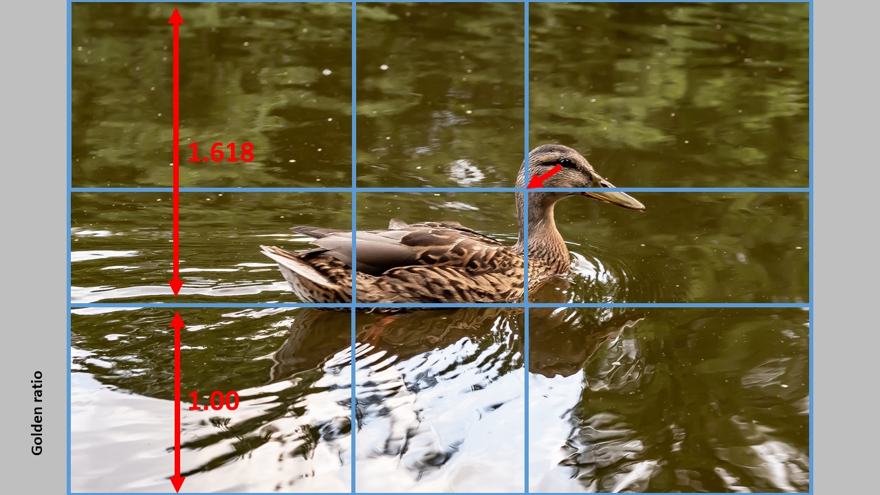
If you want to use the golden ratio instead, the lines are positioned a bit differently, so that the distance between say the leftmost vertical line relative to the edges of the frame is not 1:2, but 1:1.68 instead. So the line moves a bit closer to the center of the frame. The relationship 1:1.68 is known as the golden ratio (there is a lot of theory that follows this ratio, but I will save you the details as it is less important as long as you use the ratio). The example below shows an “updated” version of the image.
As you can see, the bottom horizontal line has a distance of 1,618 to the top of the frame relative to the distance to the bottom of the frame – this is the ratio in use. The effect is that the lines move closer to the center of the frame, but still gives a grid that positions your subjects off center, of you use them. You can see that the ducks eye should move a bit closer to the center in order to follow the golden ratio.
Which one is best? Golden ratio or rule of 3rds? Let me start by saying that these rules are first and foremost for photographers with plenty of time like landscape, architecture, product and portrait shooters. I doubt that street photographers or wildlife photographers on the fly have time to think about these compositional rules, although I do think they care a lot about the composition, but my guess is that they work more on an intuitive basis and maybe fix a few things in post. Second, the rules are only a guidance or an attempt to help – it is not meant to be a straightjacket or a limiting factor. You can break any compositional rule and still have an amazing image.
Take a look at the two images below. They follow the rule of 3rds and the golden ratio respectively. Which one do you like the best? See, that is where personal preference comes into play – there is no right or wrong. Whatever you like and find to be the best image, is the answer!
Another rule says that if your subject is moving in the frame, you should let them have space in front of them so the viewer can see where they are going. Having a subject running out of the frame creates tension that you probably don’t want. As you can see – I have broken this rule with the duck. Today I would probably have positioned the duck more to the left in the frame, but the point is that you can break the compositional rules and still have images that are ok.
The point with this post was just to illustrate the golden ratio. You can use it in many different ways – say as a size ratio between two subjects in your frame or in the way you use framing in your image.
You can find plenty of posts related to the setup and activation of the walking steadiness, that works with more modern iPhones and more recent versions of IOS. It uses data from the sensors in the iPhone together with number of steps, step length and walking stability to calculate a walking steadiness index number, that translates onto: OK (best score), low or very low (worst score). The idea is to monitor your walking patterns and predict if you have a heightened risk of falling, as injuries from citizens age 65+ is a problem in growth. So the intention is good.
The problem however is that it appears not to work! I have followed every instruction on how to switch on the walking steadiness to minute detail, and re-done it over and over again: no result. Then I tried to google if others had the same issue, and yes! But no solution.
What to do? I waited!
I do not know how the software or the logic works, but suddenly my iPhone (a 12 with IOS 15.1) generated a walking steadiness score! It was on a Thursday. And after that? Silence. No update. Until it became Thursday again! New update!
So currently it looks like my iPhone calculates the walking steadiness once every week!
The strange thing is, that my wife who also has an iPhone with the IOS 15.1 installed gets daily updates! Not real time updates though, but daily updates. The only difference I can spot between the two is that I have a Garmin Phenix 3 connected to the iPhone and she has a Garmin Vivoactive watch. I doubt however, that this is the cause of the difference, as the waking steadiness is based primarily on data generated by the sensors in the iPhone.
So what to make of all this? My point is that if you experience lack of data and results when it comes to the walking steadiness function in the iPhone, maybe a bit of patience is all you need. Keep walking with your iPhone in your pocket for a week or so, and see if it results in scores generated.
As you can see from the image below, a few weeks later, it is confirmed that the updates follow a weekly pattern. Every Thursday the data is updated. I am not sure if the Thursday is the day of updating, or of it is a coincidence that is more determined by when I started to log data. But it does confirm that when you have turned on walking steadiness, patience is key, subject to what tracker you use to collect the data.
Please let me know in the comments how you are doing and what frequency your iPhone has in updating the steadiness score – it seems to me there is very little data on the subject out there, so it would be great if we could fix that via this post.
When the Z6ii came out, the world of reviewers agreed that the Z6ii was basically a Z6 with an additional processor and an additional memory slot. Probably because the cameras on the outside are almost similar. In other words, the Z6ii is not a major upgrade from the Nikon Z6, that many considered to be Nikons not-too-impressive entry into the mirrorless world. But Nikon gained some credit for actually listening to the critique raised towards the Z6, but still the Z6ii was positioned by many as a mild update of the Z6.
Nikon Z6ii with the Nikkor 50mm 1.8G lens (and the FTZ adapter in between)
I could not disagree more. I will go to the other extreme and say that the Nikon Z6ii is at a whole new league relative to the Z6. The heart of my argument is the extra EXPEED processor that Nikon added to the Z6ii. If you think about it: Why did Nikon add an additional processor? Was it just to make the spec list look better or is there a bigger picture behind this move? In a world that lacks semiconductors (November 2021), would it not be strange that Nikon added an additional CPU to their camera unless there was a compelling reason?
What many don’t realize is that a camera today is more a computer than anything else. Computing power matters. Especially when we are talking computations needed for auto focus with eye detect etc., but also for FPS and clearing the buffer of images fast. Future software logic enhancements and firmware updates may need to have some headroom CPU wise to enable new functionality or better AF to be implemented – say if some of the Z9 AF capabilities were to be trickled down to the Z6ii or Z7ii.
Is the Z6 sufficient in some cases?
November 2021 I found the Z6 over at B&H for 1600 USD and the Z6ii for 2000 USD. That is a 25% price difference, and of course you need to make sure that the added functionality of the Z6ii is worth the extra money. The Z6ii has the same sensor, same buttons and dials, same viewfinder and same rear LCD, so other than the additional card slot, more advanced AF software and more computing power, many of the hardware items that go into making the Z6 and the Z6ii are exactly the same.
I would imagine that:
if you do not to much photography where AF functionality is important,
you are not a(n event) shooter where dual card slots is vital and
you do not shoot much in low light
then the original Z6 could be sufficient for you. But I ask you to consider this carefully, as I doubt that for example future firmware updates related to AF will be done for the Z6 due to lack of computing power.
More computing power in the Z6ii
You can see from the spec list how much more computing power the Z6ii has relative to the Z6, for example:
Camera buffer 124 RAW images (vs 35 before)
Massively improved AF system
14 fps (12 fps)
Video 4K at 60fps (30fps before)
The AF system is a major step forward, and I don’t think we will see the Z6ii improvements later implemented in the Z6, simply because the Z6 does not have computing power needed. And this brings me to anther point: future improvements to firmware that require significant amounts of computing power may be possible to implement on the Z6ii, whereas the Z6 probably will have to pass. And the hardware is locked when the camera leaves the factory; you cannot add an additional CPU to the Z6 unfortunately.
The computing performance not only shows in the specs, but also in every interaction you have with the camera. I noticed this when I had both a Fuji X-T20 and a Fuji X-T3. The latter is so much faster, so much responsive and does what you ask it to do with no hesitance or delay. The X-T20 on the other hand has almost a life of its own – actually, I can turn it on, wait 1/2 a second and turn it off again and nothing happens! The camera is so slow booting that it does not find out that I momentarily had the camera turned on!
More improvements
Other than the above improvements, the Z6ii has other improvements that I believe are less related to the CPU power:
Time lapses up 15 minutes (30 seconds before)
Stronger EN-EL15c batteries (340 shots vs 315)
Charging in camera
Firmware update via Snapbridge
Connectors for the battery grip MB-N11 with controls
1 stop better low light AF sensitivity
Of course, if none or the above is important to you, and you really don’t need strong AF performance, 4K 60fps or a big buffer, then you may find that the Z6 is sufficient for you, and your wallet will thank you (unless you spend the savings on lenses or the like) as Nikon dropped the price on the Z6 when the Z6ii came out.
But my guess is that most will welcome the enhancements that the Z6ii offers over the Z6. But we are in personal preference territory here, so I leave it up to you. My hope with this post is that you gained some insight to the Z6ii improvements and see that there is more to the upgrade than a CPU and a card slot.
You probably heard the term “megapixel war” and that manufacturers try to top the number of megapixels their camera or smartphone offers. So you could get the impression that more is merrier, but there is more to the equation than that…
Resolution
If you look at a chessboard, you can see it has 8 squares across by 8 squares up, in total 64 squares. So if your chessboard was a camera sensor, it would have a resolution of 64 pixels. Indeed not a lot, but it goes to show the principle of each “dot” that enables the camera sensor to register the amount of light it is exposed to.
My Nikon D750 camera has 6016 pixels across and 4016 up, giving a total of 24.160.256 pixels, often abbreviated 24 megapixels or 24MP. For most photography this is more than sufficient resolution unless you crop your picture, which in effect takes away some of the pixels and hence the resolution.
Bit depth
The bit depth tells how much information your camera is able to store per pixel, i.e. the size of the number per pixel. JPG files store very little information per pixel – only 8 bits known as a byte, and hence it is able to store 2^8 = 256 different values (This is per colour channel, but lets leave that aside for now).
If your image is a RAW file, the format allows you to store 12 (or 14) bit of information. This gives a much finer granularity in the tones and colors that can be stored, but it also comes with a price: the file is much larger, as the information stored per pixel is dramatically increased.
No chain is stronger than…
Many only consider the resolution as an important parameter, but the bit depth is equally important, as it enables you to store the specific reading of light from the sensor. However, you also need a good lens to let through good light with all the details required to capture the scene, so if you put a poor lens in front of a high resolution sensor that captures in RAW, the only thing the sensor will register is precisely how bad the lens is.
So you need all the elements in the chain to work together: lens, sensor resolution and sensor bit depth, in order to get the best possible image captured, with good resolution and contrast.
So if you have a good camera that can capture say 24MP in RAW format on a good sensor, the limiting factor is probably more the lens that you put in front of it than the resolution of the sensor. And that is why any experienced photographer will tell you: invest in good glass before anything else.
You may have seen the post where I adapt a Canon FD 1.8 50mm lens to a Nikon DSLR with an adapter from Urth. If not, you can find the post right here. What I learned from that attempt was that the glass that has to be added to make a Canon lens work on a Nikon DSLR has some side effects that are unfortunate, to say the least. The reason for adding the glass is that the lens otherwise will not focus to infinity.
The Canon FD to Nikon Z mount adapter. As the pencil shows, there is no glass in this adapter, it is basically a metal ring.
Mirrorless are different apparently. An adapter for Canon glass to a Nikon camera body has not glass as the image below illustrate.
The adapter I bought was from K&F Concept, but there are many other options available out there. Be aware that if you buy from K&F concept, then the delivery time (judging from my case) is around 3 weeks for the parcel to travel from China to Europe (Denmark), so be prepared to be patient! But once you got it, the combination of the Canon lens, adapter and Nikon Z50 camera looks like this:
Nikon Z50 with the canon FD 50mm 1.8 lens, and the K-F concept adapter inbetween.
Mounting the lens to the adapter is straightforward, but be aware that the adapter has to be set in position “locked” to allow the aperture blades to change position. If not, the lens is fully open irrespective of how much you turn the aperture ring on the Canon lens.
Performance
I am happy to report that all the issues I found with adapting the Canon lens to a Nikon DSLR are simply gone. The 50mm lens from Canon performs as you would expect: no Vaseline like look fully open, but solid performance at all apertures.
Centre sharpness is excellent at f/5.6 and although not as good wide open, it is certainly a solid performance from a vintage lens:
Centre sharpness at f/1.8 left f/5.6 right.
Also the corner sharpness and contrast is approved, although you again can tell the difference between wide open and stopped down:
Corner sharpness at f/1.8 left f/5.6 right.
The lens suffers from aberrations especially wide open, and it looks dramatic in the image below. However, it is a 400% (!) zoom and I successfully removed the purple fringing by using the color selector in the manual removal of chromatic aberrations in Lightroom.
Wide open the aberrations are noticeable, but gone as soon as you stop down – f/1.8 left f/5.6 right.Bokeh fully open f/1.8 to the left, and stopped down to f/5.6 to the right.
The bokeh is maybe where the lens has a weak point, as it only has 5 blades and they are rather straight. So stopped down you get bokeh that is less pleasing IMHO – of course subject to personal preference. You will also notice in the blue bokeh balls to the right, that there is a bit of onion rings; something that bokeh experts do not fancy. To the left fully open you have a more pleasing result, but the edges are brighter than the center, also a no-go for bokeh enthusiasts.
So in conclusion I am very happy with the performance of this lens. It is not the lens with the best sharpness or contrast I have ever tested (that was the Nikon 135mm DC), but it is certainly not bad performance. You can get one of these lenses with a bit of luck on a flea market for around 10 USD, but be prepared to pay more when the seller is knowledgeable. Still, a lot of lens for your money.
Of course you will have to regulate the aperture by turning the ring on the lens itself, and you are left with manual focus entirely, but I don’t think anyone would expect it any different when you mount a Canon vintage lens on a Nikon mirrorless body. And in terms of “the look”, I really like the way Canon renders colors; it is a bit different than Nikon and as far as I can tell it has a bit more “coffee”-ish look that I actually like. So I look forward to shooting more with this combo.
Saul Leiter In My Room, Edited by Margit Erb and Robert Benton. The Ilford HP5 film to the right just to give a sense of size of the book.
You probably know Saul Leiter as the street photographer, one of the pioneers in using colors in street photography and considered part of the New York school of photography. And you may also know that he also was a painter, and started out as a painter before venturing into photography. Some of his work is painted nudes, where he combines photography and painting. And on top of all this, he also worked for many years as a fashion photographer – Harper’s Bazaar, just to mention one.
This book is not about all the above. Rather, it is filled with black and white pictures, almost entirely shot in Saul Leiter’s apartment in Manhattan. I think it is anyone’s guess why Saul shot in black and white for these images, but it enabled him to develop the films himself in the studio. And I am not so sure he ever wanted these images to amount to much, although he during the 1970’s planned to make a book of all these images, but it never amounted to anything. He was, as always, in no particular hurry.
Leiter did not any type of explanation of analysis of his work. I cannot help it, but as a photographer I immediately notice his use of natural light, patterns in shadows, framing (and yet framing!), blocking the view partly by various objects, the shallow depth of field, use of mirrors and reflections – the list goes on and on and on. He is a true master of photography – period. But where the magic surfaces for me is that no matter how much I try to analyze the images down to individual components and effects used, I find myself thinking that “this is not the whole story”. There is more to it. There is a bit of mystery, intimacy, vulnerability and uniqueness that simply transcends all analysis.
So I highly recommend this book for any photographer. Maybe his book “Early colors” is a better place to start if you are new to Saul Leiter. Or the book All about Saul Leiter. But if you find yourself wanting to know Saul Leiter for more than his street photography, or just want to see the products of a master of photography, this book should be on your coffee table anytime soon.
 Below a picture of exactly the same scene. Nothing has changed, other than the focus has been moved from the foreground, the cow, to the background, my glasses. Notice how blurred the cow in the foreground is.
 The trick is now to combine the two so that you pick the parts that are sharp and use these in a combined picture. You can do this in post processing software like Photoshop. I open the two images as layers in photoshop.
 The resulting image is shown below. As you can see, both the cow and the glasses are now sharp, which is exactly what focus stacking can do for you: it makes it possible to have both objects very close to you and objects very far away appear sharp in the image.