Some time back I made a video where I talked about micro variations in photography and recommended to try to take a lot of images of the same scene and subject, but with small changes to angle and framing. I have found that small variations sometimes is the difference between a really good picture and a “naaah” picture. Something as simple as turning the camera 90 degrees can also be the difference between great and average.
And I was very happy with this little “discovery” and thought that I for once had invented something new and fresh! Until I visited a museum and saw the work of the Danish painter Vilhelm Lundstrøm.
Same but different!
Apparently Vilhelm Lundstrøm also worked with variations over the same theme, and in the example below he has painted the same stilleben two times – one with more pale colors and viewed a bit further away than the other version that has more bang for the buck color wise but also has moved a bit closer to the subject.
Stilleben version 1: the colors here are pale and you can see the front of the table in the bottom of the image.Stilleben version 2: More colors and a bit closer to the subject.
It is probably subject to taste and personal preference which of the two paintings you like the best, but the point is that even small variations depicting the same subject can lead to vastly different results. So when you are out and about shooting, take some time to shoot several versions of the same scene using micro variations – I am sure that when you get back to the computer and open up the images for processing, you will be positively surprised how some images work and others don’t, even when they at first glance seem very similar.
It took several shots of this scene to get the result I was after.
The title of this book promises a “definitive” guide to composition. Googling the meaning of definitive, the first definition is “done or reached decisively and with authority” and one of the synonyms listed is “ultimate”. So this is the ultimate guide to composition. This author apparently does nothing to dim his shine!
Mastering composition – the definitive guide for photographers, by Richard Garvey-Williams
Comprehensive
This 175 page book is comprehensive, and covers all aspects of composition though 6 chapters. It is jam packed with illustrations – at least one per page and often 3-4 per page. As such the author walks the talk and shows how the theory presented can be applied in practice. The square format of the book works well to allow pictures and text to blend naturally.
The book covers so much more than the rule of thirds, e.g.: visual weight, framing, leading lines, dynamic tension, depth, color, tone, patterns and even a bit of gestalt theory! I find that it is one of the most comprehensive books I have found on the subject of composition. And then I really like that the author underlines that composition is a means to an end, and not an end in itself.
I did not find this book to be an easy read. At times, it felt like reading a dictionary, but I guess it is the flip side of being so comprehensive. So if you are searching for an entertaining book, you may need to look elsewhere – this one is serious about its subject and stays serious throughout.
Conclusion
If I was to recommend a book about composition for the notorious lonely island, it would be this one. It is not an easy read, and after the first read, I use it more and more to look up certain subjects, than reading it from start to finish all over. It works well also as a dictionary.
Some of the images have stuck with me in the back of my head and unconsciously influenced my photography and give inspiration for new aspirations. And as such, I have become a better photographer, processing and digesting the content of the book. And that is probably the highest praise I can give to any book about photography, and as such this book comes highly recommended.
The rule of odds applies to repetition and rhythm in a frame. We seem to like repetition and rhythm in a frame, just like we do when it is about music.
The rule, which is more a guideline or a rule of thumb, simply says that you should try to have an odd number of objects repeating, rather than an even one. Simple, right? So simple that you can question if the rule works at all! I’ll let you be the judge of that, but it is always good to be more aware of the composition of what you put in your frame, and the rule of odds is just one more to build into you set of tools and skills you use as a photographer.
Take a look at the pillars in the image below. There are 5 of them, not a coincidence at all. Some say that our eyes like to rest on the middle one, as this gives balance to both sides.
Some say that we have a tendency to group objects that are close to each other into one, to give us a better overview and simplify things. Therefore simple counting of objects may not always be the way forward. Take a look at the image below. Here the worn down wood pillars could be counted as 8 pieces, but you will have a tendency to group the 2 pillars to the right as one, and the 3 pillars in the middle as one as well, giving a total of 5 “pillars” rather than 8 as you would get counting them individually.
Another example below with the same point, that the 5 thinner stems to the left of the middle visually count as one. Notice also how the lack of rhythm in the spacing of the stems makes this a rather messy image to look at, even though the subject as such is simple.
Finally we notice what is closer to us more than what is in the distance, so in the final example below, you probably notice the 3 parasols in the foreground sooner than the 8 ones in the background, although the reflections in the pool itself is worth an extra look.
Rule of thirds illustrated by the blue lines dividing the frame.
You have probably heard of the rule of 3rds in photography, in which you position the subjects or areas of interest according to lines that divide the frame into a grid of 3×3 = 9 equally large blocks. You can see the example above, where the eye of the duck is positioned in the intersection between the rightmost vertical and topmost horizontal line. The distance between the lines and from a line to the edge of the frame is exactly the same. It is a very simple rule and many cameras have an option to make such grid available in the viewfinder. No one really knows why it is better to position your subject a bit off center, but most people agree that it makes your image more interesting to watch, and that is the point with the rule of 3rds: to create more interesting pictures.
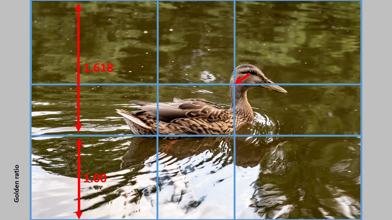
If you want to use the golden ratio instead, the lines are positioned a bit differently, so that the distance between say the leftmost vertical line relative to the edges of the frame is not 1:2, but 1:1.68 instead. So the line moves a bit closer to the center of the frame. The relationship 1:1.68 is known as the golden ratio (there is a lot of theory that follows this ratio, but I will save you the details as it is less important as long as you use the ratio). The example below shows an “updated” version of the image.
As you can see, the bottom horizontal line has a distance of 1,618 to the top of the frame relative to the distance to the bottom of the frame – this is the ratio in use. The effect is that the lines move closer to the center of the frame, but still gives a grid that positions your subjects off center, of you use them. You can see that the ducks eye should move a bit closer to the center in order to follow the golden ratio.
Which one is best? Golden ratio or rule of 3rds? Let me start by saying that these rules are first and foremost for photographers with plenty of time like landscape, architecture, product and portrait shooters. I doubt that street photographers or wildlife photographers on the fly have time to think about these compositional rules, although I do think they care a lot about the composition, but my guess is that they work more on an intuitive basis and maybe fix a few things in post. Second, the rules are only a guidance or an attempt to help – it is not meant to be a straightjacket or a limiting factor. You can break any compositional rule and still have an amazing image.
Take a look at the two images below. They follow the rule of 3rds and the golden ratio respectively. Which one do you like the best? See, that is where personal preference comes into play – there is no right or wrong. Whatever you like and find to be the best image, is the answer!
Another rule says that if your subject is moving in the frame, you should let them have space in front of them so the viewer can see where they are going. Having a subject running out of the frame creates tension that you probably don’t want. As you can see – I have broken this rule with the duck. Today I would probably have positioned the duck more to the left in the frame, but the point is that you can break the compositional rules and still have images that are ok.
The point with this post was just to illustrate the golden ratio. You can use it in many different ways – say as a size ratio between two subjects in your frame or in the way you use framing in your image.
Visual flow, mastering the art of composition, by Ian Plant w/George Stocking
Ian Plant certainly knows a thing or two regarding composition, and in this book he and his mate George Stocking give us all there is to know about composition in this 287 pager PDF based e-book. The price is around 30 USD (October 2021) and to make the review short: I find that it is worth every dime.
The book is filled with great examples and lots of them. Albeit both Ian and George are landscape photographers, the principles are easily applicable to other kinds of photography. As you may have guessed when I mentioned the number of pages, the book is much more comprehensive than the usual presentation of leading lines and rule of thirds. Much more. There are many examples from both Ian and George’s own work, but maybe even better, also examples picked from classic paintings for both East and West.
There are a few things about the book that bugs me. Not senseless, but nonetheless:
The examples are supplied with elaborate text. Text that I feel compelled to read, but it is often the same text as in the body text. And I keep jumping back and forth between the body text and the text below the examples, finding it hard to ignore the image text, which constantly interrupts the flow and line of thought in the body text.
The first 150 pages are filled with remarks like “I will get back to this subject later” or something along those lines. Although it is a good tool for organizing the way things are presented, the sheer number of times this remark is made simply drove me nuts after mentioning number 20+.
I cannot really tell if it is a stack of PowerPoints that have been converted into a so-called book. I have a suspicion that it is more a presentation with elaborate text than it is a book as such I am reading. Maybe it is the format with me reading the text on a iPad that bugs me, but it is not a pleasure to read as many other books are.
And finally I am puzzled why people that knows so much about composition knows so little about text and how we humans like to read. The fact that the text is right aligned and the words hence do not flow equally positioned on the line simply makes it harder to read. Also the font is absolutely horrible – if you know just the most basics about how we read and recognize words (as images actually) you would never have chosen this font. This again gives me more a feeling of reading a PowerPoint presentation than a book.
So don’t get me wrong, it is a vital book about photography and I absolutely recommend that you get it and read it. But that these guys in terms of readability knows so little and makes so basic mistakes in their production of this so called e-book simply bugs me to a degree where I could not let it pass unnoticed.
The rule of thirds says that you should divide your frame by to vertical and two horizontal lines at equal distance, so you get 9 equal size areas:
The “trick” is now to place your subjects and whatever you want the viewer to focus on along these lines. Here you can see that the eye of the duck (we automatically go to the eyes of both humans and animals) is positioned at the intersection of two of the lines from the rule of thirds.
Nobody really knows why this works and gives better images. Maybe it really does not, but it seems we better like images where the subject is not smack in the middle, or landscape images where the horizon does not divide the image exactly in two. So give it a try and see if it works for you.
All composition rules are rules of thumb. Use them when you see fit, and break them when not. It is not intended to be a straightjacket, just a guide you can use whenever you see fit. As the photographer, you are the boss and the director when it comes to what you put in your frame.