What is foreground attraction in photography?

3 dimensions 
Pictures are by nature 2 dimensional, trying to capture a 3 dimensional world. Thinking in foreground, midground and background (or distance) when you compose your image, can help bring the illusion to life that the image has a third dimension. So putting something in the foreground to give a bit of edge or contrast relative to the subject (typically found in the midground) can help make your image appear more 3D like.
Foreground attraction in photography
The moss and straws in the foreground serves as foreground attraction here. Some prefer the foreground to be tack sharp and have leading lines pulling the viewer into the scene – here it is more used as a way of framing.

Another role of the foreground can be to help bring the viewer closer to the scene.If you shoot a portrait of a person and the edge of the picture depicts a door, or if you shoot your subject through some vegetation, where the viewer almost feels like they are hiding somewhere and studying the subject.

Foreground attraction in photography
The brutal stem here in the foreground brings the viewer closer to the scene relative to a composition where only trees in the distance were in the frame.
Foreground attraction in photography
The stems left and right not only frame the scene, but gives the illusion that you as a viewer stand next to the stems and look at the bridge in the distance.
Foreground attraction in photography
A more “classic” use of foreground attraction where it almost feels like the foam filled wave is about to pull you into the ocean again!

The point is not to put something in the foreground each and every time. When shooting silhouette photography for example, the whole point is to play with the picture being 2-dimensional! But you can use it as one of many tools in your toolbox, exactly when you see the need to make your D2 images appear more 3D-ish!

Related reading

What is balance in photography?

Triangles as a way of composing and creating interest

Filling the frame in photography

Use it all!

I often find that some of the most simple or fundamental techniques in photography are also the ones with the biggest impact. So when it comes to filling the frame, there really is not that much more to tell than: fill the frame with your subject.

A glass of wine. Filling the frame.
A glass of wine. But where is it? A restaurant? At home? That for the viewer to figure out.

Filling the frame does not necessarily entail a macro shot, although you often will go very close to the subject to fill the frame. But the point with filling the frame is that the “stage” for the subject is lost and only the subject is left. So a lot of storytelling and the relationship between subject and surroundings is gone when you fill the frame.

A leaf. Filling the frame.
The background here is so much out of focus that there is almost no information about how this leaf “sits” in its environment.

You can fill the frame when shooting, but if your camera has sufficient resolution, it is certainly also an option to crop the image in post processing and get the same effect.

Two leaves.
The stark color contrast underlines the different stages of life these two leaves are at.

In the example above, I chose to frame the image with a lot of context information. I could have gone much closer to the withered leave in the center and gotten a very different expression, focusing more on the withered vs living leaf relative to the rainy day scene surrounding them.

Two leaves.
Here cropped in post.

There is no right or wrong here – just different expressions. So it comes down to what story it is you want to tell and the expression you want to come across. Filling the frame is just one of many options for you to compose your image.

Related reading

What are leading lines in photography?

Mind the background in your pictures

Try micro variations in your photography

Innovator!

Some time back I made a video where I talked about micro variations in photography and recommended to try to take a lot of images of the same scene and subject, but with small changes to angle and framing. I have found that small variations sometimes is the difference between a really good picture and a “naaah” picture. Something as simple as turning the camera 90 degrees can also be the difference between great and average.

And I was very happy with this little “discovery” and thought that I for once had invented something new and fresh! Until I visited a museum and saw the work of the Danish painter Vilhelm Lundstrøm.

Same but different!

Apparently Vilhelm Lundstrøm also worked with variations over the same theme, and in the example below he has painted the same stilleben two times – one with more pale colors and viewed a bit further away than the other version that has more bang for the buck color wise but also has moved a bit closer to the subject.

Vilhelm Lundstrøm
Stilleben version 1: the colors here are pale and you can see the front of the table in the bottom of the image.
Vilhelm Lundstrøm
Stilleben version 2: More colors and a bit closer to the subject.

It is probably subject to taste and personal preference which of the two paintings you like the best, but the point is that even small variations depicting the same subject can lead to vastly different results. So when you are out and about shooting, take some time to shoot several versions of the same scene using micro variations – I am sure that when you get back to the computer and open up the images for processing, you will be positively surprised how some images work and others don’t, even when they at first glance seem very similar.

Golden leaf.
It took several shots of this scene to get the result I was after.

Related reading

What is balance in photography?

Triangles as a way of composing and creating interest

Video link

Mind the background in your pictures

Leading role

If you have ever talked to a flower or macro photographer about their best tip for getting a good shot, you will often hear them talk about finding a good background for the subject rather than worrying about the subject so much. Don’t get me wrong, the subject is of course also important, but often the balance tilts to the favour of the subject at the expense of the background.

I don’t know why this focus on the background apparently is more important to macro and flower photographers, but I think it has to do with the nature of the subject – it is often very simple (= elegant, minimalistic, focused) and hence any distractions from the subject hits extra hard in this line of photography.

I think the rest of us (i.e. non flower / macro photographers) can learn from the focus they have on getting the background right. Often, when I review my images in Lightroom, the difference between a good shot and a bad one is determined by the background. As Joel Sartore says in his book Photo Basics: If there is something in your frame that is not working for you, then it is actually working against you!

I’ll leave you some examples below where I think the background works as it should.

Photography composition and the background to the subject.
A large aperture and some distance to the background helps bringing the right parts of the image out of focus.
Photography composition and the background to the subject.
The large bokeh balls do steal some attention but also help create an atmosphere that emphasises the leaves.
Photography composition and the background to the subject.
The red and green colors underline the birds lack of colors.
Photography composition and the background to the subject.
The play between in focus and out of focus shows that the background can as important as the subject.
Photography composition and the background to the subject.
A classic example of underlining the subject with a carefully selected background. Sun through trees on a winter’s day.
Photography composition and the background to the subject.
Using a flash and the effect of light falloff, I was able to make these withered leaves stand out on a dark background. If you are thinking that it did not look like this IRL, then you are absolutely right!
Photography composition and the background to the subject.
Here the balance between subject and background is almost reversed – the background takes the leading role.

Related reading

What are leading lines in photography?

What is the rule of odds in photography?

Video links


Horizontal vs vertical photography

Simple or not?

Many years ago when I took my drivers license, my first thought after reading all the driving school theory was: this is not so complicated! I got this! And then I got wiser!

When you read this blog you may well think: Ok king obvious, haven’t you got something more interesting or challenging for us to read? But please remember that it is the appliance of the theory that makes photography so challenging (and fun!) whereas the theory itself may (sometime) seem so straightforward that it is pointless. But photography is often about making choices, not solving problems. So please read the following in that light: it is about making choices, not solving problems.

Portrait and landscape

Horizontal and vertical is amongst photographers often referred to as landscape and portrait. If the image is wider than tall, then it is landscape (horizontal), if it is taller than wide, then portrait (vertical). The sensor in a digital camera is not square, but typically 3:2 or 4:3, so when shooting with the camera horizontally, you will get a landscape image, turning it 90 degrees you’ll get a portrait mode image.

Choosing

In theory, the “right” way to choose between portrait and landscape is to consider the composition and how the subject and scene works together with the oriententation. So wide subjects like a coastline would suggest landscape mode, whereas a tall subject like a tree or a skyscraper or a Giacometti statue would suggest portrait mode. And then of course you can go against convention (or what most would do) and thereby create some tension. There is no right or wrong here, only choices that work with you or against you relative to what you want to achieve.

When out and about with my DSLR or ML camera, I shoot in landscape mode 99% of the time. I think most do, probably because the way our eyes sit in our head makes us see the world in landscape orientation. But recently with my new Ricoh GR3x camera, I’ve found that I more often shoot in portrait mode. Maybe because the camera is so small and handy, that turning it falls more natural now. So a mix of convenience and coincidence can also be a factor in the orientation of the image.

Landscape mode
Here I went with landscape mode. The tree in the foreground could justify portrait, but that would have changed the dominance of the green and orange colors in the image.

Many images and video are shown on wide screens (TV and computer ) that typically are in a 16:9 format, and here obviously landscape images make a better fit to the format than portrait does. But if you read this blog on a smartphone, it is likely that the format is taller than wide. And in that case, portrait works better than landscape, unless you tilt your smartphone to become a wide screen. If you study people and how they use their smartphone, it is seldom the phone is tilted unless they play a computer game. So there is the use case to consider: in what format is the final image intended to be used? And that can drive your choice of orientation.

Portrait mode
I was struggling to capture this scene. The landscape mode versions of the image somehow did not work. Turning the camera 90 degrees gave me the result I wanted.

The square alternative

Square image (1:1)
The quare alternative created in post.

Post processing enables you to change the format into whatever you’d like and 1:1 is certainly also an option, especially if you post to Instagram, where 1:1 is the only format! And if you have made the shot sufficiently wide and with plenty of resolution, a portrait image can be changed into a landscape and vice versa. So post processing certainly gives a lot more options when the image is framed with this in mind.

Instagram posting with a landscape image
To overcome the Instagram limitation of 1:1, I often post my images with a white frame that allows a landscape image in the square format.

Summary

It is my hope that you after reading this will give portrait mode a try more often than previously! And some “aha!” or “eureka!” experiences to accompany! There are plenty of blogs (including this one) that will tell you what the “correct” composition theory is relative to the image format, but if you ignore that for now and just go with your intuition and use portrait as you see fit, then I think you will find it rewarding. And if you also can muster the energy to think about the use case (is the image to be viewed on a smartphone or printed big for an exhibition) before you hit the shutter, well, then my day is made!

Related reading

What is the golden ratio in photography?

What is the rule of thirds in photography?

Triangles as a way of composing and creating interest

Triangles

I must admit that I don’t really know why triangles are such a universal shape – maybe because it reminds us of a mountain or the shape of a pine tree? I have absolutely no clue, but the effect of using triangles in photography is often more order, structure and interest, that helps both obtaining the viewers interest but also help decode the message.

You can go a little nuts when you start to notice triangles in your photo work – both explicit triangles like a mountain or implicit triangles created by the relationship between objects in the frame. As with any new photography skill there is the risk that you use it too much, i.e. when you have a hammer, then everything becomes a nail. Over time you will  however incorporate your awareness of triangles as any other composition skill, e.g. leading lines or the rule of thirds.

Take a look at this sunset for example. Notice any triangles?

I’m sure you did. In the image below I have marked a few, but there is also a triangle top right where the fisherman is standing; a triangle made up of the horizon, the right edge of the frame and the stone pier. Some of the waves also make up triangles if you look carefully, etc. As I said, when you got a good new hammer, everything becomes a nail.

Infinity views often gives naturally created triangles, like a road that disappears in the distance or as in the example below, a long pier.

Especially roads, streets and buildings can create triangles of interest – in the image below I shot from a relatively low position, which underlines the triangles created by the staircase.

You can use triangles to almost point to your subject as in the example below where the building both left and right create triangles that seem to point to the subject a create an area of interest – helped by the big arrow in the bottom of the frame!

Triangles can also be less explicit and more implied, like the triangle created by the birds and the trees together, pointing in the direction the birds are moving and hence emphasizing the action.

In the example below, I have stopped counting the number of triangles! The framing and the lines crossing creates more interest to the iconic Berlin tower than had I just shot the tower stand alone.

Buildings often hold many triangles that you can use for interesting angles and cropping – the example below is perhaps not brilliant, but illustrates the point.

Triangles can also be used to stand out in a universe of circles or squares – in the image below from Louisiana Museum of Modern Art north of Copenhagen, then legs of the Giacometti shape makes a triangle that stands out relative to all the squares created by the window and the shades cast by the same. Also notice the implied triangle created by the tiles in the floor, pointing towards a single point to infinity.

I hope the above served as inspiration for your composition work, both in general and when it comes to triangles specifically. If triangles in a composition is new to you, it is only natural that you in the beginning see triangles everywhere! Don’t worry, it will fade and afterwards just be another tool in your photography toolbox.

Related reading

What is balance in photography?

What is the golden ratio in photography?

What is balance in photography?

Visual balance

Balance in photography is about how you as a photographer choose to position elements in your frame, to either create harmony (balance) or the opposite (tension). If you want images that are pleasing to look at, obviously you should strive for visual balance in your images.

Symmetry is the classic way of achieving visual balance. It can be a reflection in water or a building that is symmetrical. You will find that many governmental buildings are symmetrical, as it signals power and being in control.

In the example below I have positioned the moon very much in the center to create an image that is symmetrical if you split it vertically. Not perfect of course, as the treed have different shapes going left to right, but close enough to create a good balance.

In the image below from Louisiana north of Copenhagen in Denmark, the shapes are not in visual balance. The dark shape to the right dominates and is not balanced out entirely by the bright parts to the right, but it is not too bad either, as the visual weight of the shape to the left is reduced as we tend to be drawn towards subjects that are bright, sharp, colorful and recognizable. Instead, you probably see the dark shape as framing the rest of the image. And what is left is the red shape, the green grass, blue ocean and white clouds. These elements are well balanced in terms of colors, which is another dimension in which you can seek balance.

The size of the objects in the frame, other than color, sharpness and brightness, is hence an important aspect of creating balance. The three flying birds below are very small relative to the frame and the clouds. So there is obviously no visual balance here, and the imbalance tells a story of being small in a big universe, and how you cling on to travel companions. In terms of tonal values, the image is however well balanced as you have everything from pitch black (the birds) to bright areas (the area just in front of the birds) and most values in between.

The three Giacometti ladies below take up much more space in the frame than the birds above. The lady in the middle holds most visual weight as she is in focus and sharp, whereas the other two are less so. I was careful to position them so they got each a window frame, but clearly broke the rule that people should not look out of the frame but into the frame. But, as some say, you are remembered for the rules you break, not the ones you comply to.

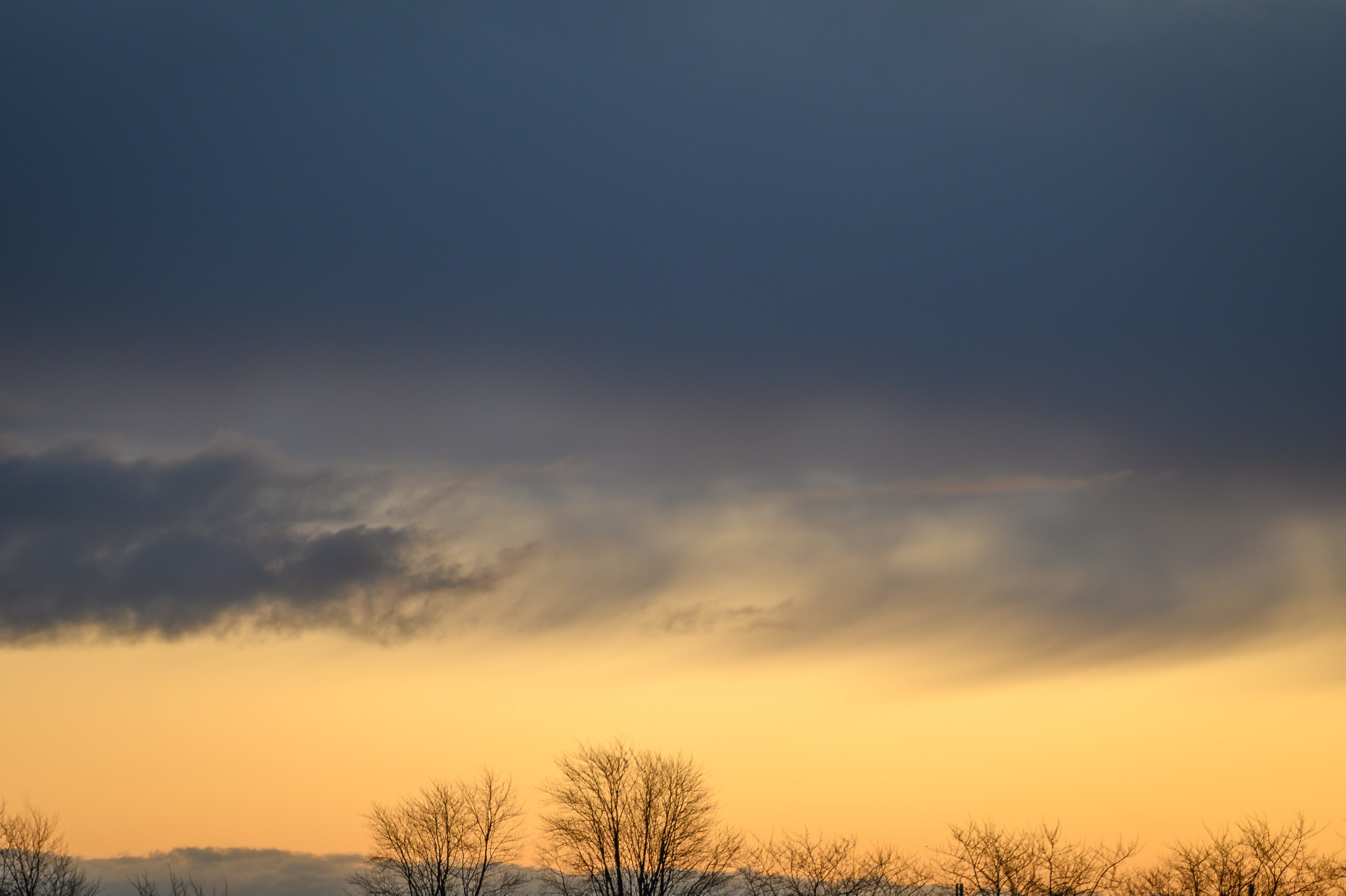
The tree tops in the image below are sharp and in stark contrast to the bright background, and hence your eyes are lead in that direction. But there is a bit of visual tension in the dark and dominating clouds above, that take 2/3rds of the frame and almost seems like a threatening pillow of darkness working its way to the trees. So the image is an odd blend of symmetry (left to right) and lack of symmetry top to bottom. I could have cropped the image so the dark clouds were much less dominating – that would have yielded a very different balance and probably a more positively biased mood.

A final example to illustrate visual balance is the light from the lighthouse below. I shot this image long after sunset and hence in almost pure darkness. The only light is from the lighthouse to the right, hidden behind the silhouette of the building. The silhouette of the tree to the left is balanced against the eery green light from the lighthouse in terms of brightness, and the dark triangle in the bottom of the frame is balanced against the heavy top of the tree. So despite the gloomy nature of the image below, I find that the visual balance is established.

I hope the above examples illustrated the idea of visual balance in photography. The point is that if you become aware of the visual balance in your images and start using them as part of your work with composition, then you will produce better images. There is no right or wrong here; it is all a matter of what works and what does not work, relative to what pictures you want to create.

Related reading

What is visual weight in photography?

What is the rule of odds in photography?

What is the golden ratio in photography?

What is visual weight in photography?

Visual weight

Visual weight has nothing to do with the weight or the density of a given subject in your frame, rather it is an informal scale that tells how well elements in your frame manages to pull the attention of the viewer. So it is a different way of getting attention than say leading lines.

Some of the dimension often quoted in relation to visual weight are:

  • High contrast
  • Good sharpness
  • Bright areas
  • Saturated colors
  • Visual size
  • Recognizable (vs abstract)

So a subject in your frame that is sharp, filled with contrast, bright and colorful will simply draw more attention than out of focus areas with no contrast and desaturated colors. It is obviously a simplification, but I think you get the gist of it.

Best to look at a few examples. Brightness. In the image below, my guess is that you immediately notice the sunrays coming through the treetops as it clearly is the brightest areas in the frame. The rays hold a lot of visual weight relative to the subtle nature of the rest of the frame.Sharpness. The blackbird below is actually the only that is sharp in the entire frame.  The out-of-focus stems are used to frame the bird, but they do not draw attention despite their size, as they are not in focus.

Color. The chest of the little fellow below stands out and draws attention, relative to the rather de-saturated background and the branch that is not exactly colorful! Also notice that eyes have great visual weight, as we tend to seek eye contact, irrespective if the subject is a person or an animal.

Contrast and brightness. You may notice the  bright sun to the right as the first in the frame below (brightness), but my guess is that right after that you notice the backlit straws. The straws have a strong contrast to the dark background hence stand out with very strong contrast. Silhouette photography has the same ability.

Another example with brightness below. Again the strong sun in the top holds a lot of visual weight and it takes some time before you notice the leaves in focus and their structure. You could consider to crop the image so that only the leaves are there – I leave it to you to decide if that would yield a better image.

Finally, one of my favorite examples of visual weight below. Although both small and not especially bright, the moon draws attention being the only bright element in the frame, with good contrast to the blue sky.

Further work

The above was only intended to be an appetizer for visual weight. Once you start to notice, I think you will start to see images slightly different and hopefully also start using visual weight as a tool in your photography.

Thank you for reading this far! Comments and questions more than welcome!

Related reading

What is the rule of odds in photography?

What is the golden ratio in photography?

What is the rule of odds in photography?

Rule of odds

The rule of odds applies to repetition and rhythm in a frame. We seem to like repetition and rhythm in a frame, just like we do when it is about music.

The rule, which is more a guideline or a rule of thumb, simply says that you should try to have an odd number of objects repeating, rather than an even one. Simple, right? So simple that you can question if the rule works at all! I’ll let you be the judge of that, but it is always good to be more aware of the composition of what you put in your frame, and the rule of odds is just one more to build into you set of tools and skills you use as a photographer.

Take a look at the pillars in the image below. There are 5 of them, not a coincidence at all. Some say that our eyes like to rest on the middle one, as this gives balance to both sides.

Some say that we have a tendency to group objects that are close to each other into one, to give us a better overview and simplify things. Therefore simple counting of objects may not always be the way forward. Take a look at the image below. Here the worn down wood pillars could be counted as 8 pieces, but you will have a tendency to group the 2 pillars to the right as one, and the 3 pillars in the middle as one as well, giving a total of 5 “pillars” rather than 8 as you would get counting them individually.

Another example below with the same point, that the 5 thinner stems to the left of the middle visually count as one. Notice also how the lack of rhythm in the spacing of the stems makes this a rather messy image to look at, even though the subject as such is simple.

Finally we notice what is closer to us more than what is in the distance, so in the final example below, you probably notice the 3 parasols in the foreground sooner than the 8 ones in the background, although the reflections in the pool itself is worth an extra look.


Related reading

What is the golden ratio in photography?

What are leading lines in photography?


What is the golden ratio in photography?

The golden ratio

Rule of thirds illustrated by the blue lines dividing the frame.

You have probably heard of the rule of 3rds in photography, in which you position the subjects or areas of interest according to lines that divide the frame into a grid of 3×3 = 9 equally large blocks. You can see the example above, where the eye of the duck is positioned in the intersection between the rightmost vertical and topmost horizontal line. The distance between the lines and from a line to the edge of the frame is exactly the same. It is a very simple rule and many cameras have an option to make such grid available in the viewfinder. No one really knows why it is better to position your subject a bit off center, but most people agree that it makes your image more interesting to watch, and that is the point with the rule of 3rds: to create more interesting pictures.

If you want to use the golden ratio instead, the lines are positioned a bit differently, so that the distance between say the leftmost vertical line relative to the edges of the frame is not 1:2, but 1:1.68 instead. So the line moves a bit closer to the center of the frame. The relationship 1:1.68 is known as the golden ratio (there is a lot of theory that follows this ratio, but I will save you the details as it is less important as long as you use the ratio).  The example below shows an “updated” version of the image.

As you can see, the bottom horizontal line has a distance of  1,618  to the top of the frame relative to the distance to the bottom of the frame – this is the ratio in use. The effect is that the lines move closer to the center of the frame, but still gives a grid that positions your subjects off center, of you use them. You can see that the ducks eye should move a bit closer to the center in order to follow the golden ratio.

Which one is best? Golden ratio or rule of 3rds? Let me start by saying that these rules are first and foremost for photographers with plenty of time like landscape, architecture, product and portrait shooters. I doubt that street photographers or wildlife photographers on the fly have time to think about these compositional rules, although I do think they care a lot about the composition, but my guess is that they work more on an intuitive basis and maybe fix a few things in post. Second, the rules are only a guidance or an attempt to help – it is not meant to be a straightjacket or a limiting factor. You can break any compositional rule and still have an amazing image.

Take a look at the two images below. They follow the rule of 3rds and the golden ratio respectively. Which one do you like the best? See, that is where personal preference comes into play – there is no right or wrong. Whatever you like and find to be the best image, is the answer!

Another rule says that if your subject is moving in the frame, you should let them have space in front of them so the viewer can see where they are going. Having a subject running out of the frame creates tension that you probably don’t want. As you can see – I have broken this rule with the duck. Today I would probably have positioned the duck more to the left in the frame, but the point is that you can break the compositional rules and still have images that are ok.

The point with this post was just to illustrate the golden ratio. You can use it in many different ways – say as a size ratio between two subjects in your frame or in the way you use framing in your image.

Related reading

What is symmetry in photography?

What are frames and framing in photography?