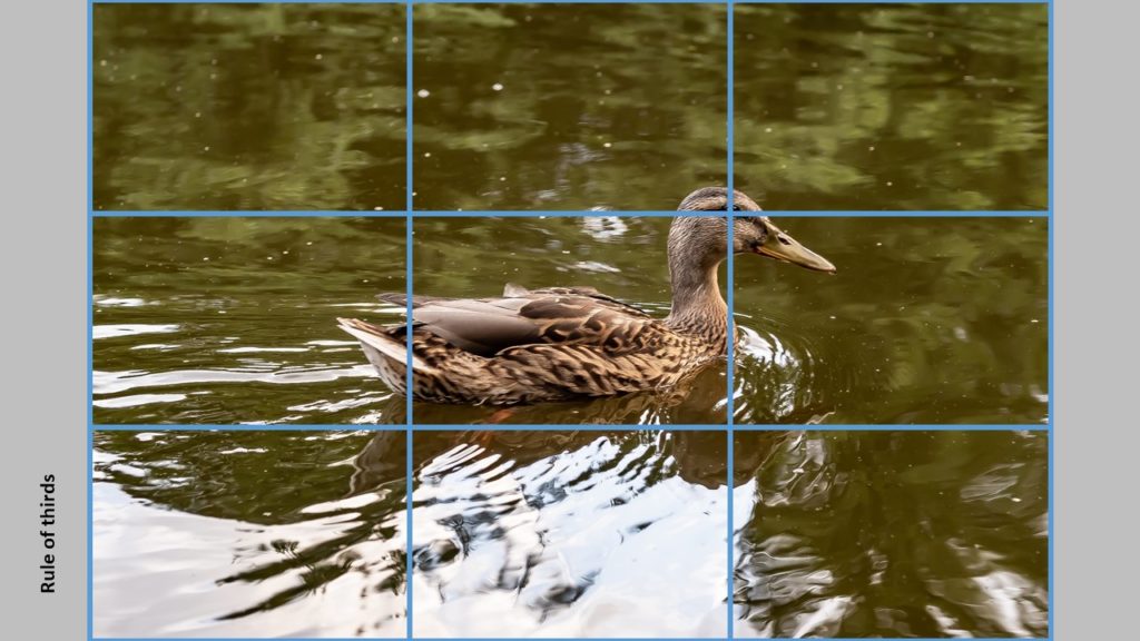
The rule of thirds says that you should divide your frame by to vertical and two horizontal lines at equal distance, so you get 9 equal size areas:
 The “trick” is now to place your subjects and whatever you want the viewer to focus on along these lines. Here you can see that the eye of the duck (we automatically go to the eyes of both humans and animals) is positioned at the intersection of two of the lines from the rule of thirds.
Nobody really knows why this works and gives better images. Maybe it really does not, but it seems we better like images where the subject is not smack in the middle, or landscape images where the horizon does not divide the image exactly in two. So give it a try and see if it works for you.
All composition rules are rules of thumb. Use them when you see fit, and break them when not. It is not intended to be a straightjacket, just a guide you can use whenever you see fit. As the photographer, you are the boss and the director when it comes to what you put in your frame.
