What is luminance in photography?

You probably know the word lumen if you have been interested in the brightness of the light in a lightbulb or a flashlight. For my bicycle lights, I always study how many lumen they generate, as I want to be as visible as possible in the traffic. So the more lumen, the brighter the light is.

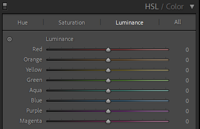
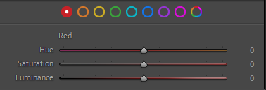
The luminance of the colors in an image is perhaps best illustrated using the sliders from Lightroom:

The luminance slider in Lightroom.

As you can see, the more luminance a given color has in the examples above, the more bright it appears to be.

The above sliders are “tweaks” you can make to the luminance in Lightroom, but in addition to this each color has an inherent level of luminance value. So blue is less bright than say yellow, just to pick two colors that luminance wise are at the opposite end of the scale. This is probably also why blue and yellow work well together as contrast colors – I often notice this when I see the Swedish flag.

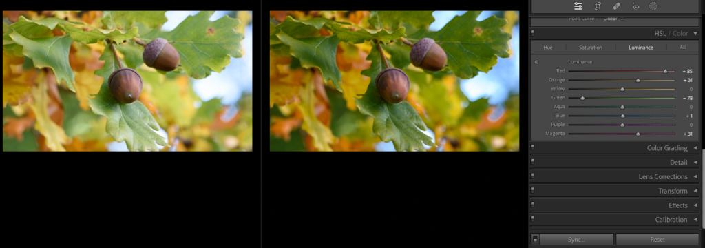
Example with brightness changed in post processing.
Example with brightness changed in post processing. Before left, after right.

In the example above I have reduced the brightness of green and increased it for red, and as you can see it gives a very different expression. Had I reduced the exposure in Lightroom, the brightness of all colors would have been changed at the same time – here I can work with the brightness of each color and how bright they are individually.

Related reading

What is color saturation in photography?

What is hue in photography?

What is hue in photography?

To me hue is the same as color. It may not be entirely correct, but this definition works for me as a photographer using Lightroom and Photoshop.

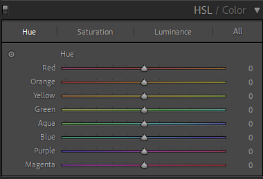
The hue sliders in Lightroom.

To me hue is the color in its purest form. If you look at the sliders in the image above, I can take Magneta at the bottom to become red if I pull it to the right or more purple if I pull it to the left. This is changes to the color as such in its purest form. Notice that each color slider picks up where the previous left, if you go from top to bottom.

You can saturate the color more or less or change the luminance (add white), but this is a different dimension than the color as such. When you change the saturation or the luminance, the hue remains the same.

Related reading

What is monochromatic colors?

What are complementary colors in photography?

What is monochromatic colors?

Single

You probably think of monochrome as black and white and the shades of grey in between, i.e. that monochrome is the same as a black and white image.  This is how it is often used, but monochrome means that only one color or hue is present in the image.

“Chromaticism” is the greek word for color. So monochromatic underlines that only one color is present. You can of course have different versions of that color by having different tints (adding white) and shades (adding grey/black) to the pure color (hue).

I think of monochrome and monochromatic as being one and the same, but this is not entirely correct. However, for practical purposes working as a photographer, I think this assumption works just fine.

Not a monochromatic image
In real life the colors here looked amazing, but it does not really come across in the image.

You can work to achieve monochromatic images by using colored filters or post processing the image or a bit of both. Personally, I use Lightroom to tweak my images to a monochromatic look.

Using one single hue across the board in this image
Pulling a few sliders in Lightroom, it is possible to change the image to be (almost) monochromatic.

The reason for using a monochromatic color scheme is to simplify the image and take out some distractions. If you have a scene where there are many different colors, reducing the variety of colors down to monochromatic can help the viewer to see more of the structures and textures in the image, and help the scene appear more calm.

Related reading

What are complementary colors in photography?

What is color saturation in photography?

What are complementary colors in photography?

Opposites attract

When put next to each other, complementary colors gives the biggest contrast and – for reasons beyond me – are an appealing combination to the human eye. You can use this knowledge if you work in a studio where the combination of the color of the models clothing and the color of the backdrop can be matched as complementary colors. Or you can use it in post to say do split toning to the highlights and lows using two complementary colors to do so.

The color wheel here as a screen shot from Lightroom.

Complementary colors sit exactly opposite each other in the color wheel, so if you follow the edge of the color wheel through all 360 degrees, you will find all the possible combinations. However, many of these are gradual changes from one color to another, so a more “black and white” presentation of the complementary colors could be:

  • Red and green
  • Yellow and violet
  • Orange and blue

Some photographers like Finn Beales are able to color grade their entire image portfolios in a consistent way and clearly using their knowledge of color science in general and complementary colors in particular. If you can follow this lead, it could be a way for you to develop a portfolio of images that stands out from the crowd and enables you to brand your work so it is easy to recognize.

Related reading

Color composition in photography

Why color temperature is vital in color photography

What is split toning in photography?

High and low

Split toning is simply to apply different colors to the highlights and lows in the image. You are changing the original colors based on the intensity of the light. Subject to the colors chosen, the emotional response to an image pre and post split toning can be very different.

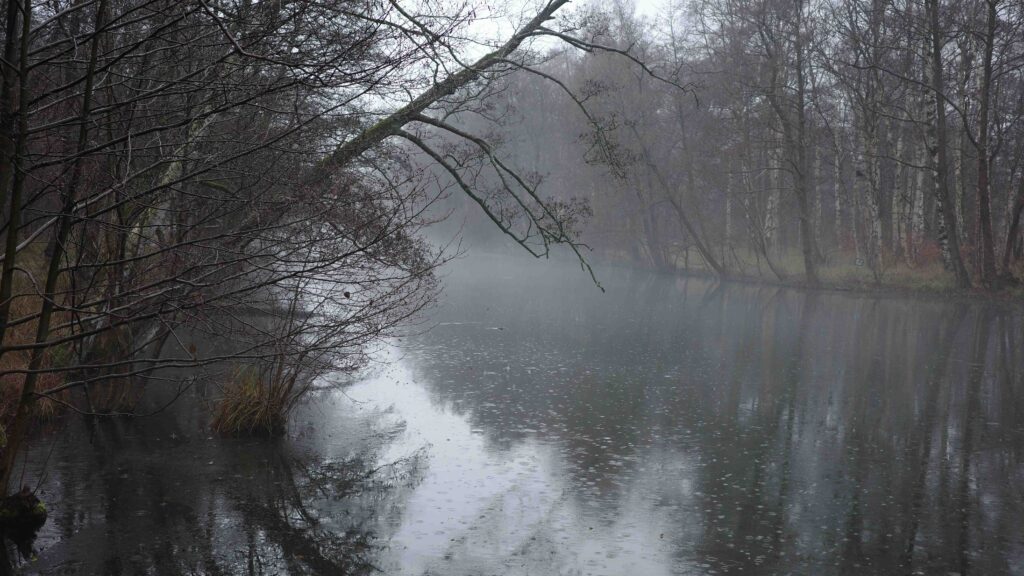
split toning not applied
The original image without split toning.

I see many photographers using split toning to get a distinct look to their images so the color profile is consistent throughout their portfolio. I am no master here and my colors are all over the place, but when reading the book by Finn, I could clearly see how strong a tool color grading in general and split toning in particular is. So if you have the energy and the discipline, split toning is a great tool for making your images distinct and different than most of what you find on say Instagram.

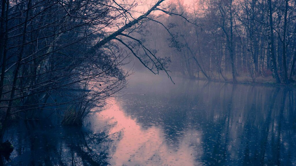
split toning applied to highs and lows
Red-orange applied to the highlights. Blues added to the lows. Notice how especially the branch over the waster pops out much more in this version.

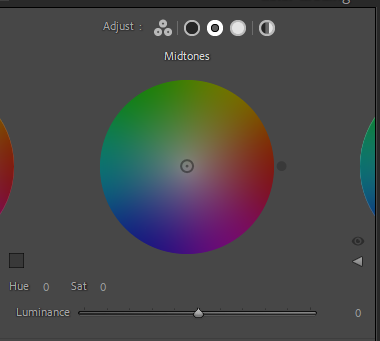
I apply split toning when working in Lightroom, and Lightroom even allows you to add 3 levels of toning: high, mids and lows. But in the example above I have just used highs and lows. The colors used are blue for the lows and a red-orange one for the highs.

It is not a coincidence that I have used orange and blue. These two colors sit opposite each other on the color wheel and are thus complementary colors. Complementary colors create the biggest contrast, and as you probably know, contrast draws attention. In addition, complementary colors apparently are pleasing to the eye – I have no idea why, but judging from my own experience it sounds about right.

Related reading

Color composition in photography

Why color temperature is vital in color photography

What is color saturation in photography?

Intensity

I think the best way to describe color saturation is that a completely desaturated image is a black and white image! So the intensity of the color is the saturation. And a color that is completely desaturated is just a shade of grey.

The more grey you add to a color, the less saturated it is. (This is probably not technically correct, but I find it to be a good pragmatic way to think of it).

The saturation slider in Lightroom
The saturation slider in Lightroom, here in the middle. Notice the value all to the left (grey).

The saturation of a color in real life is a given, but you can tweak the saturation of a color in post processing. The above I have cut from the post processing tool Lightroom, where the slider in the middle – in this example – allows you to take the intensity of the red color from grey (all the way to the left) to a very intense red (all the way to the right).

As colors speaks to and invoke our emotions, desaturating an image can make it more subtle and calm. So if you want the structures and textures to play a bigger role in your image, taking the saturation down can change the balance in what elements in your picture that dominates.

You can also use saturation to change the balance between different colors, so if you have a red field of flowers on a green bed of branches and leaves, you may want to desaturate the green color a bit to give room for the red flowers shine (relatively) more.

Related reading

Color composition in photography

Why color temperature is vital in color photography

What is the Purkinje Shift in photography?

Low light

You may have noticed that your eye works a bit differently at night than at daytime. Due to the way your eye is constructed, the colors red, yellow and orange will appear less bright relative to blue and green colors, when perceived in low light.

This can lead to some frustrations as a photographer, as your camera does not follow this logic and simply register the light as is. So what you remember to have seen at night may not be what you find when you open the image in your post processing software! The solution is to color edit the images to make the red, yellow and orange less intense so the image is better aligned to how you remember the scene.

Low light image.
At night your eyes will be better able to see green and blue relative to red and yellow.

Related reading

What is light falloff in photography?

What is hard light vs soft light?


Color composition in photography

Emotions

Colors and emotions go hand in hand like horse and carriage from that famous song by Frank Sinatra. And as such it can be used as a tool for your photography and the emotions you want to induce.

Think of a midsummer morning where the sun is just rising, filling the room you are in with warm light and long shadows. What colors do you think of? Probably yellow, orange and red. If I had asked you to think of a frosty windless winters morning, what colors would then spring to mind? Probably more cool blue or white. Filmmakers are exceptionally good at using colors to underline or emphasize a mood using colors – I often notice the color coding they use (and the music of course) to create a certain mood. In dystopian movies like Blade Runner the blue and brown colors are often dominating to underline the unsettling look into the future.

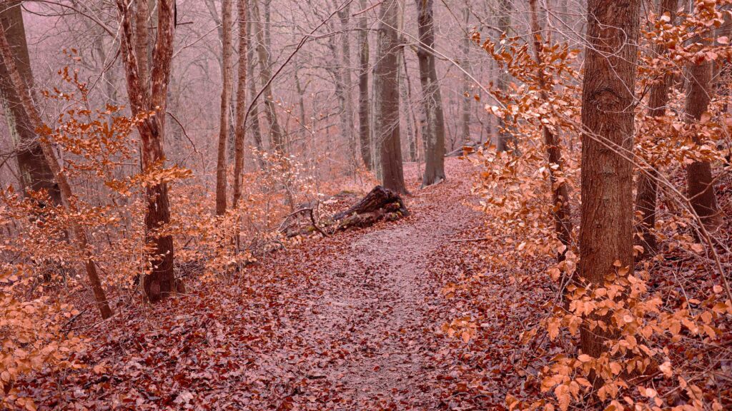
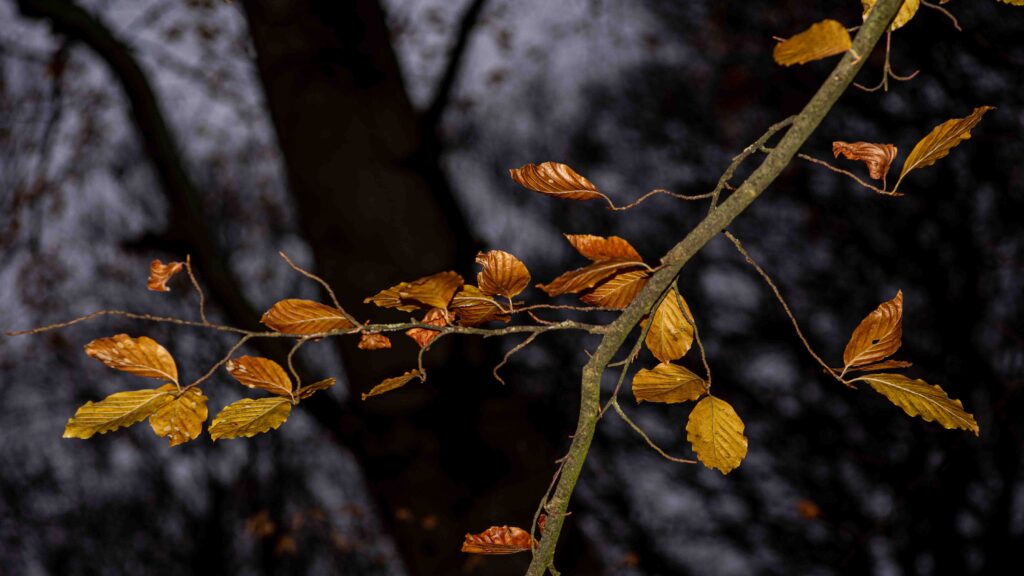
Beech leaves in the woods.
The warm and golden colors of the beech leaves are a stark contrast against the dark background made up of the trees in the wood. The effect is achieved using a flash and the effect of light falloff.
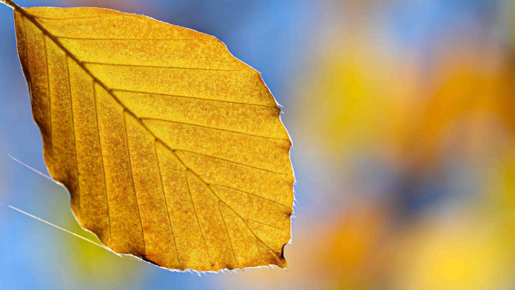
Orange leaf.
Blue and orange are complementary colors and gives a pleasing contrast.

Colors not only induce emotions, but can also be used to create patterns and connect objects that would otherwise seem without relation.

Green bokeh.
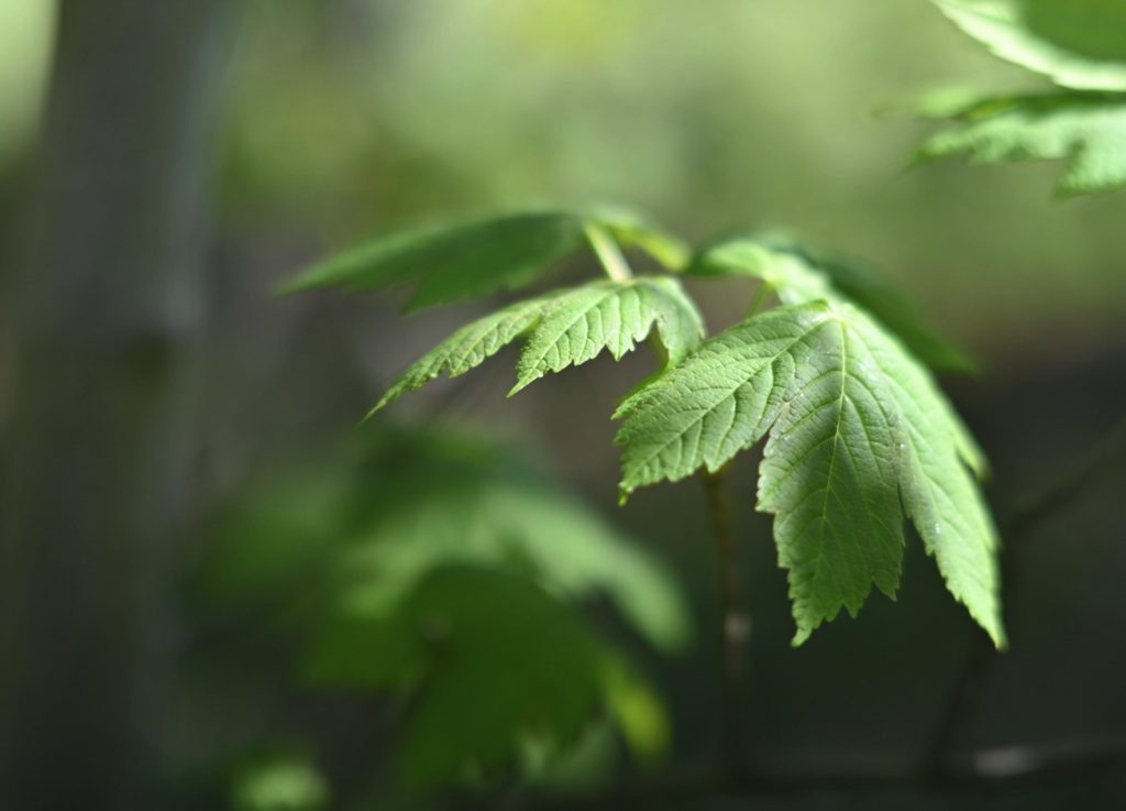
Green is often associated with nature and harmony which is probably why this image signals a calm atmosphere more than anything.
A black cat.
Sometimes less is more. The cat here is by nature black and white, and the colors of the eyes hence makes a big contrast.
Desaturated but natural colors.
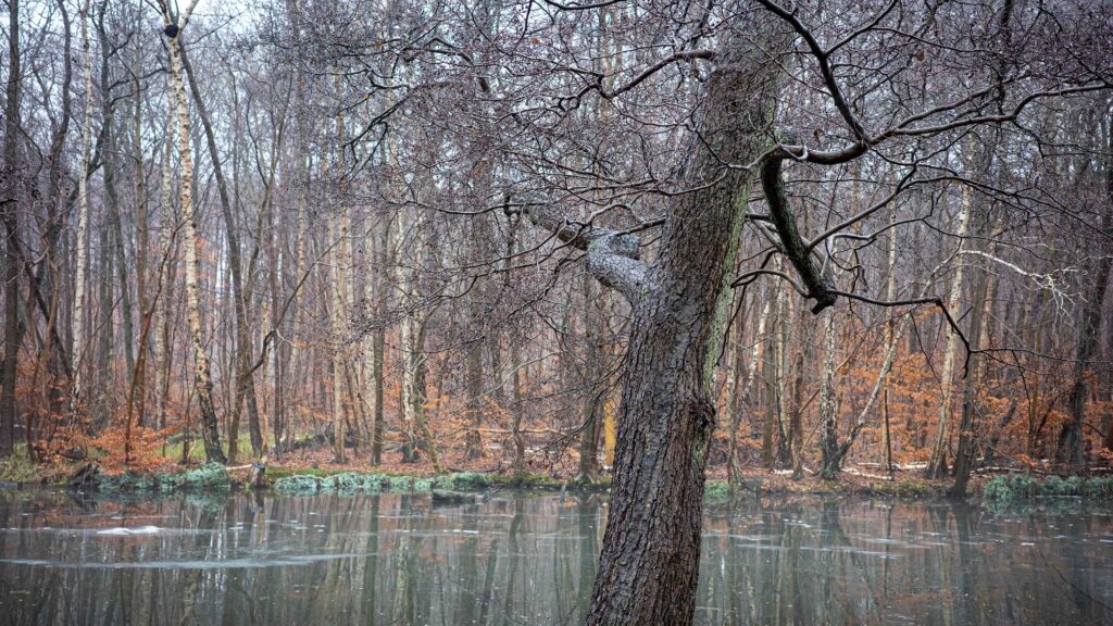
The colors here are desaturated and underline the tranquil scene. The stronger the colors, the stronger the effect. Desaturated colors calm the mind.
Leaves on a wet table.
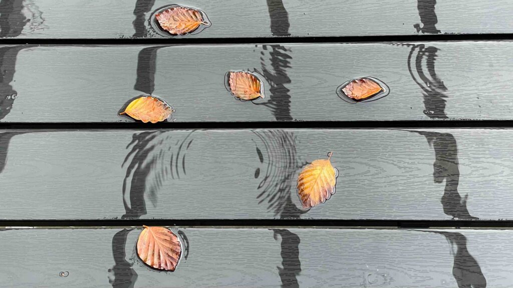
Here the color of the leaves help bring them together despite the more structural elements in the composition pull in the opposite direction.
Winter landscape.
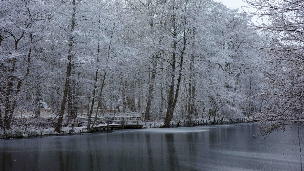
White and blue are often associated with calmness and clarity. Also sterile and purity, which is why these colors are often used in bathrooms!
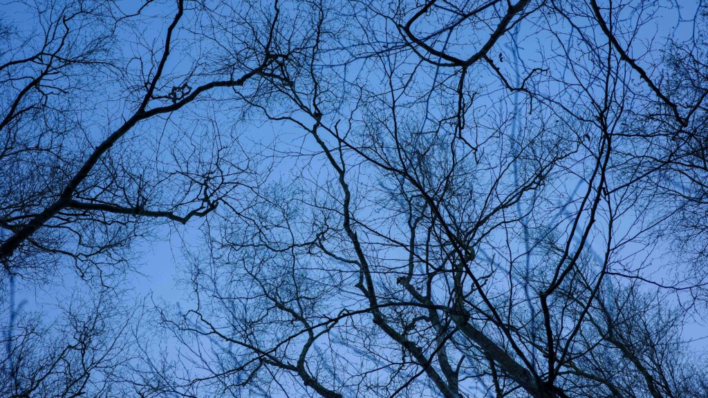
Winter silhouettes.
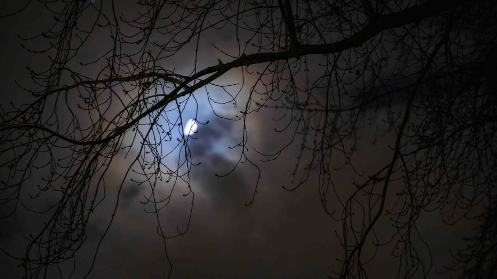
By altering the color temperature to a colder tone, the freezing cold winter day is emphasized.

Next step

One way to study the effect of colors using your own reaction as guide, is simply to make both a color and black and white version of an image and see how the different versions work for you. You can also try to alter the colors in post processing and play with saturation, hue and brightness.

The point with this post is not that there is a right and a wrong when it comes to colors. If you learn how to use the colors to achieve a certain effect, then your images will have a much bigger impact. And of all the tools in the photographers toolbox (composition, exposure, etc), color is the strongest of them all.

Related reading

Why color temperature is vital in color photography

Triangles as a way of composing and creating interest

Why color temperature is vital in color photography

Light sources

If you are new to photography, then color temperature may not be the first thing you worry about. There are many other dimensions of photography that demands you attention, ranging from selecting the right camera and lens, to composition and exposure. However, when you have found your feet and start getting the results you want, then white balance and the color temperature of light may start to be one of the more advanced subjects that you want to dive into.

Every light source has a certain color temperature. It is measured in Kelvin, and for reasons beyond me, it is typically on a scale between 2000 and 10000, and to signal it is a value on the Kelvin scale, a “K” is added after the number. So for example candlelight is 2000K whereas an overcast sky is around 6000K. So low values equals more red, high values more blue and in between is white.

You are fast!

No, I don’t write that headline to charm you, but it is a fact that your brain adapts to new light sources with astonishing speed and probably without you noticing. So if you walk from noon daylight (5200K) into a tungsten lit living room (2500K), then you’ll adapt to the new temperature of the light super fast and probably without noticing. And colors will look like they always do, and white will look white, simply because you adapt fast to a new light source. It is really smart design!

Your camera is not so smart

You camera is not so smart. In order for it to record the light in a way where the images that comes out of it look natural (e.g. white looks white), then the camera needs to know the temperature of the light. If it doesn’t, then I can assure you the colors will be strange – white will be yellow and blue will be purple, etc. So you need to tell the camera what color temperature you are shooting at.

Auto white balance

Luckily, most modern cameras has an option named auto white balance where the camera itself reads the light and figures out the color temperature of the ambient light. It works really well in most cases. You can try to play with a manual setting of the white balance, just to get a feel for what happens if the white balance is off and what options this gives you for giving your images a distinct look. If you have ever seen images by Bryan F. Petersson, you can find some amazing images where he gives the night sky a distinct purple look using manual setting of the white balance.


What is white balance in photography?

True colors

As strange as it may sound, white is not just white. Subject to the temperature of the light, measured in Kelvin, white is many different shades of yellow! Why is this hard to believe? Because your brain does an amazing job compensating for the color temperature, so that different version of white always appears to be the same white to you.

Unfortunately your camera is not as smart as your brain! Your camera needs to know what the color temperature of the light is in order to reproduce white (and colors) so that it looks credible when you see it in the screen or the print. If the white balance setting is off relative to the temperature of the ambient light, the colors (and the white) in the image will look unnatural. This can be used as a tool for making your images stand out, but for now I just assume that you want your images to look natural.

Auto white balance

Most modern cameras has an auto white balance function that in far most cases will give the technically correct white balance settings. Also, if you shoot in RAW format, the options for adjusting the white balance as part of the post processing work makes the wrong white balance settings less of a catastrophe – of course it is always nicer (and less work!) to get the white balance settings right in camera, but when shooting in RAW, hard work in post can make your images look right.

Manual white balance

You can set the white balance manually also. Typically your camera has two options, either you can go hard core manual and enter the Kelvin value directly (typically between 2500K and 8000K), or you can select between some predefined values such as sunlight, overcast, tungsten, incandescent, and so on. These names are just name for a specific Kelvin value – if you for example have a value on your camera called “overcast”, it is the same as entering a Kelvin value of about 6000K to 6500K.

Several light sources

Recently I was shooting images at a lunch party, where the party was held inside with tungsten light, but the light from an overcast sky seeped through large windows that (unfortunately!) served as a backdrop for many of the images. Although the auto white balance in my camera did it’s best, the mix of two different light sources with two different Kelvin values did not work out well for my images. The people at the party either had a very red color in their faces, or if I adjusted so that they looked more natural, the light from the windows started to look weird. That taught me to be careful mixing different light sources – had I chosen to frame the images differently (without the windows), this would not have happened.

Bottom line

If you are new to photography, I would not worry to much about white balance for starters. Set your camera to auto white balance, and focus on other matters like composition and storytelling. However, if you want to dive more into playing with color temperature and see what it can do for your images, try to study the Kelvin scale and start to set the white balance manually. Once you are comfortable with manual white balance, next step is to play with white balance settings on your camera that do not match the available light! Have fun!