Symmetry is about balance. It is one of the more extreme versions of balance, but about balance it is. You can both use symmetry as a way to position your objects in the frame, or it can be given to you by the subject you are photographing.
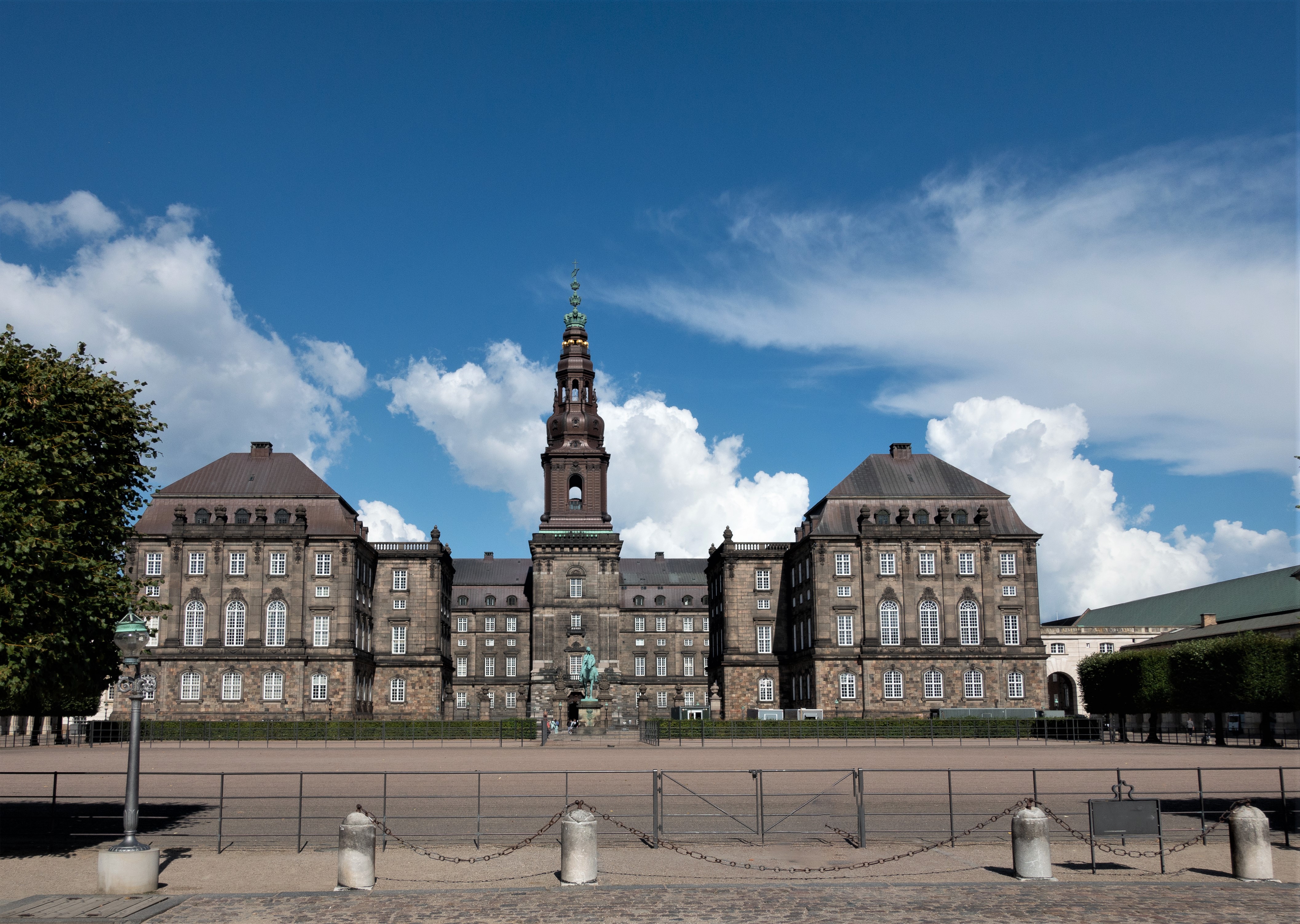
In architecture symmetry is used as a tool to signal power and influence. You will see that many government buildings are symmetrical like the Danish parliament below. This is what I call left to right symmetry, as it is symmetrical over a vertical axis:

You can also find it in many other kinds of buildings like a library with a Harry Potter feel:

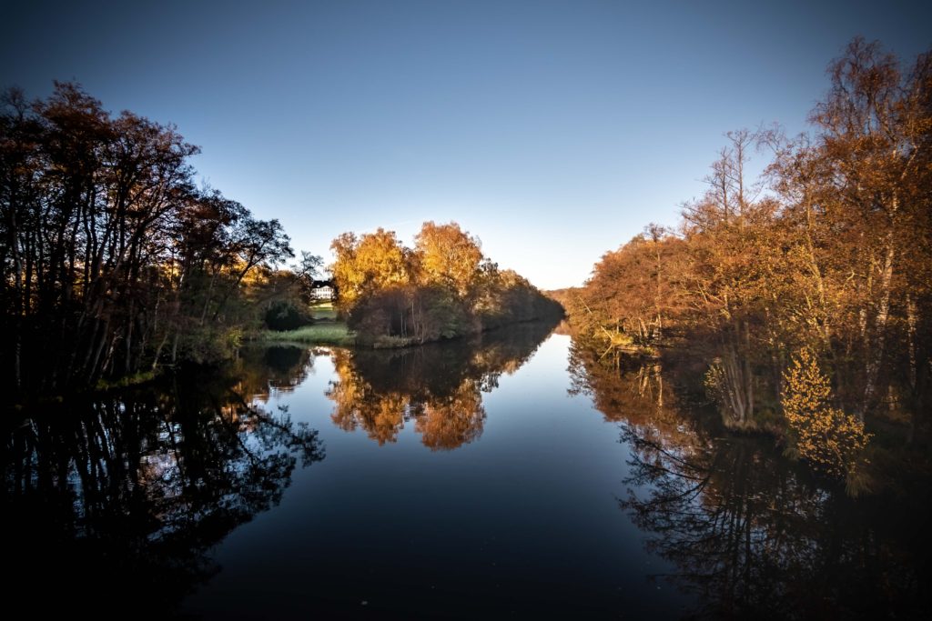
Symmetry can also be top to bottom, i.e. the axis over which the symmetry works is horizontal. Reflections are the classic example of top to bottom symmetry:

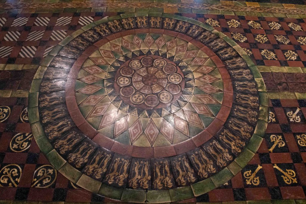
And finally you can combine the two to give you symmetry both vertically and horizontally, a model mother nature often uses:

But we human beings also like this kind of symmetry:

So what is the point with all this? When you start to become aware of symmetry within the images you see, you will notice symmetry and the effect more and more as you study other photographers work. This is a great way to enhance your skillset and build symmetry into your composition toolbox and hence start using symmetry in your own work.
Symmetry, like rhythm and repetition, makes the image more likeable and pleasing, and that may be exactly what you need to make your photo work. But be careful with symmetry: a little is great, too much is boring in the long run. So use it sparingly.
