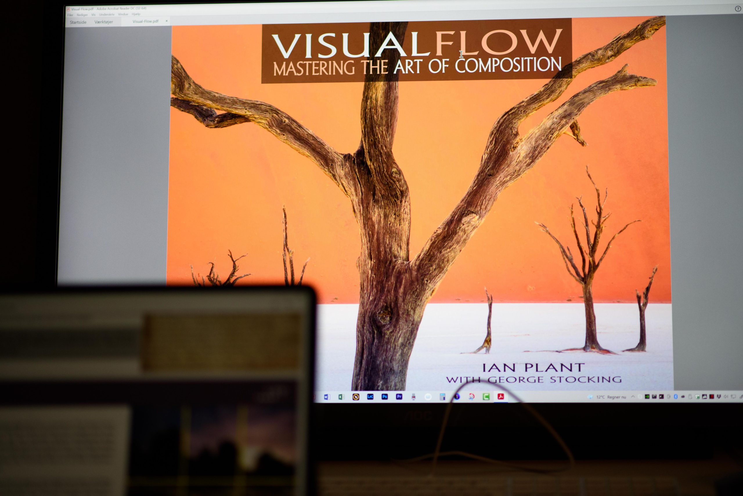
Book review

Ian Plant certainly knows a thing or two regarding composition, and in this book he and his mate George Stocking give us all there is to know about composition in this 287 pager PDF based e-book. The price is around 30 USD (October 2021) and to make the review short: I find that it is worth every dime.
The book is filled with great examples and lots of them. Albeit both Ian and George are landscape photographers, the principles are easily applicable to other kinds of photography. As you may have guessed when I mentioned the number of pages, the book is much more comprehensive than the usual presentation of leading lines and rule of thirds. Much more. There are many examples from both Ian and George’s own work, but maybe even better, also examples picked from classic paintings for both East and West.
There are a few things about the book that bugs me. Not senseless, but nonetheless:
- The examples are supplied with elaborate text. Text that I feel compelled to read, but it is often the same text as in the body text. And I keep jumping back and forth between the body text and the text below the examples, finding it hard to ignore the image text, which constantly interrupts the flow and line of thought in the body text.
- The first 150 pages are filled with remarks like “I will get back to this subject later” or something along those lines. Although it is a good tool for organizing the way things are presented, the sheer number of times this remark is made simply drove me nuts after mentioning number 20+.
- I cannot really tell if it is a stack of PowerPoints that have been converted into a so-called book. I have a suspicion that it is more a presentation with elaborate text than it is a book as such I am reading. Maybe it is the format with me reading the text on a iPad that bugs me, but it is not a pleasure to read as many other books are.
- And finally I am puzzled why people that knows so much about composition knows so little about text and how we humans like to read. The fact that the text is right aligned and the words hence do not flow equally positioned on the line simply makes it harder to read. Also the font is absolutely horrible – if you know just the most basics about how we read and recognize words (as images actually) you would never have chosen this font. This again gives me more a feeling of reading a PowerPoint presentation than a book.
So don’t get me wrong, it is a vital book about photography and I absolutely recommend that you get it and read it. But that these guys in terms of readability knows so little and makes so basic mistakes in their production of this so called e-book simply bugs me to a degree where I could not let it pass unnoticed.
Related reading
Understanding a photograph by John Berger
Landscape photographer of the year, collection 10
And then there was silence, by Jan Grarup
