The golden ratio

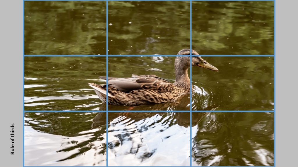
You have probably heard of the rule of 3rds in photography, in which you position the subjects or areas of interest according to lines that divide the frame into a grid of 3×3 = 9 equally large blocks. You can see the example above, where the eye of the duck is positioned in the intersection between the rightmost vertical and topmost horizontal line. The distance between the lines and from a line to the edge of the frame is exactly the same. It is a very simple rule and many cameras have an option to make such grid available in the viewfinder. No one really knows why it is better to position your subject a bit off center, but most people agree that it makes your image more interesting to watch, and that is the point with the rule of 3rds: to create more interesting pictures.
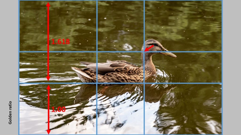
If you want to use the golden ratio instead, the lines are positioned a bit differently, so that the distance between say the leftmost vertical line relative to the edges of the frame is not 1:2, but 1:1.68 instead. So the line moves a bit closer to the center of the frame. The relationship 1:1.68 is known as the golden ratio (there is a lot of theory that follows this ratio, but I will save you the details as it is less important as long as you use the ratio). The example below shows an “updated” version of the image.
As you can see, the bottom horizontal line has a distance of 1,618 to the top of the frame relative to the distance to the bottom of the frame – this is the ratio in use. The effect is that the lines move closer to the center of the frame, but still gives a grid that positions your subjects off center, of you use them. You can see that the ducks eye should move a bit closer to the center in order to follow the golden ratio.
Which one is best? Golden ratio or rule of 3rds? Let me start by saying that these rules are first and foremost for photographers with plenty of time like landscape, architecture, product and portrait shooters. I doubt that street photographers or wildlife photographers on the fly have time to think about these compositional rules, although I do think they care a lot about the composition, but my guess is that they work more on an intuitive basis and maybe fix a few things in post. Second, the rules are only a guidance or an attempt to help – it is not meant to be a straightjacket or a limiting factor. You can break any compositional rule and still have an amazing image.
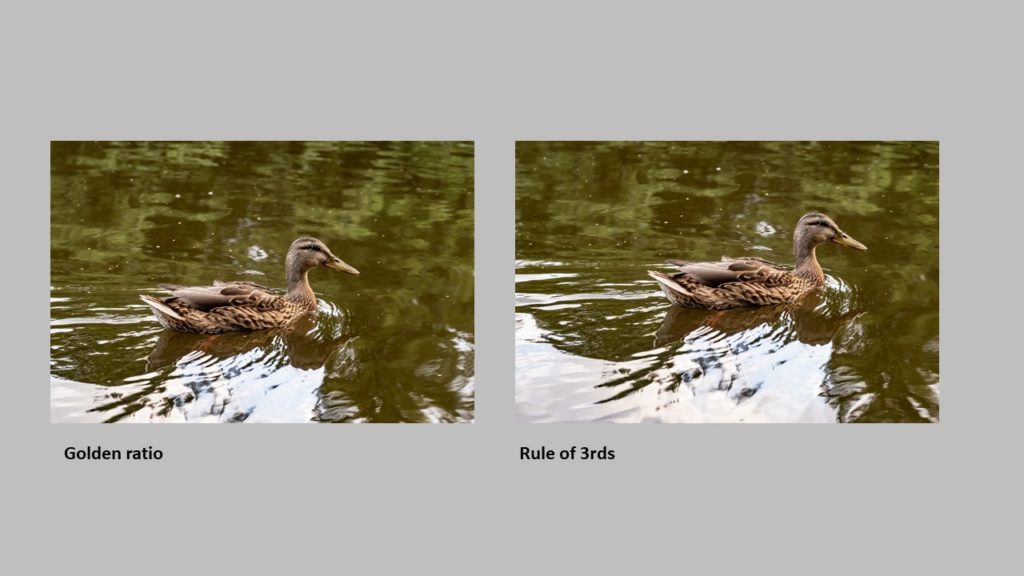
Take a look at the two images below. They follow the rule of 3rds and the golden ratio respectively. Which one do you like the best? See, that is where personal preference comes into play – there is no right or wrong. Whatever you like and find to be the best image, is the answer!
Another rule says that if your subject is moving in the frame, you should let them have space in front of them so the viewer can see where they are going. Having a subject running out of the frame creates tension that you probably don’t want. As you can see – I have broken this rule with the duck. Today I would probably have positioned the duck more to the left in the frame, but the point is that you can break the compositional rules and still have images that are ok.
The point with this post was just to illustrate the golden ratio. You can use it in many different ways – say as a size ratio between two subjects in your frame or in the way you use framing in your image.

