Color composition in photography

Emotions

Colors and emotions go hand in hand like horse and carriage from that famous song by Frank Sinatra. And as such it can be used as a tool for your photography and the emotions you want to induce.

Think of a midsummer morning where the sun is just rising, filling the room you are in with warm light and long shadows. What colors do you think of? Probably yellow, orange and red. If I had asked you to think of a frosty windless winters morning, what colors would then spring to mind? Probably more cool blue or white. Filmmakers are exceptionally good at using colors to underline or emphasize a mood using colors – I often notice the color coding they use (and the music of course) to create a certain mood. In dystopian movies like Blade Runner the blue and brown colors are often dominating to underline the unsettling look into the future.
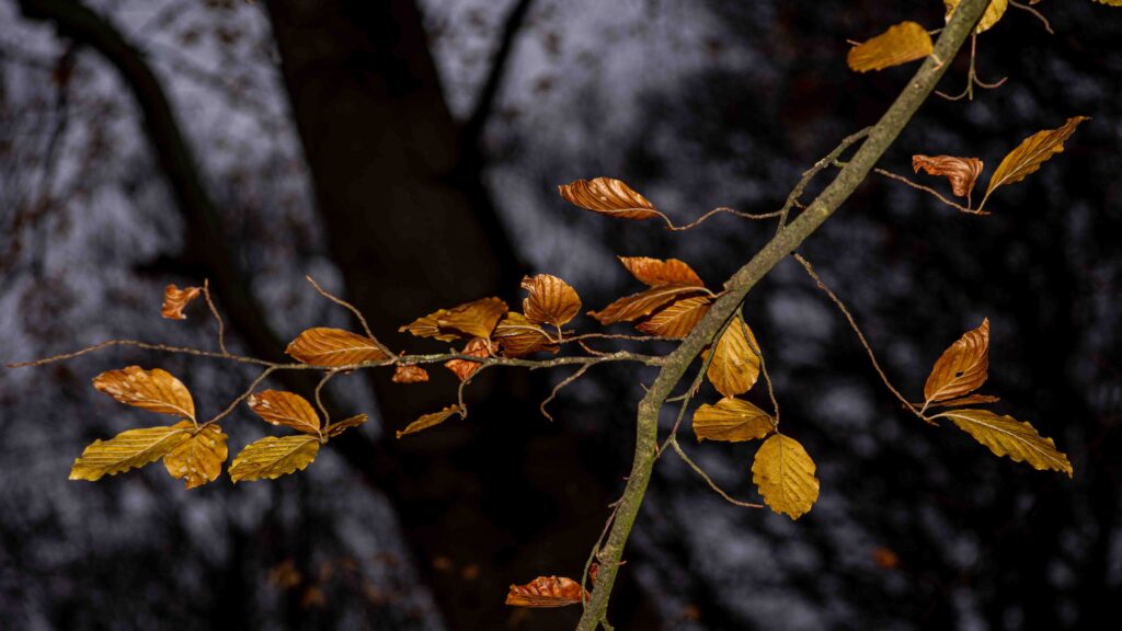
Beech leaves in the woods.
The warm and golden colors of the beech leaves are a stark contrast against the dark background made up of the trees in the wood. The effect is achieved using a flash and the effect of light falloff.
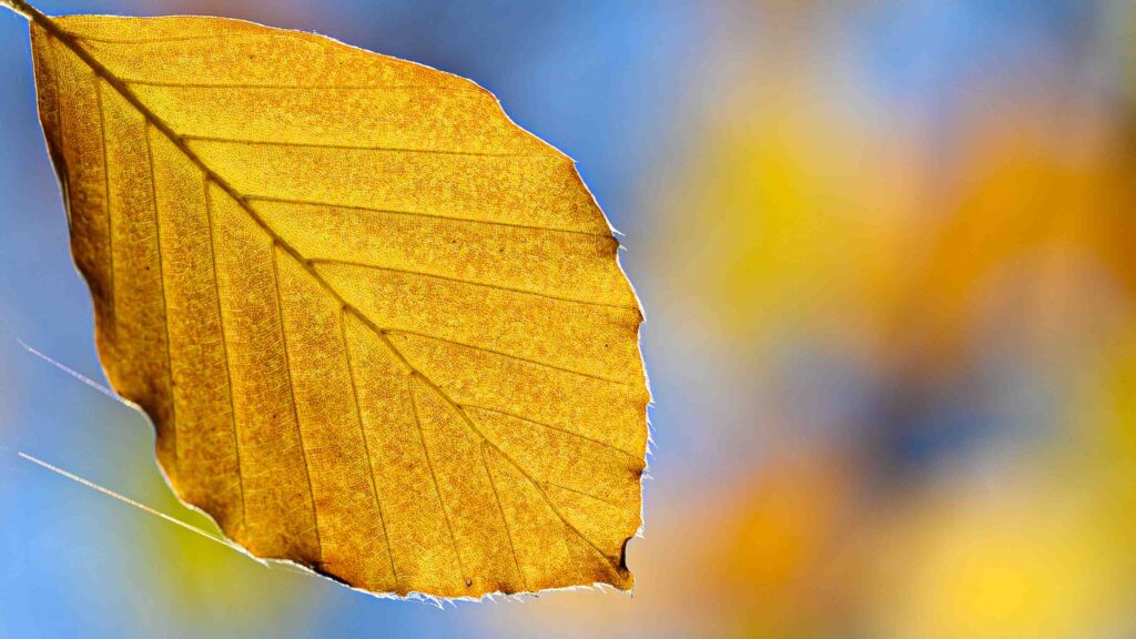
Orange leaf.
Blue and orange are complementary colors and gives a pleasing contrast.

Colors not only induce emotions, but can also be used to create patterns and connect objects that would otherwise seem without relation.
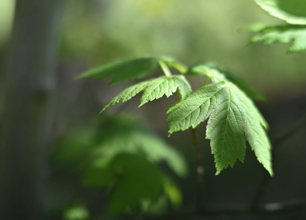

Green bokeh.
Green is often associated with nature and harmony which is probably why this image signals a calm atmosphere more than anything.
A black cat.
Sometimes less is more. The cat here is by nature black and white, and the colors of the eyes hence makes a big contrast.
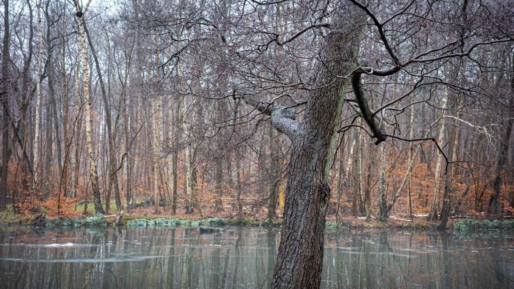
Desaturated but natural colors.
The colors here are desaturated and underline the tranquil scene. The stronger the colors, the stronger the effect. Desaturated colors calm the mind.
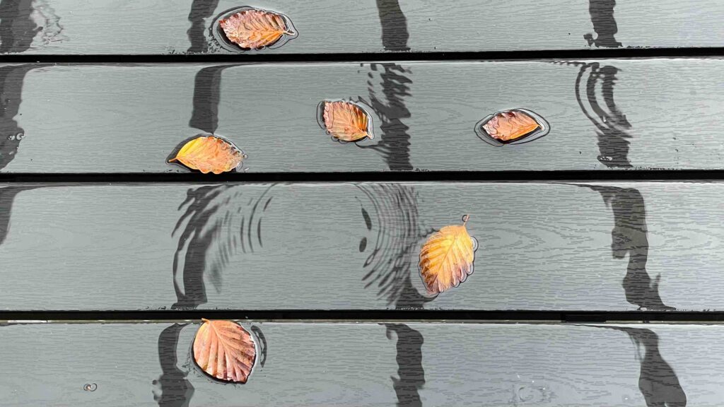
Leaves on a wet table.
Here the color of the leaves help bring them together despite the more structural elements in the composition pull in the opposite direction.
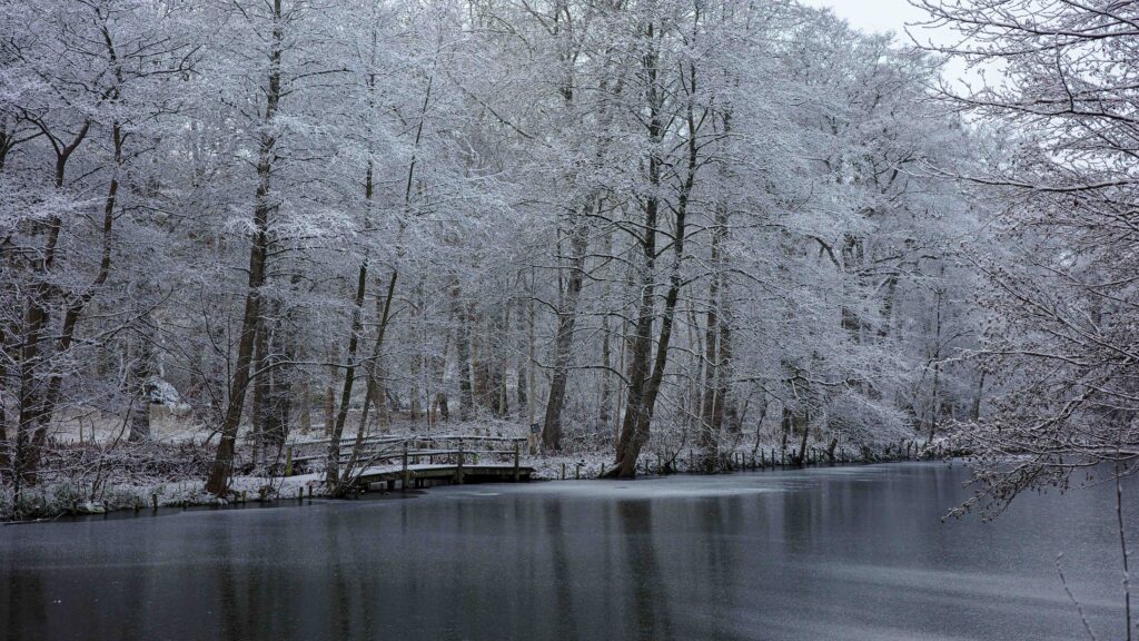
Winter landscape.
White and blue are often associated with calmness and clarity. Also sterile and purity, which is why these colors are often used in bathrooms!
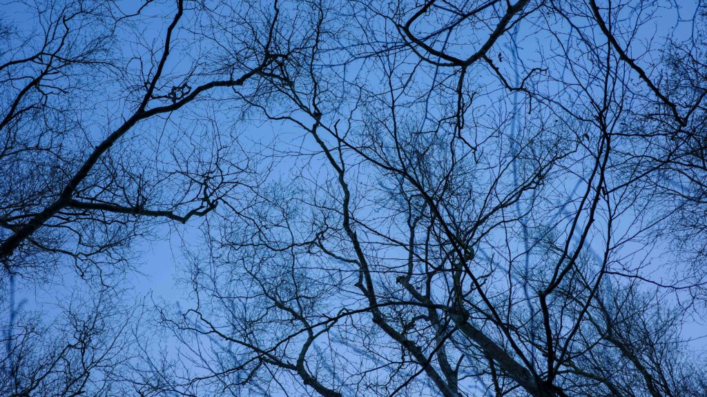
Winter silhouettes.
By altering the color temperature to a colder tone, the freezing cold winter day is emphasized.

Next step

One way to study the effect of colors using your own reaction as guide, is simply to make both a color and black and white version of an image and see how the different versions work for you. You can also try to alter the colors in post processing and play with saturation, hue and brightness.

The point with this post is not that there is a right and a wrong when it comes to colors. If you learn how to use the colors to achieve a certain effect, then your images will have a much bigger impact. And of all the tools in the photographers toolbox (composition, exposure, etc), color is the strongest of them all.

Related reading

Why color temperature is vital in color photography

Triangles as a way of composing and creating interest

Author: Frederik Bøving

Frederik is a photographer, blogger and youtuber living in Denmark in the Copenhagen region. Outdoor photography is the preference, but Frederik can also be found doing architecture, product shoots and stills.

Leave a Reply

Your email address will not be published. Required fields are marked *