What is a mirrorless camera?

Mirror and optical viewfinder

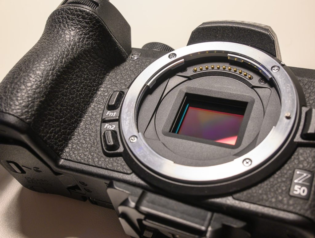
A mirrorless (ML) camera is as the name says, a camera without a mirror, nor does it have an optical viewfinder. Light flows directly from the lens to the camera sensor. The ML camera can be seen as a natural evolution of the DSLR and even the SLRs, but the ML concept is also used in cameras that do not have an interchangeable lens system, like a point-and-shoot camera or a smartphone.

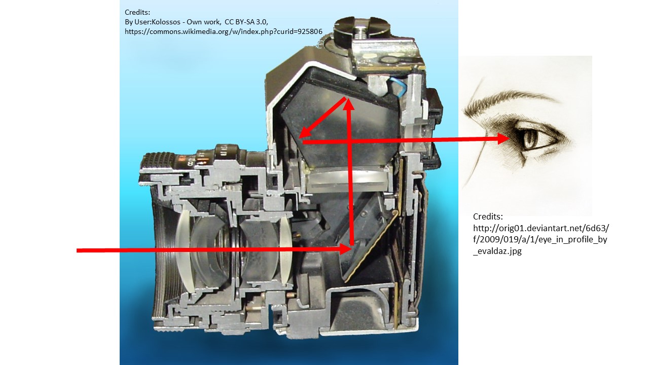
The image below shows how a DSLR works. The light is sent to the optical viewfinder via several mirrors, most notably the first one that keeps the light away from the sensor (or film).

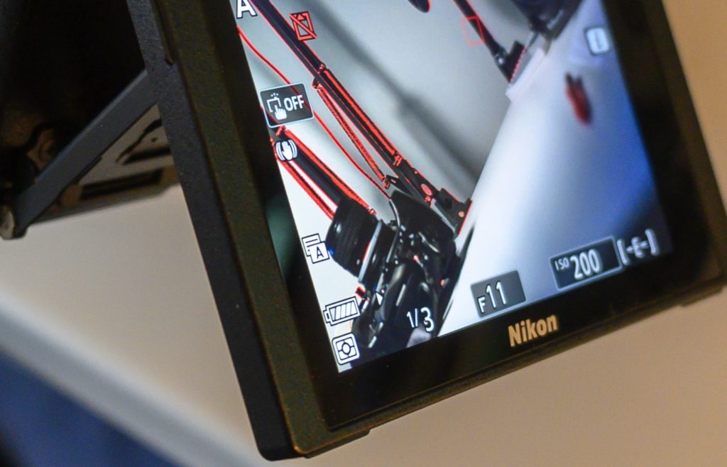
With a mirrorless camera, the light is constantly and directly sent to the sensor. The optical viewfinder is replaced by a electronic viewfinder, which basically is a small TV screen located where the optical viewfinder used to be. Not all ML cameras have a viewfinder, but instead uses the rear LCD as viewfinder.

Many DSLR cameras can flick away the mirror and show on the rear LCD what you can see in the electronic viewfinder of the ML camera. In that way, the DSLR can work as a ML when using the rear LCD.

The lack of a mirror is not to be confused with the shutter. Many ML cameras have both a mechanical and an electronic shutter. The mechanical shutter has two curtains that allow the sensor to be exposed according to the selected shutter speed by moving the curtains across the sensor. The electronic shutter turns the camera sensor on and off to get the same effect. It is all about measuring the light at the timeframe dictated by the shutter speed. Notice that for flash photography a mechanical shutter is required.

On a DSLR/SLR, the focus system is often a separate system that via a small hole in the glass uses a small area of light to determine focus or not. Therefore a DSLR focus system often only allows you to select a focus area in the center of the frame. With a ML system, the entire sensor in real time receives light and determines focus or not – this requires good software and computing power, but it also opens up for selecting focus points in the entire frame (incl. corners) and intelligence to recognize people (their eyes) and animals, and thereby take the sophistication of the auto focus systems to a new level.

Related reading

What is a DSLR?

Is mirrorless cameras better than DSLRs?


What is silhouette photography? And is it for you?

Silhouettes…

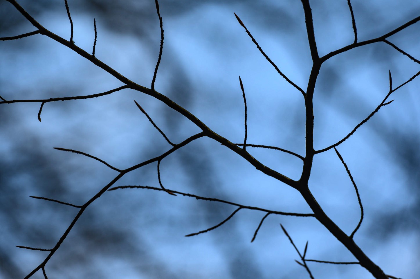
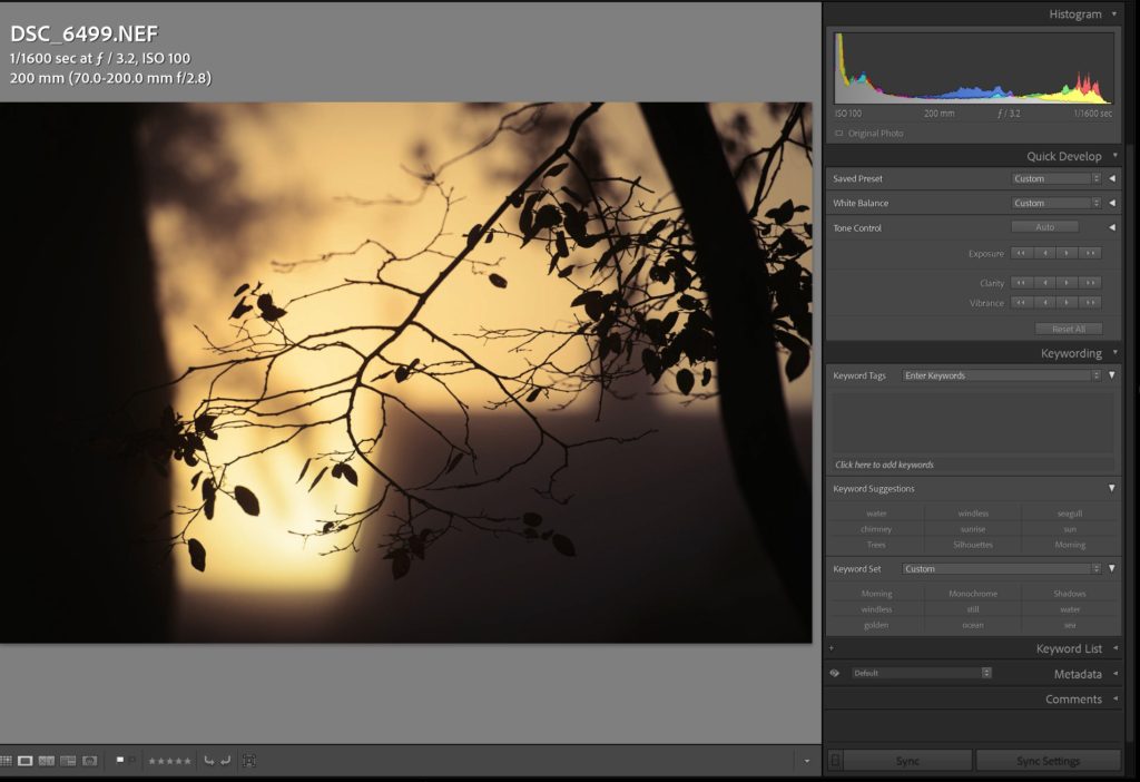
Many associate silhouette photography with shooting into the light where the dynamic range of the scene forces both bright areas to be blown out and all details in the shadows to be complete gone and pitch black instead. But take a look at the image below – it is possible to make silhouette photography without shooting into the sun!

Although there are no super bright areas in this image, the details in the dark of the branches are completely gone and you only see the branches as silhouettes.

But otherwise silhouette photography is, as the name says, shot in a way where the subject only stands out as a silhouette. A lot of detail and information is lost about the subject or subjects. And this is on purpose to bring the structure or the shape of the subject in focus.

Image left, histogram right. Notice how the histogram touches the left hand side, indicating that details are lost in the shadows.


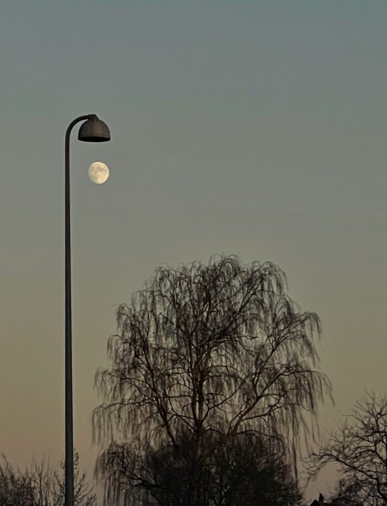
Although some details of the lamppost is provided, the tree and the lamppost stand as silhouettes against the moon top left. Notice how the image plays with lack of depth information.

Another often overlooked feature in silhouette photography is that it is 2 dimensional. Often photographers add depth in an image by having something both in the foreground, middle and background to compensate for a photo being a 2D representation of a 3D world. Silhouette photography deliberately seeks a more 2D expression just like a Chinese shadow theater.

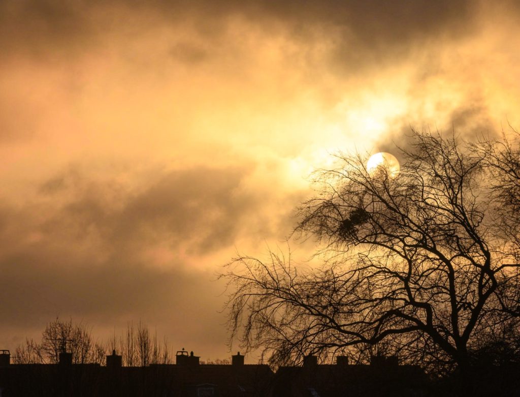
A more classic silhouette photography with lots of dynamic range. The houses are reduced to black shapes and so is the tree. Morning sun.

You can try out silhouette photography: Shooting into the sun is the “classic” way of doing it, and your camera will often not be able to capture the dynamic range of it all and hence create an image that looses a lot of detail in the shadows – just like you want it to. If your camera has an metering setting that allows you to expose for the highlights, you can try this option – it is excellent for shooting silhouette photography also when you are not shooting into the sun.

Related reading

What is hard light vs soft light?

What is light falloff in photography?

What is a camera battery grip? And why use it?

A grip on ergonomics

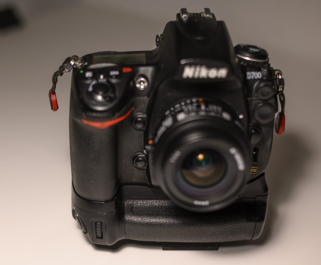
A battery grip is an optional extension of your camera body, that allows you to mount more batteries than what can be in the camera body as such. Some cameras like the Nikon D4 are “born” with the grip as an integral part of the camera, but most cameras has a battery grip as an option.

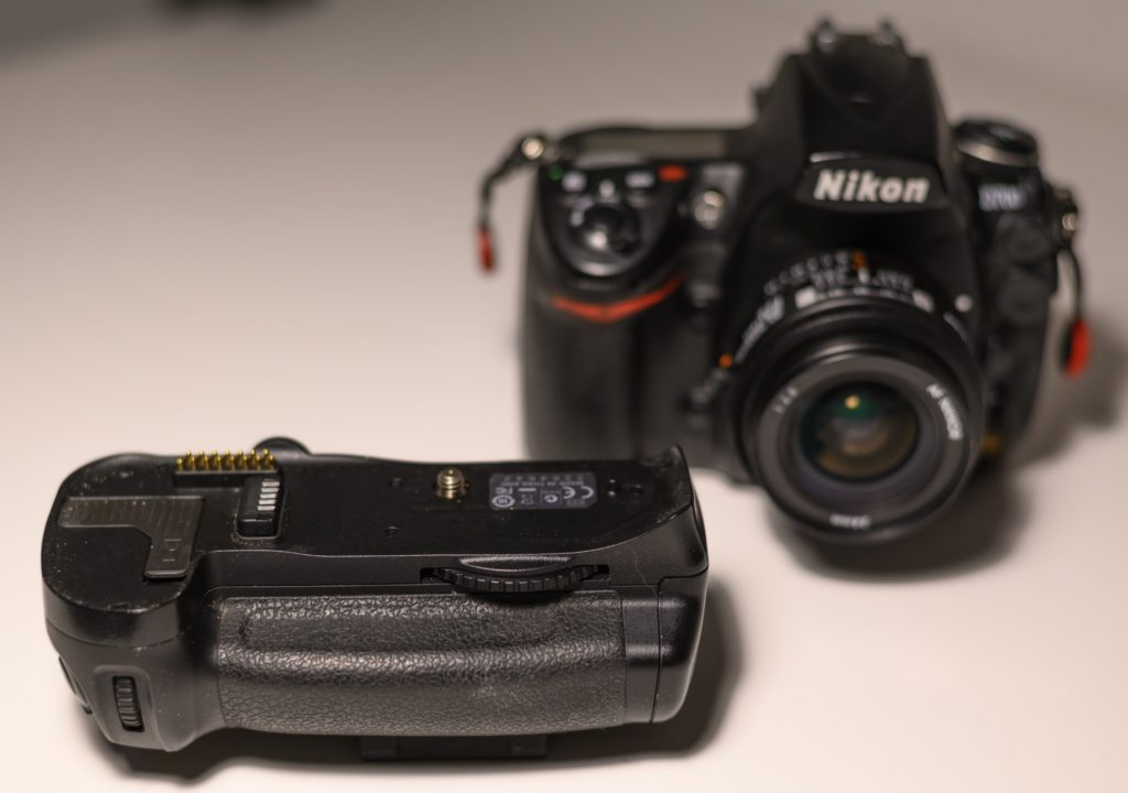
A battery grip for my Nikon D700 here front left. Notice the contacts that enables the grip to talk to the camera.

You can always carry an extra battery in your pocket, but the first advantage of a grip is that it extends the number of “built in” batteries. Some camera grips even allows you to charge the battery while mounted in the camera which further eases the job of leaving home with sufficient battery power.

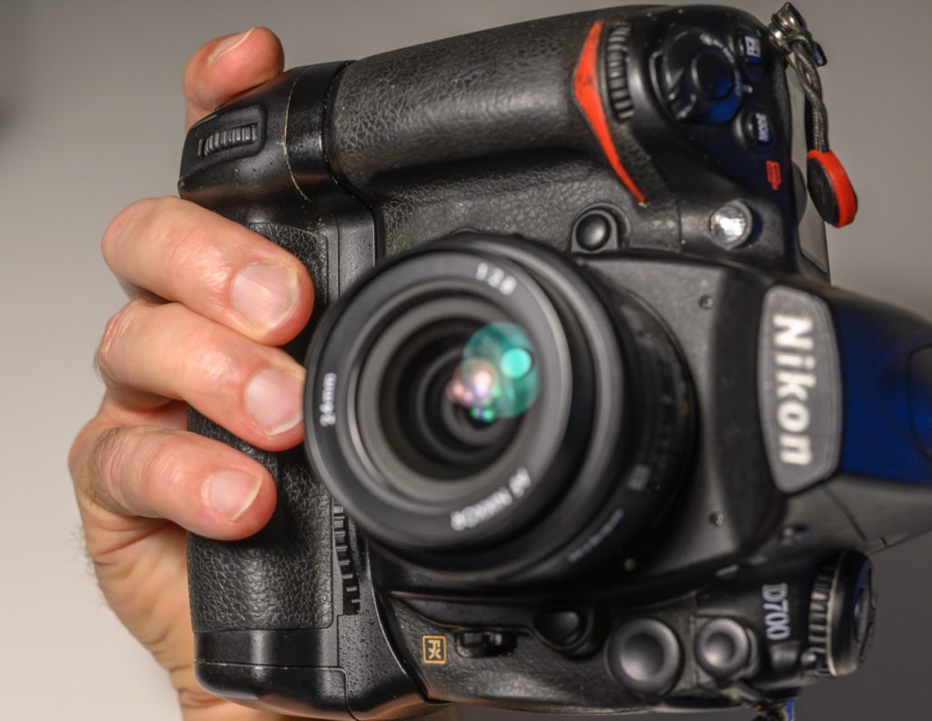
Battery grip mounted here on the Nikon D700.

Another advantage is improved ergonomics. In the image above, you can see that the camera body is extended downwards, and there for gives more real estate for your hands to hold on to. When shooting in landscape mode, especially the pinky on large hands will find much better support and grip than without the grip.

Shooting in portrait mode with improved ergonomics.

A third advantage is also related to ergonomics. When shooting in portrait mode as many portrait photographers do most of the time, the battery grip provides ergonomics very similar to the grip in landscape mode. You avoid the twist in the wrist, as your hand can stay in the same position while you turn the camera. This may sound like a small thing, but when you are working with heavy cameras and/or for extended periods of time, the relief a grip provides for your wrist is vital.

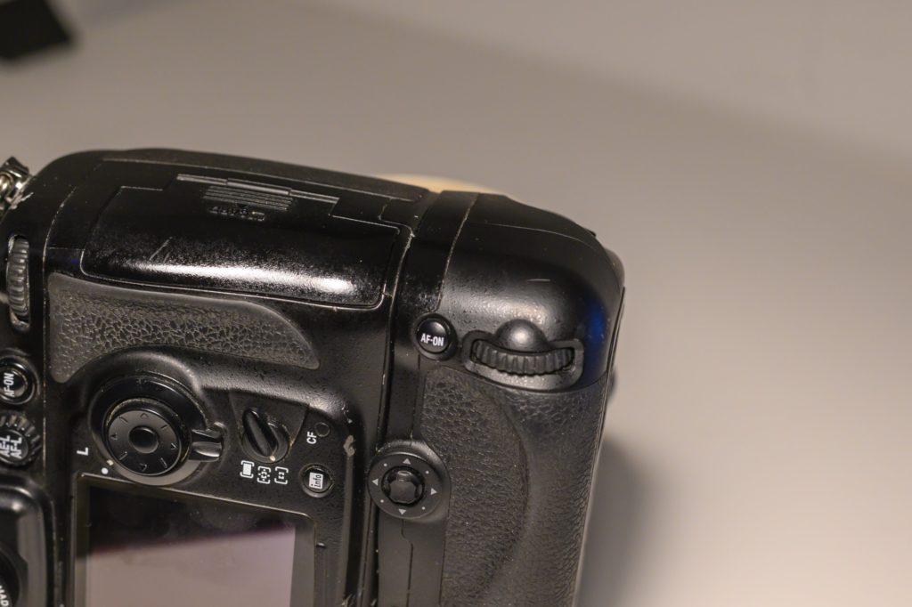
On battery grips, it is often the case that the shutter release and the most vital controls are replicated. Not all grips have this feature, so make sure to check the one you consider to buy. Lack of controls on the grip reduces the ergonomic benefits somewhat.

Vital controls are replicated on the grip here, and even a joystick is added which is not part of the camera body as such – it “only” has a command wheel.

In the example above from my Nikon D700, the grip actually has better buttons and dials than the camera body as such, as the command wheel is replaced by a joystick!

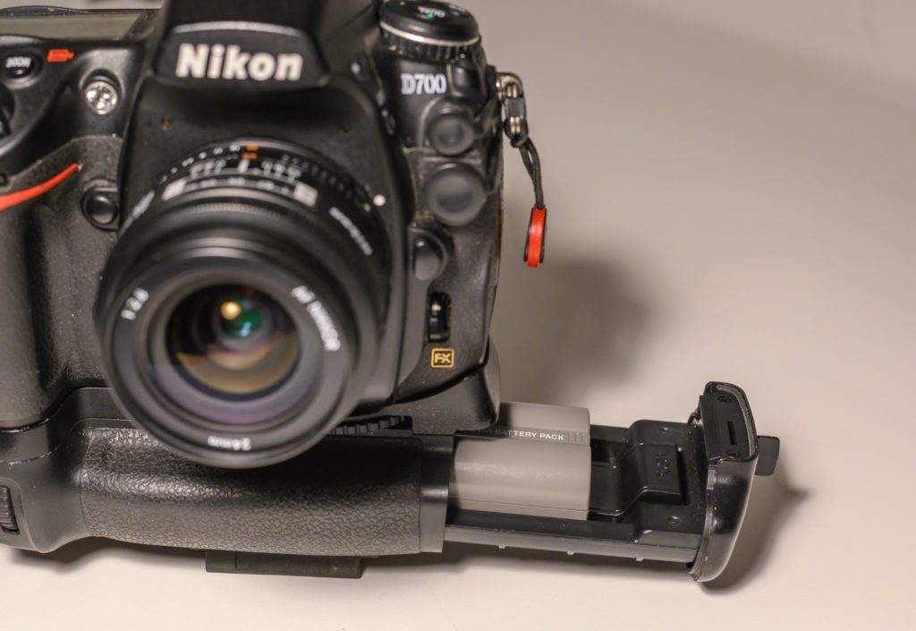
A final benefit is the ease of access to the batteries in the grip, when mounted on a tripod:

Easy access to the battery in the grip. A little tray that slides out horizontally holds the battery.

The battery in the camera body sits vertically, where as the grip holds the battery in a horizontal position. This makes access much easer. A slight disadvantage is though that access to the battery in the camera body can be more cumbersome, as it involves removing the grip first.

The disadvantage of grips is extra cost and extra weight.

A grip can easily make up a significant investment relative to the price of the camera body. There are many off brand producers that make battery grips that price wise are significantly lower than the brand versions. But in my experience, the extra cost of the brand version is more than justified in better quality and feel.

Not everybody likes the added weight. I find on the contrary that the overall balance in the camera body and glass is improved, so I love my grips! But we are into personal preference territory here,  and I recommend that you try out a grip before you buy exactly for that reason.

Related reading

What is a DSLR?

Is mirrorless cameras better than DSLRs?


Triangles as a way of composing and creating interest

Triangles

I must admit that I don’t really know why triangles are such a universal shape – maybe because it reminds us of a mountain or the shape of a pine tree? I have absolutely no clue, but the effect of using triangles in photography is often more order, structure and interest, that helps both obtaining the viewers interest but also help decode the message.

You can go a little nuts when you start to notice triangles in your photo work – both explicit triangles like a mountain or implicit triangles created by the relationship between objects in the frame. As with any new photography skill there is the risk that you use it too much, i.e. when you have a hammer, then everything becomes a nail. Over time you will  however incorporate your awareness of triangles as any other composition skill, e.g. leading lines or the rule of thirds.

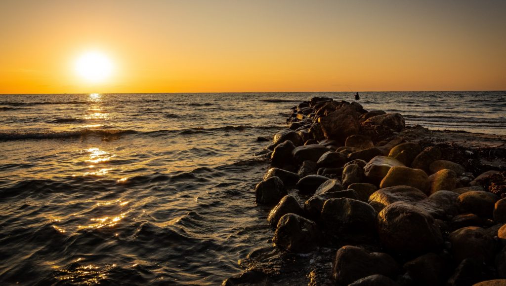
Take a look at this sunset for example. Notice any triangles?

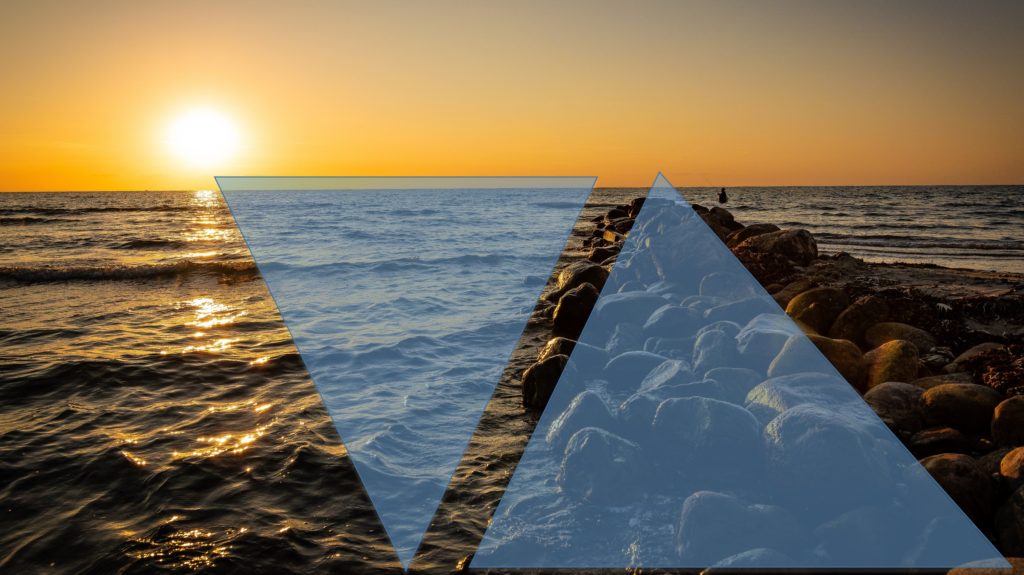
I’m sure you did. In the image below I have marked a few, but there is also a triangle top right where the fisherman is standing; a triangle made up of the horizon, the right edge of the frame and the stone pier. Some of the waves also make up triangles if you look carefully, etc. As I said, when you got a good new hammer, everything becomes a nail.

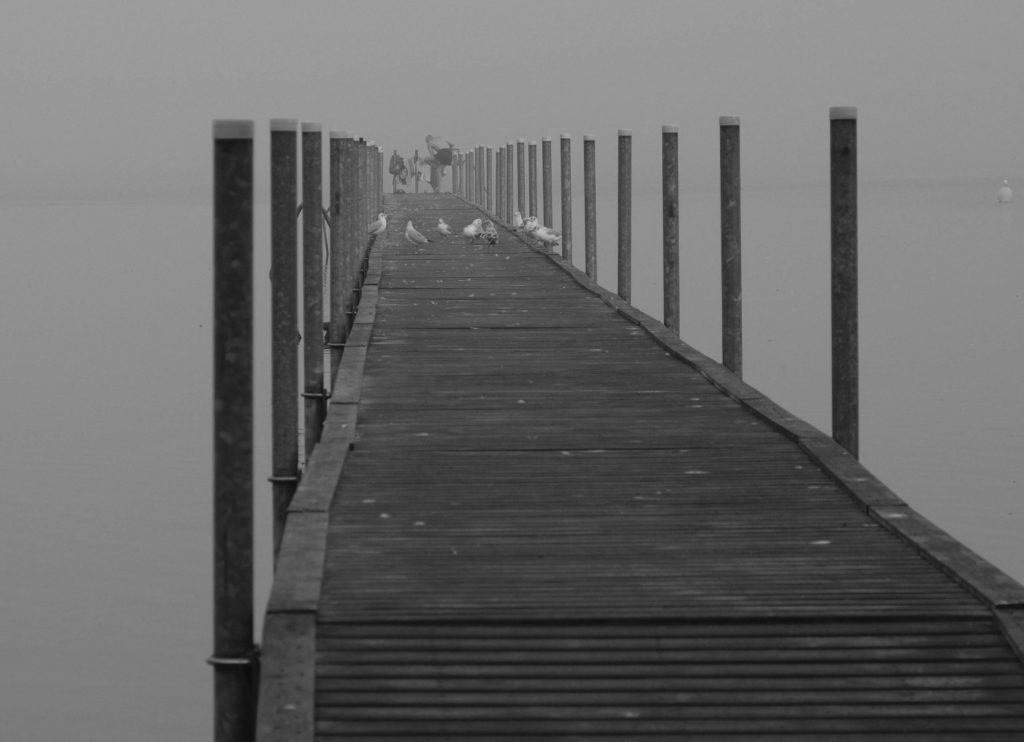
Infinity views often gives naturally created triangles, like a road that disappears in the distance or as in the example below, a long pier.

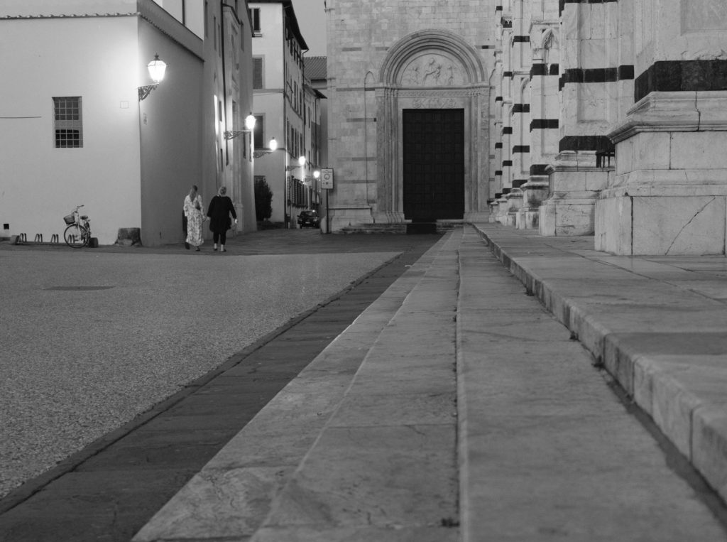
Especially roads, streets and buildings can create triangles of interest – in the image below I shot from a relatively low position, which underlines the triangles created by the staircase.

You can use triangles to almost point to your subject as in the example below where the building both left and right create triangles that seem to point to the subject a create an area of interest – helped by the big arrow in the bottom of the frame!

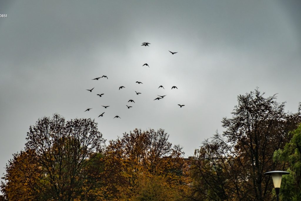
Triangles can also be less explicit and more implied, like the triangle created by the birds and the trees together, pointing in the direction the birds are moving and hence emphasizing the action.

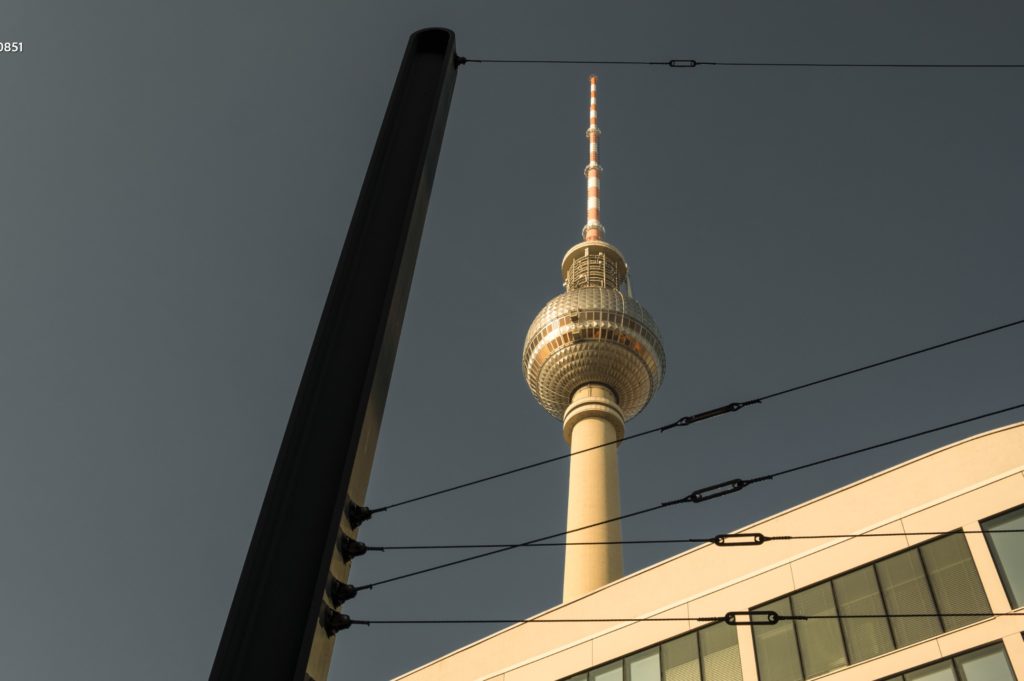
In the example below, I have stopped counting the number of triangles! The framing and the lines crossing creates more interest to the iconic Berlin tower than had I just shot the tower stand alone.

Buildings often hold many triangles that you can use for interesting angles and cropping – the example below is perhaps not brilliant, but illustrates the point.

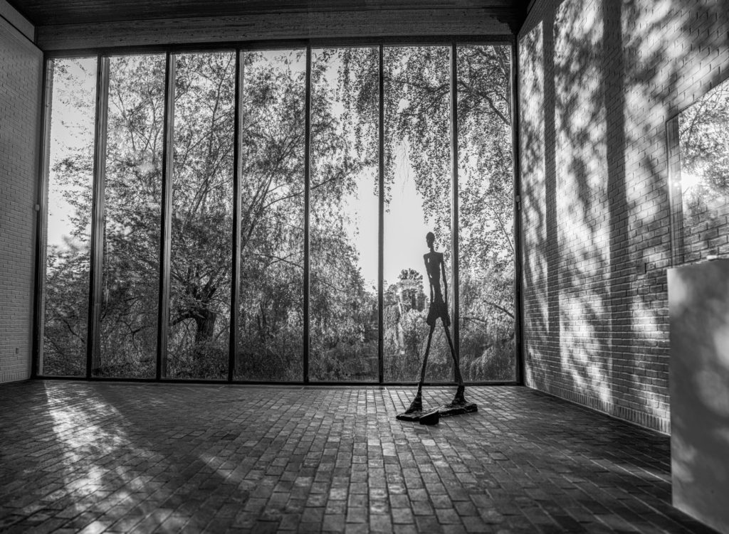
Triangles can also be used to stand out in a universe of circles or squares – in the image below from Louisiana Museum of Modern Art north of Copenhagen, then legs of the Giacometti shape makes a triangle that stands out relative to all the squares created by the window and the shades cast by the same. Also notice the implied triangle created by the tiles in the floor, pointing towards a single point to infinity.

I hope the above served as inspiration for your composition work, both in general and when it comes to triangles specifically. If triangles in a composition is new to you, it is only natural that you in the beginning see triangles everywhere! Don’t worry, it will fade and afterwards just be another tool in your photography toolbox.

Related reading

What is balance in photography?

What is the golden ratio in photography?

What is a prime lens? And why use it?

Fixed focal length

A prime lens is simply a lens with a fixed focal length. You cannot zoom in or out – you only got one length to work with. It can seem strange to limit yourself to one focal length when zoom lenses that offer an interval of focal ranges have been around for a long time. But there are benefits of a prime that still today makes primes a preferred tool amongst photographers.
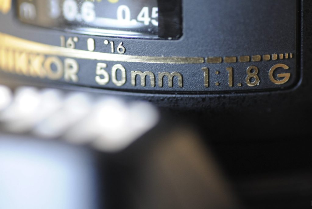
The Nikon 50mm prime lens 1.8G – a general purpose focal length.

First and foremost, a prime lens is a much simpler construction than a zoom. In a zoom lens there is glass moving as you zoom in and out. None of that in a prime, and that brings us to the first benefit of a prime: it is typically much lighter and more compact than a zoom. If you want to travel light, then a few well chosen primes can be a much more backpack friendly solution than a prime.

Secondly, as the zoom lens has more moving parts that need to align perfectly and move at the same time, some say that primes are sharper than zooms. I think this argument was right in the early days of the zoom lenses, but this day and age they are very close, and if you notice the lenses photo journalists uses, you will see that zooms are the preferred lens type. That would not be the case if zooms had sharpness issues. So for vintage lenses this argument is probably true, for modern lenses less so.
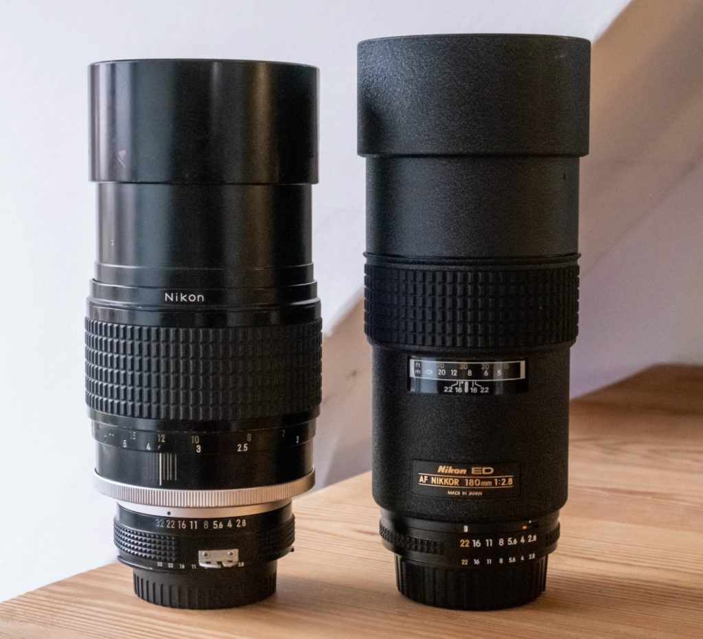
Two primes at 180mm – old version to the left, newer AF version to the right.

Thirds, as the primes have a more simple construction they are also cheaper to produce, and hence the price is lower. Of course, if you need to buy several primes to have the same access to focal ranges as a zoom offers,  then the price difference of course diminishes as you dig into more and more primes. However, a portrait photographer may actually only need a 85mm prime and that’s it and then buying a 70-200mm zoom may not be relevant at all.

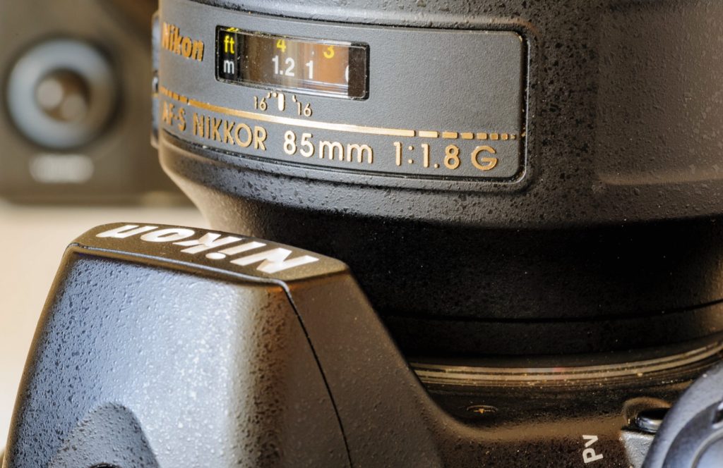
A classic portrait focal length is the 85mm, although the 105mm and 135mm is also popular for this line of work

Fourth, and maybe the most overlooked argument of them all, is that primes can let in a lot more light. Most fast zooms can “only” go to f/2.8 in the wide end, whereas a prime often can go to f/1.8 without breaking the bank, and if you are willing to break the bank, then f/1.4 is often seen. The fastest lens I got is my portfolio is the Nikkor 50mm f/1.2, but there are primes that will go even faster, actually below f/1.0!!

If you need the lens to take in a lot of light, for example because you shoot in low light or fast moving subjects, then a prime will enable you to capture much more ambient light than a zoom. And every time you go one stop faster, you double the amount of light, so in some situations with very little light and no options for adding light (flash etc), primes may be the only workable option.

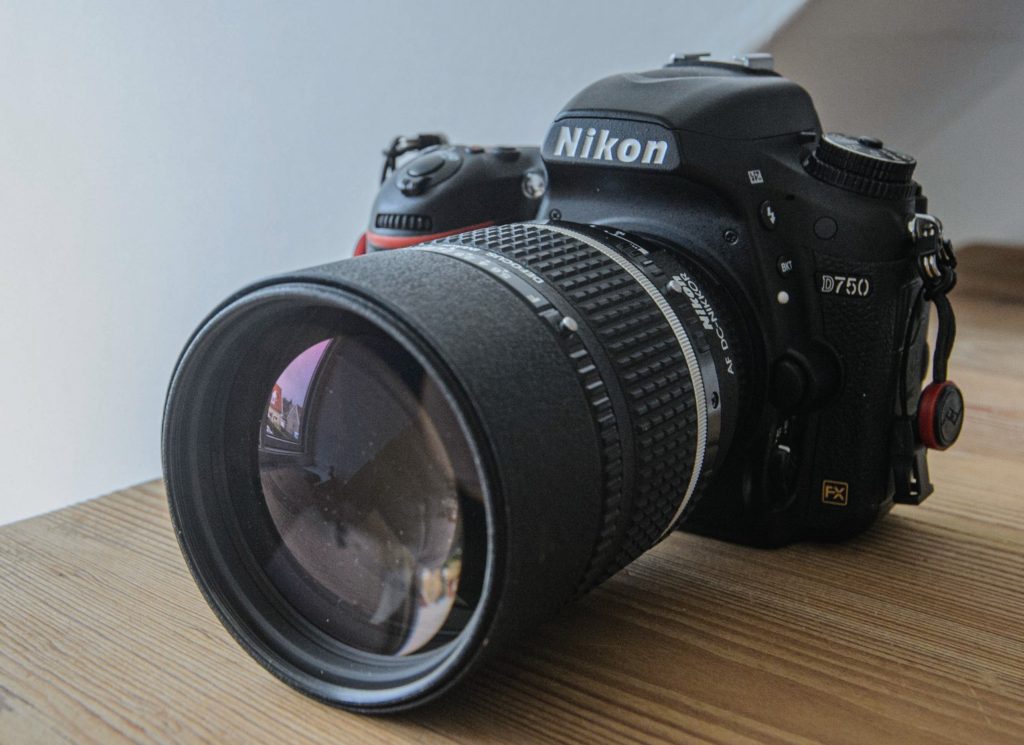
One of my favorite lenses: The 135mm DC from Nikkor. Also comes in a 105mm version,

Finally, some say that if you shoot with primes, you volunteeringly limit yourself. In this way, you stress your own way of working and step a bit out of your comfort zone. This is probably more related to developing as a photographer than a heads to head compare of primes versus zooms, but you really force yourself to think differently or position yourself differently relative to the subject, in order to get the result you are after.  I assure you, it can be super frustrating when you are used to the comfort of a zoom lens, but give it a try and see what happens. You may find you like your new way of shooting.

Related reading

What is the holy trinity of lenses in photography?

Can you zoom with your feet in photography?


What is angle of view in photography?

Angle of view

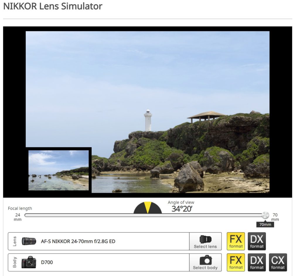
One of the best ways to see how different lenses gives different angles of view is to head over to Nikons homepage and spend 2 minutes with their lens simulator. You can find the link right here (credit: Nikon).

Lenses comes with a focal length expressed in millimeters. A very wide lens that takes in a lot of the scene (e.g. 150 degrees) is typically very short, say 12mm. A long lens that takes in a very small part of the scene is much longer, say 500mm. The benefits of a long lens is that you can get your subject really close in the frame despite it being far away in the real world, so naturally bird and wildlife photographers love long lenses as they can observe and photograph wildlife from afar. But the down side is a bit like a horse with blinders: you can’t really see all that much to the left and right – only straight ahead!

There is a direct correlation between the lens focal length and the angle of view: longer lenses yields more narrow angle of view. Actually, the angle of view with a long lens can be just a few degrees, and you will notice this when you try to hold a camera with a long lens in your hands: you really have to hold the lens still in order not to make you feel seasick! The slightest movement of the lens will make what you see in the viewfinder jump a lot! So wildlife photographers often have their long lenses on a tripod, not only because the lens is heavy, but also because there is a strong incentive to hold the lens still!

Now, instead of being bugged down by all this, I suggest you head over to Nikons lens simulator. You can find the link right here (credit: Nikon).

Here you can select a lens and a camera body, and see how it works on a given scene.  In the example below, I have chosen a zoom lens that ranges from 24-70 mm and gone all the way to 24mm by pulling the slider all the way to the left. In the middle of the slider, the yellow part of the half circle shows that the angle of view here is approximately 84 degrees.

When I pull the slider all the way to the right, the simulator shows what happens at 70mm: the angle of view is now reduced to 34 degrees (notice how much more narrow the yellow part of the half circle is). And the lighthouse has now moved much closer.

If you look carefully, you will see that the bright part of the beach just to the right of the dark stones, is gone when zoomed in. This is a consequence of using a longer focal length: the angle of view is narrowed and parts of what used to be visible in the edges of the frame is now cut away when zooming in.

Some say that it would be much more useful if we instead of talking about lenses in terms of their focal lengths, rather talked about their angle of view. But it has become a standard now, so I guess we have to live accept it. And as if this was not sufficient confusion, hear this: the size of the sensor changes the focal length of the lens! A lens that on a full frame camera is 50mm  is on a cropped sensor (APS-C) the equivalent of a 75mm lens. You can also test this in the lens simulator from Nikon.

Related reading

What is lens vignetting?

What is lens distortion?

Can you zoom with your feet in photography?

Zooming by walking

If you have brought a prime lens that is not long enough, you often hear the argument that you should zoom with your feet instead, i.e. walk closer to the subject to get the effect that you want. But does it actually work zooming with your feet? Both yes and no.

When you walk closer to your subject, you can make the subject take up more space in the frame as if you had zoomed in. So in that regard, you can zoom with your feet.

However, when you zoom in, two things happen: One is that the subject takes up relatively more space in your frame, but at the same time the angle of view is reduced as you zoom in.  As you zoom in, you more and more become a like a horse with blinders: you can see less and less to the sides. This effect you cannot recreate when you zoom with your feet. A prime lens has a fixed angle of view.

Let me illustrate.

The first image below is shot at 70mm:


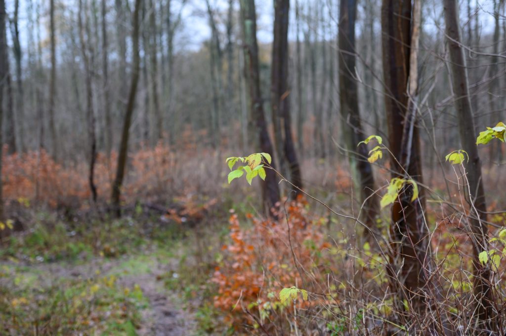
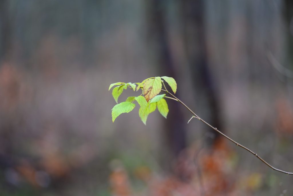
In the next image here, I have zoomed in at 200mm, but not moved an inch. All the change you see between the image above and the image below is due to zooming from 70mm to 200mm. I promise you, I did not move an inch, nor a centimeter. Notice how the field of view is significantly reduced, i.e. you cannot see as wide in the image below as you can above.

So, finally, I zoomed back out to 70mm and walked closer to the subject. I was here exercising the advice to zoom with my feet. I am not to praise myself, but if you compare the green leaves above and below, I did a fair job of getting the subject to (roughly) take up the same size in the frame. So I zoomed with my feet.

But notice how much of the woods you can see to the left and the right here in the third image, and compare that with the image in the middle above. When you walk close to the subject maintaining the focal length, you also maintain the angle of view, and even though the subject takes up more space in the frame, you get a lot of the background as well.

So zooming with a zoom lens is smart if you really want to focus on your subject and not have too many distracting elements, whereas zooming with your feet works best if you also want to include the surroundings or the scene the subject is located in.

Related reading

What is lens flare?

What is lens distortion?

What is balance in photography?

Visual balance

Balance in photography is about how you as a photographer choose to position elements in your frame, to either create harmony (balance) or the opposite (tension). If you want images that are pleasing to look at, obviously you should strive for visual balance in your images.

Symmetry is the classic way of achieving visual balance. It can be a reflection in water or a building that is symmetrical. You will find that many governmental buildings are symmetrical, as it signals power and being in control.

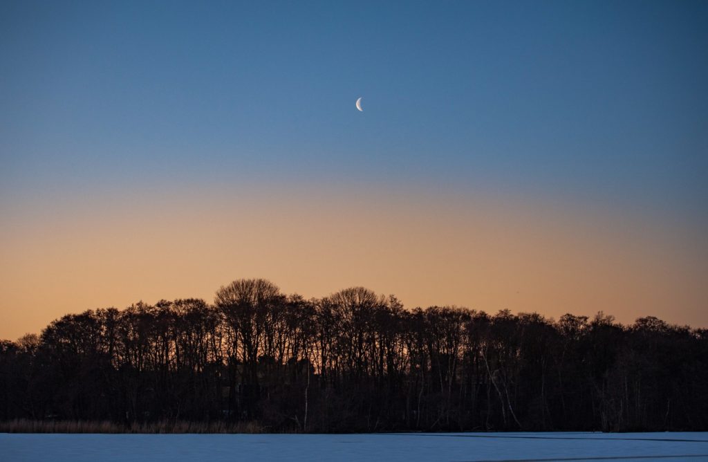
In the example below I have positioned the moon very much in the center to create an image that is symmetrical if you split it vertically. Not perfect of course, as the treed have different shapes going left to right, but close enough to create a good balance.

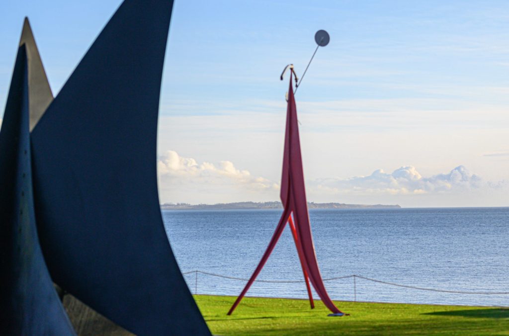
In the image below from Louisiana north of Copenhagen in Denmark, the shapes are not in visual balance. The dark shape to the right dominates and is not balanced out entirely by the bright parts to the right, but it is not too bad either, as the visual weight of the shape to the left is reduced as we tend to be drawn towards subjects that are bright, sharp, colorful and recognizable. Instead, you probably see the dark shape as framing the rest of the image. And what is left is the red shape, the green grass, blue ocean and white clouds. These elements are well balanced in terms of colors, which is another dimension in which you can seek balance.

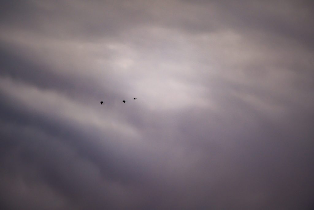
The size of the objects in the frame, other than color, sharpness and brightness, is hence an important aspect of creating balance. The three flying birds below are very small relative to the frame and the clouds. So there is obviously no visual balance here, and the imbalance tells a story of being small in a big universe, and how you cling on to travel companions. In terms of tonal values, the image is however well balanced as you have everything from pitch black (the birds) to bright areas (the area just in front of the birds) and most values in between.

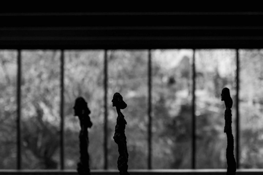
The three Giacometti ladies below take up much more space in the frame than the birds above. The lady in the middle holds most visual weight as she is in focus and sharp, whereas the other two are less so. I was careful to position them so they got each a window frame, but clearly broke the rule that people should not look out of the frame but into the frame. But, as some say, you are remembered for the rules you break, not the ones you comply to.

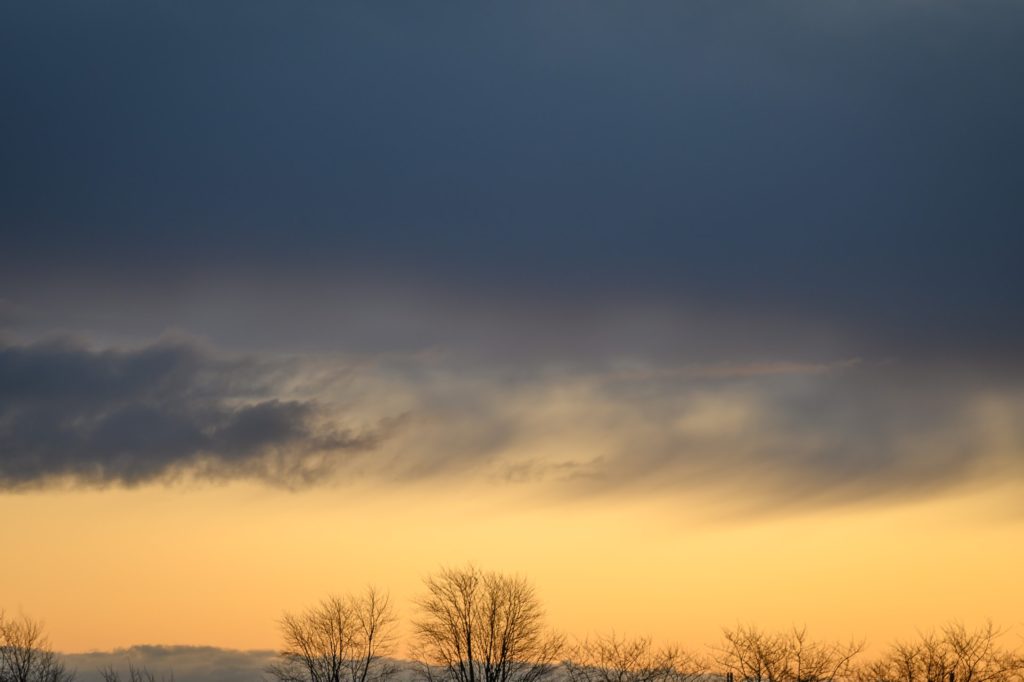
The tree tops in the image below are sharp and in stark contrast to the bright background, and hence your eyes are lead in that direction. But there is a bit of visual tension in the dark and dominating clouds above, that take 2/3rds of the frame and almost seems like a threatening pillow of darkness working its way to the trees. So the image is an odd blend of symmetry (left to right) and lack of symmetry top to bottom. I could have cropped the image so the dark clouds were much less dominating – that would have yielded a very different balance and probably a more positively biased mood.

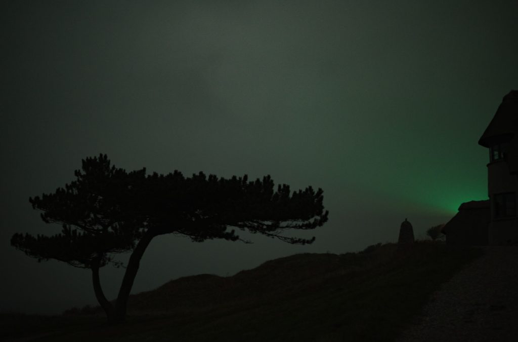
A final example to illustrate visual balance is the light from the lighthouse below. I shot this image long after sunset and hence in almost pure darkness. The only light is from the lighthouse to the right, hidden behind the silhouette of the building. The silhouette of the tree to the left is balanced against the eery green light from the lighthouse in terms of brightness, and the dark triangle in the bottom of the frame is balanced against the heavy top of the tree. So despite the gloomy nature of the image below, I find that the visual balance is established.

I hope the above examples illustrated the idea of visual balance in photography. The point is that if you become aware of the visual balance in your images and start using them as part of your work with composition, then you will produce better images. There is no right or wrong here; it is all a matter of what works and what does not work, relative to what pictures you want to create.

Related reading

What is visual weight in photography?

What is the rule of odds in photography?

What is the golden ratio in photography?

What is manual focus in photography?

Manual focus

Most modern cameras, including smartphones, have auto focus systems, whereby the camera in various ways automatically selects the focus of the image. It can be a face or a point in the frame selected by the photographer. Manual focus is when you as a photographer bypass the options for automation of the focus and manually choose to focus the lens yourself. The benefits is more control and more freedom to decide the outcome, but it also introduces potential for errors in the shape of out of focus images that were not intended to be out of focus.

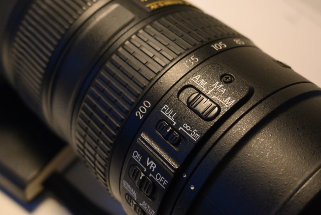
The switch for changing from auto focus to manual focus sits on the lens in this case.

In the image above (the Nikon 70-200) there is a switch on the lens that allows you to choose between manual focus (the rightmost option M) and two different flavors of auto focus. When in manual focus, you as a photographer have to turn the focus ring (the rubberized ring top left in the image) to obtain focus.

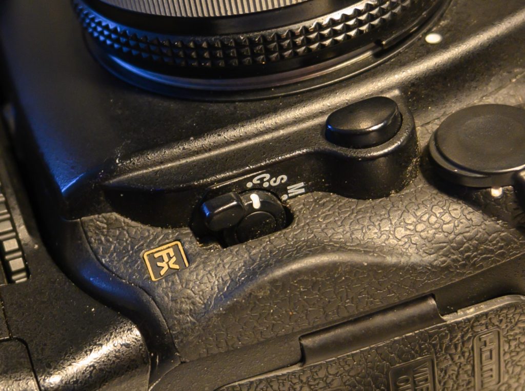
The Nikon D700 has a switch on the camera body to engage and disengage the auto focus motor sitting on the camera body.

In other cases, typically for older lenses without a focus motor built into the lens and hence dependent on a motor in the camera body, the switch to engage or disengage the auto focus sits on the camera body. I the image above you can switch between continuous auto focus (C), single auto focus (S) and manual focus (M).

When you focus manually, you move the focal plane closer to and further from the camera by turning the focus ring on the lens. You can think of this as a big vertical plate that you push back and forth as you turn the focus ring. All the things the plate “touches” will be in focus. Things just before and just after the focal plane will appear to be in focus as well, subject to the depth of field.

When you focus manually, the camera will typically give you some help to determine if you have the focus that you want. The classic way of doing this is with a small indicator that has to arrows and a focus confirmation dot:

Credit: Nikon D700 manual

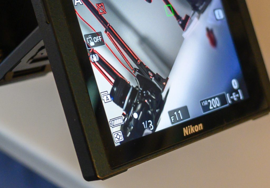
With mirrorless systems you also have so called focus peaking highlights, that based on contrast shows you which parts of the frame that are in focus. It does so with a color you can select; in the example below the color is red (notice: there is nothing naturally red in the frame as such – all red is added to the image by the camera as part of helping you obtain focus):

The focus point is the red box in the top of the frame a little to the right of the middle. You can move this point around, typically using either a command wheel or a joystick on the camera. The image above is from the rear LCD of the camera, but the focus point is also visible in the viewfinder, both for DSLRs and mirrorless cameras.

If you look very carefully, bottom left in the LCS, just to the right of the battery indicator, there is an arrow pointing to the right. This tells you that the focal plane needs to be pushed a bit further away to obtain focus in the selected focus point.

Focus confirmation dot is active. 

In the image above, the focal plane has been pushed a bit further away, and you now see that the focus indicator to the right of the battery indicator shows the round dot that is the signal for focus + the focus point top right in the frame has turned green – another way of showing that this point is in focus.

All of the above may sound a bit overwhelming, but I assure you that it is much simpler when you try it out in real life and see how the moving parts work together.

The benefits of manual focus is control. You’re the boss. Often automated systems do not do exactly as you want them to, although it constantly gets better and better with face recognition and other forms of intelligence in the cameras. However, there still are situations where manual focus for some is the preferred way to go, and I recommend that you try it out to see what it can do for you, to decide if it should be part of your photography “arsenal” or you instead want to go for relying on the cameras automatic systems.

Further reading

What is focus shift?

What is focus breathing?

What is focus stacking in photography?

Focus stacking

Focus stacking is a post processing technique where several images of the same subject and scene is combined in post processing, to make all of the image sharp rather than having the sharpness defined by the depth of field.

Focus stacking is especially useful for macro photographers, because the depth of field becomes very very shallow when the lens focuses extremely close to the subject, but also landscape photographers and architecture photographers can benefit from focus stacking.

Example

Look at the silly picture below, taken in my office. In the foreground and in focus you have the mad cow and in the background and out of focus, my glasses, a computer screen and a lamp with a bright light.

Below a picture of exactly the same scene. Nothing has changed, other than the focus has been moved from the foreground, the cow, to the background, my glasses. Notice how blurred the cow in the foreground is.

The trick is now to combine the two so that you pick the parts that are sharp and use these in a combined picture. You can do this in post processing software like Photoshop. I open the two images as layers in photoshop.

First step is to make sure the pictures sit right on top of each other, and Photoshop has a function to secure this (edit, auto-align layers).

Second step is to ask Photoshop to create masks to combine the two images into one (edit, auto-blend layers, stack images). You can see in the two images below how the top one selects the cow, whereas the bottom one selects large parts of the background including the glasses. What is white is included and what is black is masked out.

The resulting image is shown below. As you can see, both the cow and the glasses are now sharp, which is exactly what focus stacking can do for you: it makes it possible to have both objects very close to you and objects very far away appear sharp in the image.

If you study the image carefully, you will notice that the lamp looks a bit funny. It is as if the edge between the light and the dark part suddenly has a half circle to the left – just above the head of the cow. This is due to focus breathing – the lens used here suffers from slight focus breathing, meaning that the angle of view changes ever so slightly when the focus changes. This error makes it impossible for Photoshop to combine the images properly as the size of the lamp varies between the two images. So it is important that there is absolutely no focus breathing for lenses used for focus stacking!

Related reading

What is focus breathing?

What is Depth-Of-Field?