Portrait Photography Away – Check list for beginners (part 1)

Portrait photography away from home is a brutal game if you ask me. Not only do you have to be ready with the gear and your skills lined up, but you  also have to adjust to the lighting conditions and the physical location the client has chosen. The parameters in play are many more than if you ask the client to show up in your studio where you know exactly what backdrops to choose from and where the flashes are positioned.

This little checklist is intended for you if you are new to the task of shooting (digital) portraits away from home. A getting started guide, if you like. As your experience grows, you may find that you grow out of the advice given here, but that is as it should be. The intention is to get you going, not to limit you as your skills and experience grows.

You are not alone

If you are a photographer and not super comfortable with all the buttons and dials on your camera, then here is a little secret: you are not alone! Many photographers are not engineers but originate from a more creative line of business, and hence the many technical aspects of photography is either not of interest or not necessary to get the job done. The most important thing is that you are comfortable with the fact that you don’t need to know all corners of your camera. Or to say it another way: it is OK to be uncomfortable with the fact that your are uncomfortable with some buttons on the camera. You can get the job done still.

Respect your own role

You have been hired to do a job. To be successful in that job, you sometimes have to instruct and direct the client. Maybe they need to adjust the hairdo, bend an arm a little more, the dress folds in a way you don’t want it to, etc. Make sure you are the boss when it comes to the photography work.

The client may be tired and want to move on, they don’t want to do as you say, etc. Here you need to take charge and not cave in: Your success does not come randomly, but through carefully managing the shooting process, and that entails directing the client and being the boss when needed. Be polite and friendly of course, but do stand your ground. The better you are at this, the better results and the happier clients.

Take time to talk to the client during the shoot. Not everyone is comfortable in front of the camera, and then your job is the help them. You can try different approaches like asking an open ended question or cracking a joke – both helps them being less self aware. Or involve them in the shoot and ask them to hold a reflector, if that can stay out of the frame. But first and foremost: read the person you are photographing and adjust your instructions accordingly to create the best atmosphere possible.

Agreed

To define your role, an agreement in writing is a must. It does not have to be very long or in the shape of a formal contract, but an e-mail to agree terms and conditions along with the scope of the assignment is mandatory if you ask me. Many photographers are not comfortable with this part, but it will come back and bite you if you do not lock the scope of the assignment with some sort of written agreement. And define what you plan to charge.

The important is that you have a good understanding of what the client wants to achieve and that expectations are managed on both sides. So if you are hired to shoot Adam at his 18th year birthday, then that is the job. Not to shoot Adam’s girlfriend or his parents. Use the scope definition as a central tool in managing the expectations. And also define who owns the images and if example copies can be used in your marketing or not.

If you plan to deliver the images on a memory stick and this is defined in the agreement, then it should be clear to everyone that ordering 10 printed copies of one of the images will be charged separately. Having a list of prices for additional services (such as printing) can help manage expectations.

Pricing is very individual per country and hence difficult to be specific about, but make sure you don’t sell yourself cheap. Just because it is easy for you to shoot 10 additional images does not mean it is easy for anyone. When you hire someone to paint your living room, it may be easy for that person to do the job because they have the skills and the training. But the value add for you is that you get the painting done with a very capable person that can paint much better than you will ever be able to do. Or find the time to do it. And there is the value, right? Look at your own profession the same way – your skillset did not come easy and there is a lot of value add from hiring a pro photographer.

Work backwards

When I was new to photography, I never gave the end result a thought. I was more worried about framing, light, exposure, etc. And that is also important. But it can be valuable to know how the digital images are going to be applied. There is a huge difference if the image is going to be posted on instagram in a 1:1 format, shared on a UHD TV set in 16:9 format or printed huge in 3:2 format to hang in a hallway somewhere.

When I shoot images that I know are going to be cropped to 16:9, then I often go a bit wider in my framing to allow the top and the bottom of the image to be cropped in order to fit the 16:9 format that I often use. Had I not zoomed out a bit, then I would be facing some difficult cropping choices. So beginning with the end in mind is a good exercise.

When shooting portraits, you may find that to fill the frame the best way, you may need to turn your camera 90 degrees to – well – portrait mode. Hence the name, I guess. But it can make a huge difference how you frame the shot. And if you find that portrait mode works for you, and you shoot with a tripod, then maybe an L-bracket is something you need in your camera bag. This question only came up, because you started thinking the process though.

Mind the background

Your subject is the star or the main actor. You don’t want anything to steal the attention from the star. So mind the background, please. If you study flower portraits or portraits of insects, you will see that the best photographers are very good at selecting backgrounds that do not dominate the subject.

Some photographers love to give their subject props such as flowers, hats, umbrellas or glasses. I am a bit sceptical to this approach. If you think it is the right thing to do, the do it by all means, but please consider if the props start to take focus away from the subject.

One way to make the background less dominating is by making it blurred. This is a common technique amongst photographers, as it makes the subject pop: Razor sharp subject, super blurred background. And it does work. But the price is that you may need to shoot at a shallow depth of field, and then focusing can become more tricky. And in extreme cases, only parts of the subject is in focus. What you can do is to make sure there is much more distance between the subject and the background than there is between the camera and the subject. In this way you can shoot at a middle-of-the-road aperture as f/5.6 and still get a reasonably blurred background.

If you choose say a white wall as a background, be mindful that the light metering system in the camera can be a bit confused. Your camera probably has an option named something like “centre weighed metering” – try that for size and see if it gives better results.

Focal length

If you want to be REALLY bored (say, you can’t fall asleep), try this: Ask two portrait photographers which focal length they prefer. Chances are that they don’t agree and will debate for hours on end. We are in personal preference territory.

One thing is certain: a very wide lens (say 20mm) will not make the subject look attractive, especially if you put the camera right in front of their nose! Whatever is in the middle of the frame will take up a disproportionate size, which of course is funny if you want the clowns red nose to be extra big, but most buying a portrait photographer expects something a little more accommodating.

The classic focal length for portrait is 85mm. It is like buying a Volkswagen Golf – it can hardly go wrong. Others prefer a bit longer lenses like 105mm or 135mm. But it stays in that range. The reason is that 85-135mm gives a natural representation of proportions without compressing the image too much. In other words: it looks natural.

Zoom versus primes is a discussion that started when the earth cooled down. In the old days, it was probably true that primes were sharper than zooms, but a zoom lens today is very, very close to a prime. So close that I doubt you for any practical purposes (other than pixel peeping) will notice the difference. And I do find that my 70-200mm zoom gives me some options to vary the framing via zooming that my 85mm prime does not. But it is very much up to you and your personal preference.

Notice that when I talk focal length here, I refer to the full frame (35mm) focal lengths. If you are shooting with an APS-C camera with a cropped sensor, then you need to multiply the focal length with 1.5 approx. to get to the full frame equivalent. So a 70mm lens on a APS-C camera is the same as a 105mm lens on a full frame camera.

Home

My best advice? Make sure you come home with something. Anything but empty hands. Your clients have put trust in your ability to do the job, and if your memory card goes belly up for some reason, or your camera gets stolen on the train on the way back from the event, then you have zero. Zip. Nada.

It is not funny to tell the clients that the important event wasn’t documented, unfortunately. And how ever good a reason you have, it does not help much. So do everything you can to avoid ending up in that situation. That is my best advice. Even the best composition with wonderful lighting captured with just the right exposure does not help much, if it sits on a memory card you cannot read or in a camera you don’t know where is. So backup, backup and backup.

If you watch some YouTube videos with camera reviews, one of the things many reviewers talk about for hours on end is if the camera has one or two card slots. I did not understand the importance of this in the beginning, but now I do – it’s all about having no single point of failure to ruin your day. If your data is duplicated at the source (= two card slots) then that helps a lot.

But even if you only have one card slot, you can bring a laptop or a storage device to make backups during the shoot. Or even better: to some cloud solution. Even if you have a dual card camera, you may want to do a backup still.

Be mindful that theft is a risk if you e.g. go via transportation shared with others, such as a plane or a train. Many people store their backups the same place as the original and forget that fire and theft will potentially ruin both the original and the backup in one sweep.  So be a bit paranoid: make backups during the shoot and split the original and the backup as best you can.

Some older DSLRs allow you to happily shoot away with no memory card installed! There is a little sign on the rear LCD notifying you of this, but in principle you can go all day and shoot without noticing this. Such a grim situation will also be mitigated if you make it a habit to do backups during the shoot.

Procedure

Photography is in the creative genre. Quite opposite to procedure. Agreed. But combining procedure and creativity in my experience is the best way forward. Having worked in procedures you follow loyally allow you to focus on the more creative and fun part, while the more dull and boring part runs on routine. Well worked in routine.

It is not funny to establish these procedures or routines. But it will help you produce the same high standard result on a consistent level. And the difference between a pro and an amateur is exactly the consistency. So establish routines that lay the foundation for success, such as:

  • Have a checklist for what needs to go in the camera bag and follow that list to the point.
  • Bring spare batteries fully charged + a charger and a power bank
  • Bring spare and formatted memory cards that you know work
  • Test your flashes from home and how they are set-up in groups and channels

The above are just examples. But work on your routines to make sure you take all the unnecessary variables out of the equation. That gives you comfort and surplus to focus on the more fun stuff about photography.

Light

Photography is writing with light, so obviously light is important. If you need to travel carrying as little as possible, chances are that you do not have flashes or video light as an option, let alone light diffusers and stands to hold it all. So you are left with ambient light.

For portrait photography soft light is the preference by most, unless you are doing something very specialised, which I assume is not the case.

Soft light makes the transition from light to dark areas happen gradually rather than the abrupt way that hard light does. If you are standing in the sun on a cloudless summers day around noon, then you will know what hard light looks like!

Soft light is produced with a large light source relative to the size of your subject. So this is why the sun on a cloudless day can produce brutally hard light: it is a very small light source, far far away from your subject. If a cloud obscures the sun, then the cloud serves as a diffuser (and increases the size of the light source) and all of a sudden the light is much softer.

One way to soften ambient light is to put a big white cloth between the light source and the subject. You can do this both outdoor and indoor. The biggest challenge is to find a way to mount the white cloth, but a few pieces of cord and a bit of ingenuity can get you a long way. If this gets to complicated, holding a shoot through umbrella between the light source and the subject is another way of softening the light. Get the umbrella as close to the subject as possible to maximise the effect.

Finally, as simple tool as a reflector can maximise the use of the ambient light. If the light enters from the left, hold the reflector to the right to make the two sides of the face more evenly lit. If it enters from the top, hold the reflector under the chin to balance the light more evenly. You will be surprised how big the effect of such a simple tool can be. If you don’t have a reflector, simply use a white piece of paper or cardboard. A bonus is here that you can ask the subject to hold the reflector and hence be more engaged in the shooting process, which may help some become more relaxed and less self aware.

Continued reading

In part two I talk more about camera settings and the like operational stuff. Thanks for reading this far!

Related reading

Review: Nikkor 85mm f/1.8 S lens

Horizontal vs vertical photography


What is PPI in photography?

PPI is pixels-per-inch or points-per-inch. It is used to express the resolution for a screen, say a monitor, a television, a tablet or a smartphone, just to mention a few.

If you think of a game of chess measuring 1 inch by 1 inch, the PPI is 8. You have 8 pixels across and 8 pixels down, giving a total of 64 pixels. So the PPI does not count the total number of pixels per inch, but tells you how many pixels you will find on both sides of the 1 inch by 1 inch square.

The PPI cannot change. The resolution of your monitor or your television  has the PPI set from the factory and it remains fixed – no parameter of configuration can change that.

The PPI is a grid into which the pixels in your image can fit. If your image file has a lot more resolution than the PPI, the screen simply cannot do justice to the quality of the file and will have to scale down the resolution of the file to match the PPI of the screen. You can counter this when you edit by zooming in on the image in which case the constant PPI would be applied to a small(er) part of the image and hence would yield a relatively higher resolution.

Typically the PPI increases the smaller the device is. My iPhone 13 has a PPI of 440 approx, whereas the 32 inch AOC monitor I use to write this has a PPI of 140. You would think that the iPhone is a much better screen than the AOC, but here you have to factor in the viewing distance: The greater the viewing distance, the less PPI you will need. I find this to be a bit counterintuitive, but have accepted that it is the way it is. If a billboard was made using a monitor, you would not need 140 PPI’s!

Many want their camera to have a lot of megapixels, and primarily use the files produced to present on a UHD monitor (typically 32″ in size). The resolution is 3840 x 2160 equal to 8.3 megapixels which is much less than say the 24mp you would find in a Nikon Z6ii or a Nikon D750.

Related reading

What is the difference between resolution and bit-depth in photography?

Is JPG a bad format for photography?

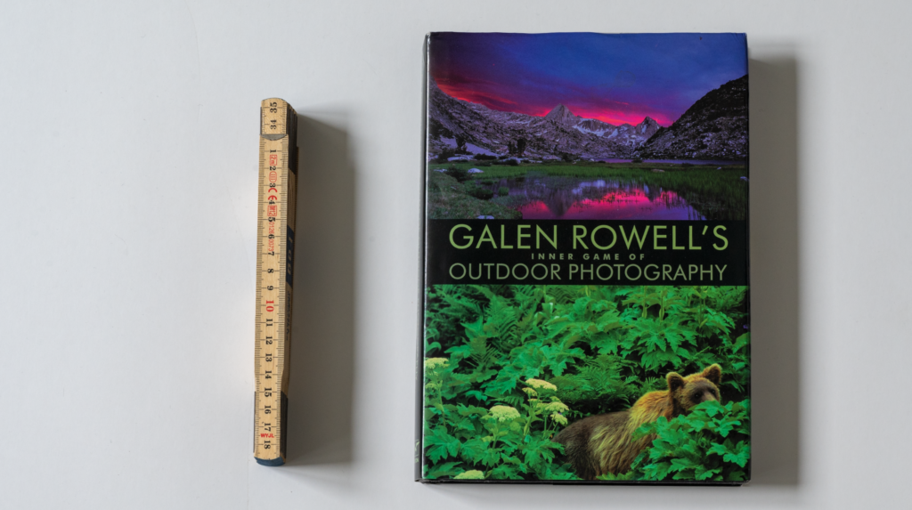
Review: Galen Rowell’s Inner game of outdoor photography

Imagine a job add where you would ask for someone who is (1) a master mountain climber, (2) an outstanding and engaging author and (3) one of the best outdoor photographers with 40+ years of experience. And add to that that travel experience requirements is to have travelled all 7 continents and both poles! Do you think someone from HR would let you publish such an add? Nah. They would probably tell you such person does not exist. But such person actually did exist in the shape of Galen Rowell.

Asking a photographer what model of camera he uses is like asking a writer what type of typewriter he uses. Galen Rowell.

Galen Rowell's Inner game of outdoor photography
Galen Rowell’s Inner game of outdoor photography

Galen

According to wikipedia, Galen Rowell was born in 1940 and died in a plane crash in 2002. The inner game of outdoor photography was published in 2001. So Galen has probably written a some of the book quite late in his life. Other parts of the book is based upon essays previously published in the Outdoor Photographers Magazine.

Especially in the first of the 4 parts of the book, Galen strikes me as a very well read person who is not afraid of taking a big step back and looking at things from the outside in. My guess is that he has learned this from his father, being a philosopher, but it is of course a guess. The philosophical angle runs as a red thread throughout the book, and to me this is an additional dimension to the book that I really enjoy.

The medium may not be the message, but it sure can make a big difference. Galen Rowell.

Inner game of outdoor photography

The book contains 66 essays or small chapters, varying from 2-5 pages, and blended with the text comes more than 140 colour photographs that illustrates the essays. The 4 sections are:

  • Visions: creative and cognitive processes
  • Preparations: equipment, film and technique
  • Journeys: merging visions with realities and
  • Realisations: communicating your worldview through photography

You can tell that the book is 20+ years old today when Galen talks about pushing the ISO on the film or how to get the weight of his gear reduced as much as possible e.g. using the Nikon F65. Also, towards the end of the book he talks about scanning and enhancing the 35mm film digitally, which also shows that the book was published at the brink of the digital revolution. It is also interesting how some of the readers of the Outdoor Photographers Magazine have sent letters (!) as part of a debate about outdoor photography! I think today that would have been settled via social media.

Galen Rowell's the inner game of outdoor photography
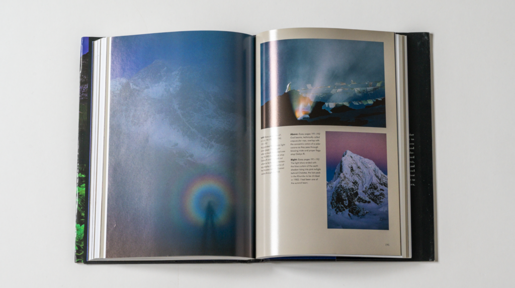
An example page from Galen Rowell’s the inner game of outdoor photography – there are 140 colour photographs in the book!

But despite the book clearly being 20+ years old, the vast majority of the content is as relevant today as it was back when he wrote it.

The format is excellent – the chapters / essays are so short that you can read them rather quickly and independent of each other. Just like a step-calendar leading up to Christmas.

The best photographers know better than to try to lead others all the way down their inner path, because the act of following someone else’s, instead of discovering your own, will eventually be self defeating. Galen Rowell.

The first part of the book is the most abstract and philosophical talking about cognitive processes and the meaning of photography. The second part takes a big swing the other way and becomes very operational and hands-on and how-to use flash and push film and make your backpack as light as possible. Third part is enjoyable stories from all his travelling around the globe and the final part again zooms out and looks more at the photography industry and the relationship between man and nature. And every section of the book is really well written and a joy to read – provided of course that the outdoors and outdoor photography is close to your heart.

Conclusion

I am really happy that I got to read this book. And I think I will read especially part 1 several times. I feel this book has given me the privilege to look over the shoulder of an exceptional photographer, one that has travelled the world and seen things I will never get to see. And alone for that reason, I can highly recommend this book for any outdoor photographer. Despite some sections being dated obviously.

Consistently creative photography requires learning to bridge the chasm between and engineer’s technical mastery and a blind monkey’s unselfconscious intuition. Galen Rowell.

The book also leaves me a bit sad. Galen was killed in a plane accident, and I cannot help thinking how much experience and knowledge that was lost in that incident. How many of those funny little stories that this book is filled with did Galen have on stock that he just did not have an opportunity to tell? Today he would have been well into his 80ties and I envision an old man sitting by the campfire telling stories from his long life to his grandchildren and any young photographer that drops by. But obviously that vision will never materialise and this book is as close as we will ever get.

Many have made me aware that Thom Hogan in this blog post has described his relationship to Galen Rowell and what Galen meant to him as a mentor and a friend. I highly recommend that you read Thom’s blog if you want to learn more about Galen and his work and influence.

Practical note

I live in Europe and copies of this book does not come easy. I ordered a used copy via Amazon and it took a month (!) for it to arrive. I ordered a copy in UK, but apparently the supply chain started in US, which explains the long wait for it to arrive. So should you decide to buy a copy you may find that a bit of patience is required.

Related reading

Review: Ernst Haas by Photofile

Review: Saul Leiter In My Room, Edited by Margit Erb and Robert Benton

Review: All about Saul Leiter, collected by Margit Erb

Review: Ernst Haas by Photofile

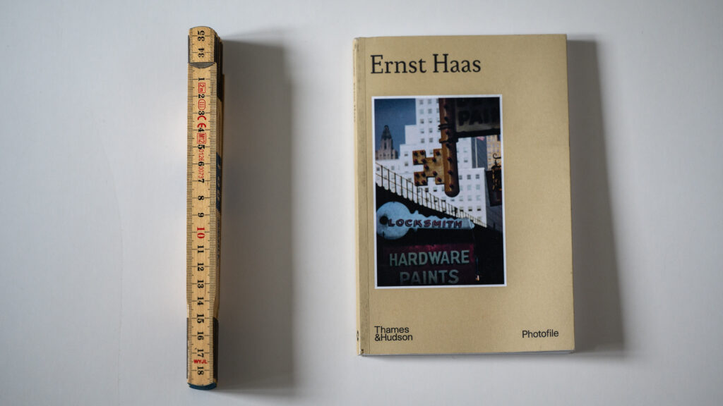
Photofile is a apparently a series of books that provides what they describe as “an accessible introduction” to some of the greatest photographers. And in this case it is Austrian / American photographer Ernst Haas.

The book is a relatively little paperback book (20 cm tall) with 67 photographs by Ernst Haas in colour and duotone.  A far cry from some of the big and delicious coffee-table books you can find about photography, but so is the price, to be fair.

Ernst Haas by Photofile

The book gives a relatively short 9-10 pages well written introduction to the professional life of Ernst Haas by Virginie Chardin and then the rest of the book is simply a presentation of 67 pictures shot by Ernst Haas.

Ernst Haas by Photofile.
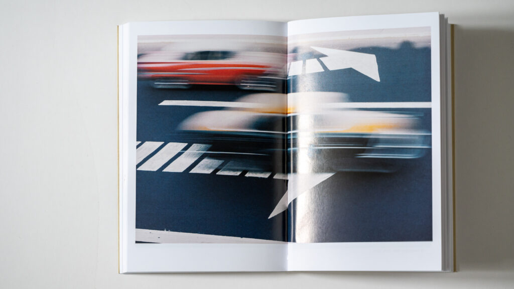
Ernst Haas by Photofile, example page.

Over at the homepage independent photo, Ernst Haas is quoted for saying: “Bored with obvious reality, I find my fascination in transforming it into a subjective point of view. Without touching my subject I want to come to the moment when, through pure concentration of seeing, the composed picture becomes more made than taken. Without a descriptive caption to justify its existence, it will speak for itself – less descriptive, more creative; less informative, more suggestive – less prose, more poetry.”

This book gives absolutely no information about the images other than the year and location, and as such it is very much in the spirit of Ernst Haas (“less descriptive, more creative”).

As I am a big fan of Ernst Haas’ work, I could have wished for more information about Ernst, more examples of his work, etc. But as such the format of the series Photofile aims for a lighter touch. So I find it to be a good introduction, but and introduction that wants me to see more of his amazing and pioneering work.

Related reading

Review: Street Photography – A history in 100 iconic images, by David Gibson

Review: Henri Cartier-Bresson Here and Now, by Clément Chéroux

Review: Street Photography – A history in 100 iconic images, by David Gibson

I like tapas. Small portions of delicious food where you taste a lot of different food and flavours. You won’t get full from the individual tapas, but ranging across a lot of different small dishes, you eventually will be full.

Review: Street Photography - A history in 100 iconic images, by David Gibson
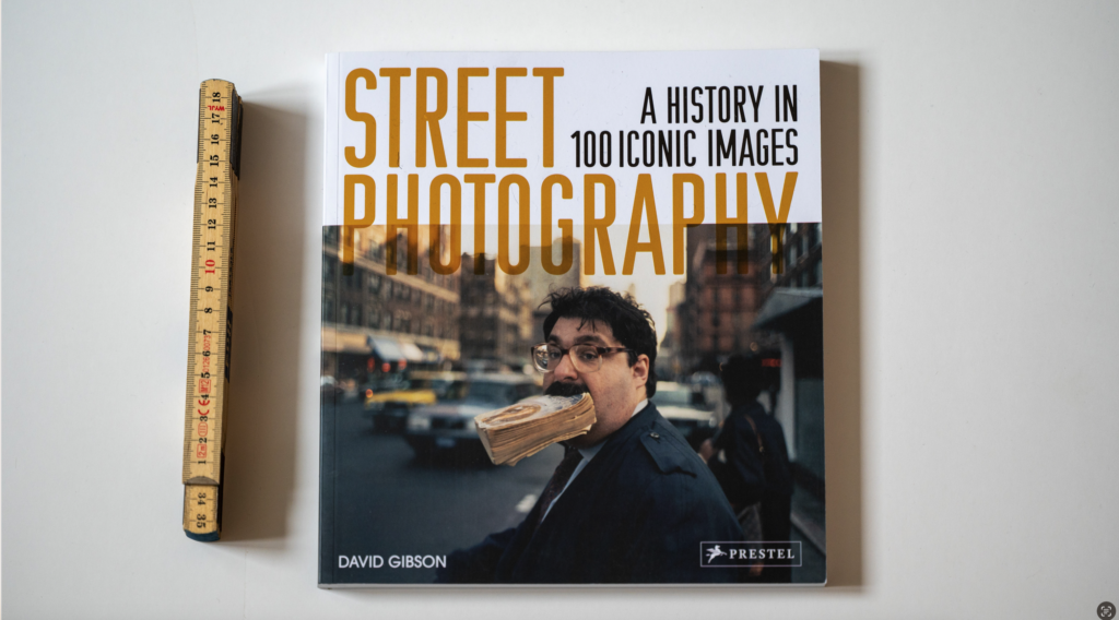
The almost square format (23x25cm) book contains 210 pages with 2 pages per photographer.

This books is a bit like tapas: 100 different street photographers. Hand picked by the author David Gibson. And for each photographer, one image and one page of accompanying text. Really well written, well researched and an interesting read. And I think he has picked some of the most interesting street photographers of all time (Saul Leiter, Vivian Maier and Diane Arbus just to mention a few).

Review: Street Photography - A history in 100 iconic images, by David Gibson
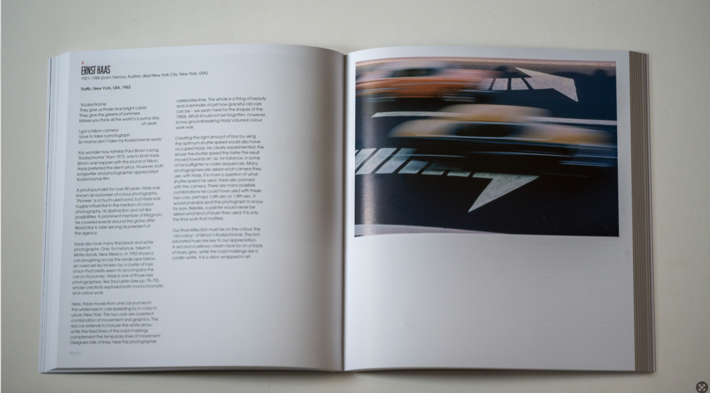
An example page from the book – here with Ernst Haas.

If you want to get to know these photographers in depth, then this is not the book. It only scratches the surface for each photographer, but if you want a good overview and a light touch on the 100 greatest street photographers of all time, this book comes highly recommended.

Further reading

Review: Henri Cartier-Bresson Here and Now, by Clément Chéroux

Review: Vivian Maier by Christa Blümlinger, Ann Marks and Anne Morin

Review: The Unseen Saul Leiter by Margit Erb & Michael Parillo

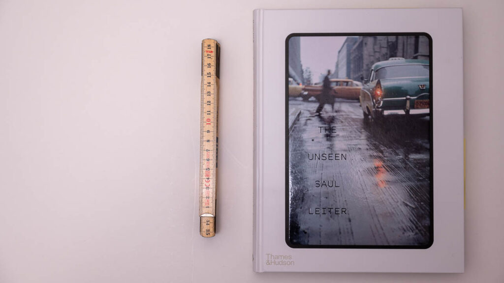
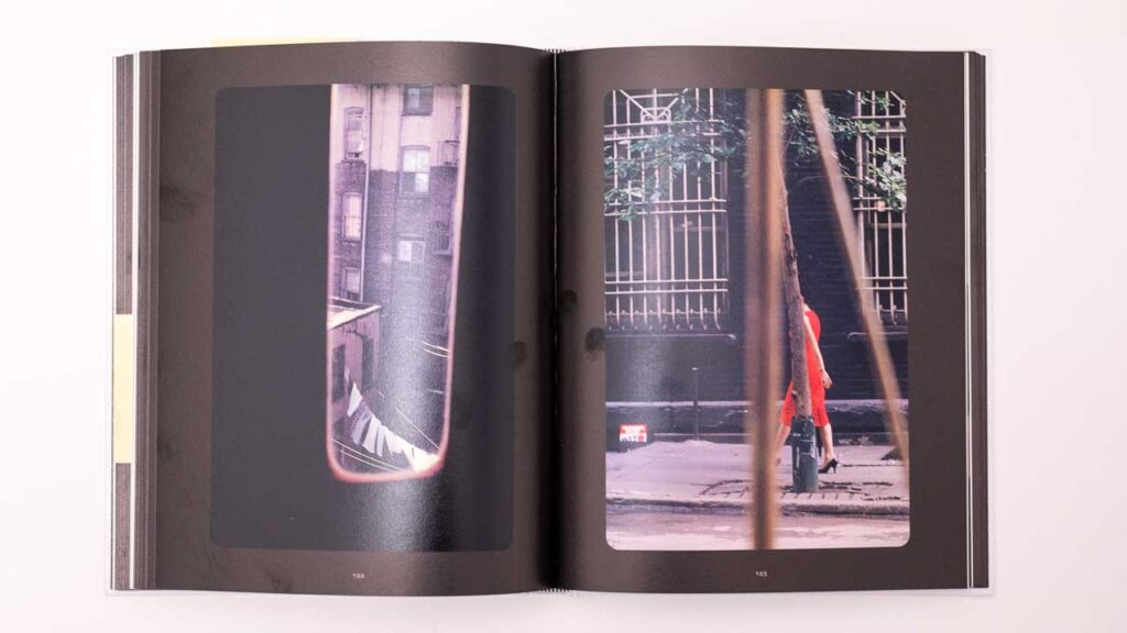
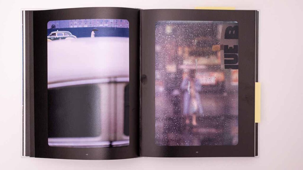
In this book the authors Margit Erb and Michael Parillo have hand picked 76 images from Saul Leiters earlier work where he used slide film as the medium. The book presents the images on completely black pages, simulating that you sit in front of the projector and see Leiters work being cast onto the wall. It works really well, and IMO they have managed to capture the “feel” of slide film being projected to large scale format really well. The 160 pages book is a hardback and measures 22 cm across and 28 cm down.

The Unseen Saul Letier
The Unseen Saul Letier. Hardback. 160 pages approx.

Extraordinary

When Michael Parello writes that “Leiter was a keen observer as life unfolded before him, somehow finding a way to reliably pluck a sublime split-second out of a mundane moment”, it really resonated with me and how I see Leiters images. Leiter was truly able to make something extraordinary out of the ordinary. A talent that many of us that dream of travelling to the other side of the globe to capture something extraordinary (like a mountain or an iceberg) could benefit from being reminded of on a regular basis.

Further into the book Michael quotes Robert Benton for describing Leiters images: “[They] were like paintings in which the subject matter did not dominate the photograph but was only one element among swaths of color, abstract shapes and daring composition”. Again, this very precisely pinpoints another dimension to Leiters images that makes them stand out: the subject is not dominating, but serves (almost) as a prop in a bigger composition as one of many elements.

The Unseen Saul Letier
Framing, framing and framing.

These quotes very well describe why I find Leiters work so extraordinary, and to this I will add that his use of out of focus elements sprinkles a bit of mystery to the scene. You may think that out of focus is harder than in focus, but actually getting the right amount of out of focus is the key here – so that the subject is still visible and recognisable, but hiding the finer details and only leave a shadow or an outline. His use of misted windows serves the same purpose.

The Unseen Saul Letier
To the right: Out of focus. But just the right amount of out of focus.

Finally, his use of framing is simply mind blowing. Especially if you have just read a book about composition and all the classic compositional rules. Leiter breaks them all, and did so long before the text books were written! In some images the subject is only revealed as a small beam of light between solid objects completely dominating the frame. Or he shows 6 people in a frame where the heads of 4 of them are hidden. It makes me want to study the images even more!

Conclusion

If you like the work of Saul Leiter, I think you will enjoy this book. The hard back is solid quality and the images present themselves really well on the black pages. And each image has got the space and room it needs to work the best.

The book gives a little text about how the images have been collected and indexed, but the main focus of the book is to present Saul Leiters work. If you are after getting to know Saul Leiter better, then this may not be the book for you, but if you enjoy his work and want to see it as first hand as a book can offer, then this book comes highly recommended. But be warned that I am a Saul Leiter fan and my objectivity relative to reviewing this book is highly questionable.

Further reading

Review: Saul Leiter In My Room, Edited by Margit Erb and Robert Benton

Review: All about Saul Leiter, collected by Margit Erb

Shopping link

Affiliate link to the book on Amazon.


Review: Vivian Maier by Christa Blümlinger, Ann Marks and Anne Morin

When photographer Vivian Maier passed away April 2009, she left behind more than 140.000 images, many of which had not been developed. As soon as Vivians work was shared on the internet, both her work and her story drew lots of attention.

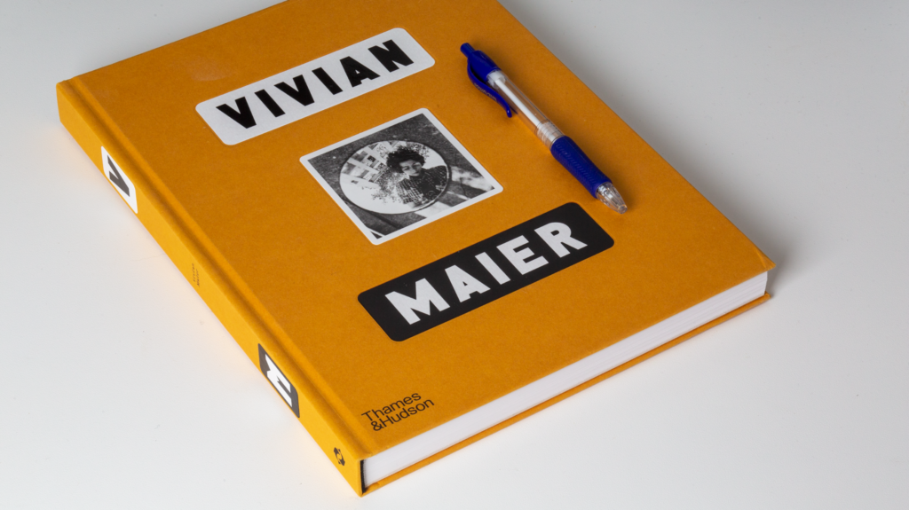
Front page of the book Vivian Maier by Christa Blümlinger, Ann Marks and Anne Morin

This books gives both her story and presents a lot of her work. As interesting as her story is, I enjoy her work the most. For that reason I was happy to find that 200 of the 250 pages in this book is dedicated to presenting her work.

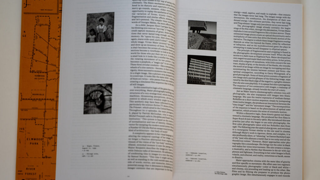
Vivian Maier
This images shows an example from the approx 30 pages in the beginning of the book – another section like this at the end of the book.

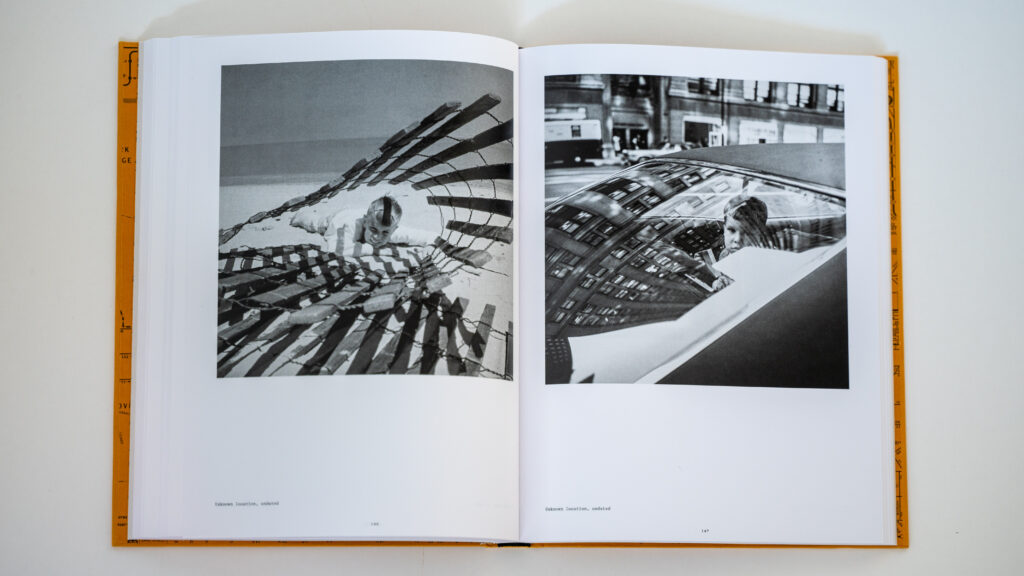
Of course I was aware that Vivians work would centre around street photography, but I has impressed with other sides of her work showing architecture, landscapes, self portraits, still life and even some surrealistic work reminding me of work done by Henrik Cartier-Bresson.

Vivian Maier
Two examples from the work of Vivian Maier.

I am not aware of how large a share of her total body of work has been developed and used for this book, but even so I find Vivian to be a very complete photographer that uses composition, reflections, framing, etc in an effortless way that you – if you are into photography – can only admire. And in addition the street images portrait people in a way where the portraits are almost loving in the tender way they capture people sleeping, reading newspapers or just passing by.

So as you can probably guess, I can wholeheartedly recommend this book if you are into photography and want to study and seek inspiration from the work of one of the best photographers of all time. It really is a pleasure to study Vivians work.

Related reading

Review: Henri Cartier-Bresson Here and Now, by Clément Chéroux

Shopping link

Affiliate link to the book on Amazon.

What is exposure delay mode? (using Nikon as an example)

Camera shake is typically something you want to avoid if you want sharp images, and many landscape photographers use different techniques to avoid camera shake.

One classic tool is to put the camera on a tripod to secure the camera is held absolutely still during the exposure, but even when using a tripod, there are a few more factors that can contribute to camera shake, such as

  • the photographer pushing the shutter and hence moving the camera slightly
  • the mirror flicking (in a DSLR)

These small movements may – if you are striving for minimum camera shake – yield ever so slightly movements to the camera body. Here  exposure delay comes to the rescue.

Exposure delay is pretty much what the name says: after you hit the shutter, there is a delay before the picture being taken. It is worth noticing however, that on a DSLR, the mirror is lifted as you hit the shutter, so the mirror movement does not yield any camera shake.

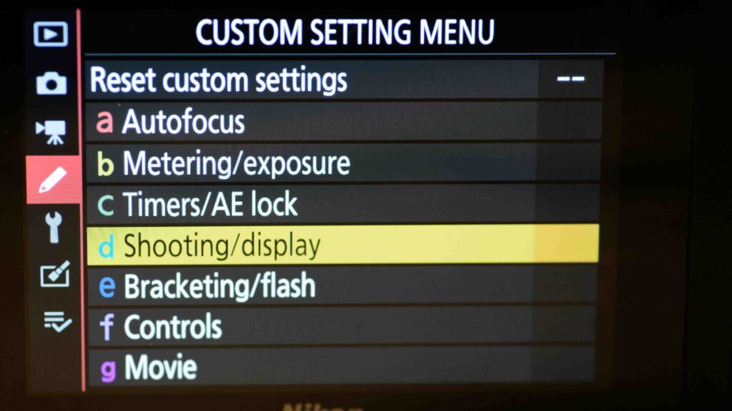
You can set up the duration of the exposure delay in the shooting/display menu that you find in the custom settings menu (also know as the pencil menu).

Exposure delay mode
You find the exposure delay mode setup under the shooting/display menu item in the Custom Settings Menu.

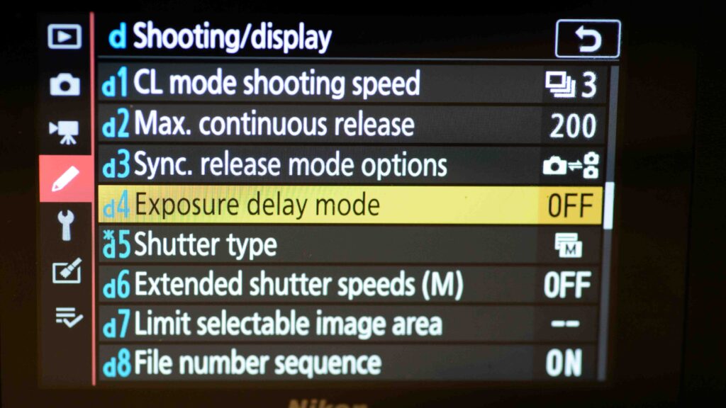
In the menu “d” for shooting/display, you will find the Exposure delay mode option.

What is exposure delay mode? (Nikon)
You find the exposure delay mode menu item in the shooting/display menu. Notice that the specific menu item ID may vary from camera to camera, so this is just an example.

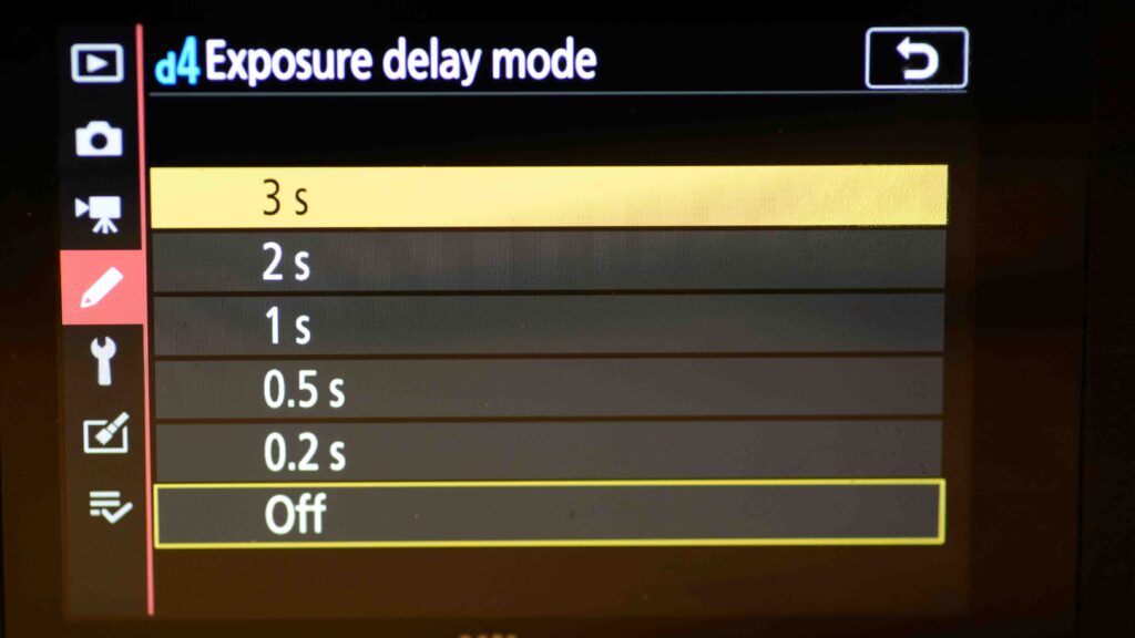
Typically you can set the shooting delay mode from 0.2 seconds up until 3 seconds. I always use the longest option available.

What is exposure delay mode? (Nikon)
The options available for how long you want the exposure delay to be.

Alternatives

The big advantage of using exposure delay is that it is a solution that is available, provided you have brought your Nikon along. You can also use a remote trigger (wired, radio controlled) to make sure you pushing the shutter does not give any camera shake, but of course the pre-condition is that (1) you have a remote trigger and (2) that you remembered to bring it along!

Also, there is an option to set the release mode to self-timer, in which you can shoot one or more images with an interval you select. But again, on a DSLR, the mirror flicks for each image and hence the exposure delay is a better option.

Related reading

Nikon Z6ii: Firmware upgrade, how-to

Nikon D4: Manual exposure, how to

Review: Ansel Adams: 400 Photographs

When looking at the long list of hits that Beatles or Rolling Stones have produced and comparing that to what other successful bands have made, it dawns on you just how talented these bands were. It’s a different league, simply. This is exactly the feeling I get when browsing the 400 images of Ansel Adams – there are so many great images presented in one book. He was and is in a league of his own.

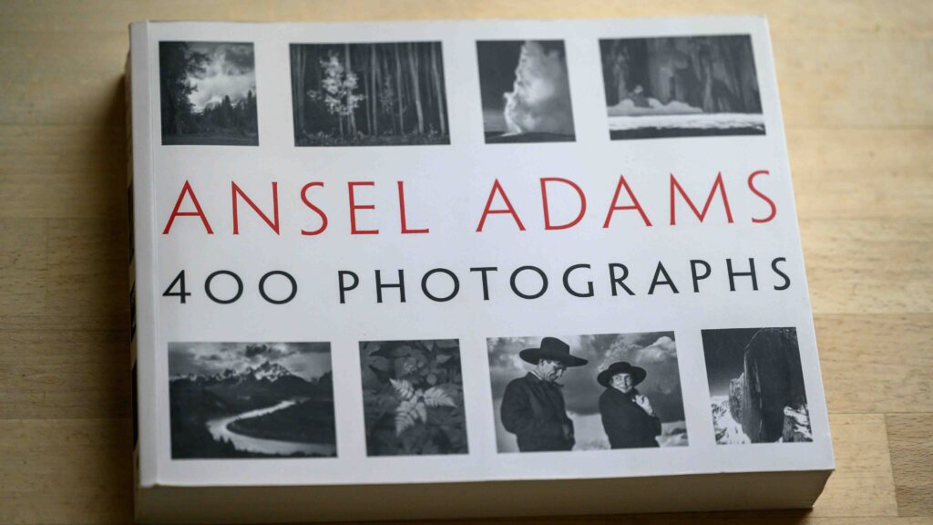
Ansel Adams - 400 photographs
The book is 25cm by 20cm. Maybe not as big as the images deserve, but on the other hand the book is easier to handle than some of the massive coffee table sized books.

Another thing that strikes me is the consistency of the work. Of course the images have been carefully selected amongst many more, but the sheer consistency and super high quality of each and every image is truly impressive. Adams is known for his motto that “nothing is worse than a sharp image of a fuzzy concept”, and he lived his own motto: every concept in the 400 images presented is razor sharp.

Ansel Adams - 400 photographs
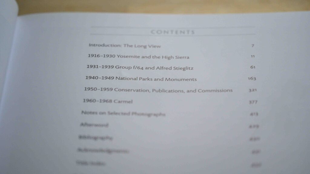
The table of contents. Ansel Adams – 400 photographs.

The book gives a short introduction by Andrea G. Stillman, but other than that the book is simply presentation of 400 images, organised into different phases of Adam’s life. The book is relatively small (25cm by 20cm) and paperback quality, but the black and white images present themselves really well despite the format not being the largest.

Ansel Adams - 400 photographs
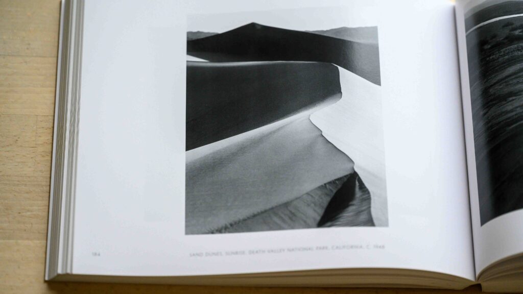
An example image from the book.

And as an outdoor photographer, I especially enjoy the section from the national park and monuments, probably the images that Adams is the most famous for. And of course you will find the moonrise image from New Mexico and the golden gate before the bridge. But there are many, many more great images.

Ansel Adams - 400 photographs
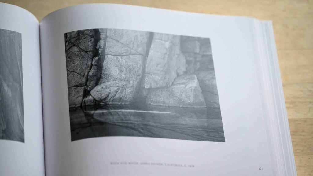
An example image from the book.

Can I recommend the book? Yes, if you are interested in landscape photography and want to study one of the greatest of all time, then this is a good place to start. When evaluating my own work, I often ask myself if I would hang my own work in my living room, and only a few images pass that test. But when it comes to Ansel Adams, I’d gladly put any of the images in this book on my wall.

Related reading

Review: Photo Icons, 50 landmark photographs and their stories, by Hans-Michael Koetzle

Review: Outdoor Photography monthly magazine

Use a grid to shape the flash light

Forward

A grid is a pattern of black fabric that you mount typically on the front of the softbox instead of the usual white fabric. The grid will effectively stop or dampen all light that tries to travel sideways relative to the direction the flash is pointing, and hence make most of the light travel in the same direction.

Grid in flash photography.
The grid seen from the side when the flash fires. Most light that tries to “travel” sideways will be stopped or dampened.

Although the softbox itself is coated with a reflective fabric on the inside and and hence designed to send all the light forward, the forward direction is still much wider than the front of the softbox itself. The grid helps limit the sideways travel by only allowing the light moving straight forward to continue, the rest is blocked or dampened.

The flash grid.
The grid in action to the left, and the softbox without grid to the right. Notice how much wider the light is cast to the right.

I use the grid to give more specific direction to the light, if for example it is important that the light bouncing from the floor or the ceiling is minimized. Notice that the grid dampen the effect of the flash all things equal quite significantly, so especially if you shoot the flash in manual mode, you need to factor in the effect of the grid when setting the flash power.

Related reading

What is optical slave mode in flash photography?

Review: Godox V860 III Speedlite flash