Review: In America by Robert Frank

Swiss-born photographer Robert Frank on the cover page of his book “In America” is quoted for saying: “Across the USA, I have photographed with these ideas in mind: to Portray Americans as they live at present. Their everyday and their Sunday, their realism and dream. The look of their cities, towns and highways”.

Robert Frank In America

Many big words – both praising and criticising Franks work – have been written about this book, but I stick to Frank’s simple description of his work done during his travel across America. Then I let others decide if this truly is a landmark in photographic history or a touchstone of American identity.
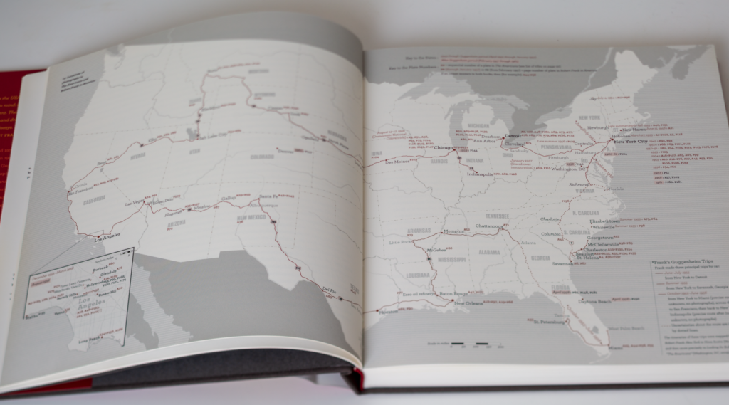
Robert Frank's way across America.
Robert Frank’s way across America.

What strikes me as a photographer looking through the black and white images of this book is Frank’s extraordinary visual talent. And for me this is a source of inspiration that I can visit again and again. Seeing Franks work really makes me want to be a better photographer – not in the same way as the playfulness of Saul Leiter or the clean compositions of Henri-Cartier Bresson, no, it is a visual talent where the compositions are very natural and – for the lack of a better word – non-composed.
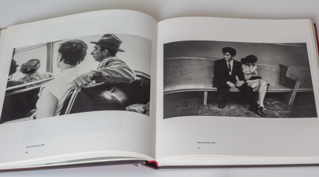
Example images from In America.

Some of his images I can study again and again and still find new nuances and details; new inspiration and the work of a natural talent. It is difficult for me to asses if you will feel the same way, but if you are looking for inspiration from one of the best photographers of all time, this book may be just what you need.

Further reading

Review: Henri Cartier-Bresson Here and Now, by Clément Chéroux

Review: The Unseen Saul Leiter by Margit Erb & Michael Parillo

Should you get a teleconverter?

What if I told you that there is a magic little gadget you can buy and install between your lens and camera, and all of a sudden the lens is significantly longer and has more reach? Does that sound too good to be true? Well, it is not. The name is teleconverter, and it comes in different variations but they all do the same: make your lens longer.

Teleconverters for Nikon comes in 1.4x, 1.7x and 2.0x meaning that the length of your lens is extended with 40%, 70% and whopping 100%! And good news is that the teleconverter is a relatively small device that does not add much weight to your setup. But it is not a free ride.

First, extenders are expensive. In order for the converter to work well and not deteriorate image quality, the glass in the converter has to be of super high quality. In addition the converter has to be 100% transparent in facilitating the communication between the lens and the camera in order for the auto focus system to work as efficient and fast as without the converter. That is a demanding challenge for the engineers. So good converters are expensive for good reasons.

Second, getting a teleconverter that works with your lens and camera may be a bit of a pain, especially if you say shoot with a Nikon body and a Tamron lens – should you then go with a Nikon teleconverter or a Tamron teleconverter? Difficult to say if you ask me. You can get third party converters that are more reasonably priced than the main brands, but make sure you study the spec sheet to see if your combo of lens and body is supported.

Third, the speed of your lens is affected negatively. How much depends on the specific model, but you can rest assured that if you have f/2.8 as your current widest aperture, then that max aperture will drop as a consequence of adding a teleconverter. So if you are shooting fast moving subjects, this could be a negative impact you seriously need to take into consideration before making the buy decision. And in addition most teleconverters will also give rise to a slight decline in image quality although the very best teleconverters will keep this decline at an absolute minimum.

And finally, if we are talking Nikon, the teleconverters only work on full frame lenses with built in auto focus motors. So AF glass will not do. Nor will APS-C glass.

So, as you have maybe guessed, I am a bit sceptical when it comes to teleconverters. I know many professional wildlife photographers use teleconverters with great success, but I just want you to understand all the down sides of the teleconverters before you go for it. Alternatively, of you have an APS-C camera lying around, try mounting that to your full frame lens – that will give you 40-50% more reach for free. Of course you then run around with a lot of glass you don’t use, but at least you are using the best part of the glass in the lens – the centre part. I have had my Nikon Z50 mounted with my 200-500 Nikkor lens and that gave a wonderful boost to the reach.

Related reading

What is a lens reproduction ratio?

Should you buy a fast lens or not?

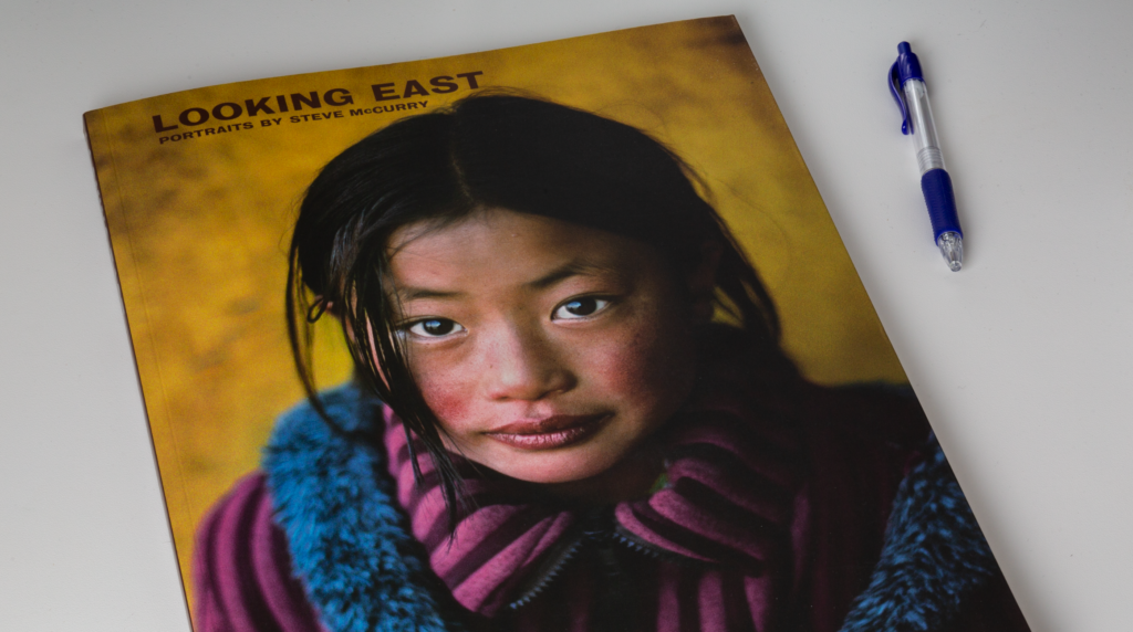
Review: Looking East, portraits by Steve McCurry.

No introduction needed? In photography I guess Steve McCurry is as famous as Rolling Stones is amongst rock fans. An institution. Member of Magnum Photos of course. Long standing contributor to National Geographics. Ropert Capa gold medal. The list goes on.

Looking East, portraits by steve McCurry.
Looking East, portraits by Steve McCurry.

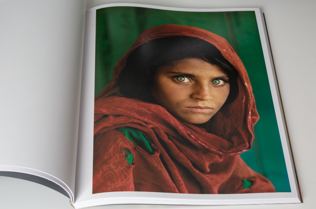
His image of the Afghan girl spiralled him into fame a long time ago, and the circumstances in which the image was taken has recently just added to the myth and the fame.

But back to planet earth and this book. It is quite large measuring approx 28 by 38 centimeter and contrary to what I had expected, it is not a hardback. Despite this, there is still a premium feel to the book, as each image is given a full page with the opposite page simply listing the location of the shoot.

You’ll find 120 images all shot in South and Southeast Asia. All portraits: Men, women and children. There is very little text in the book – normally you’ll find some curator introducing a photo book with 3-4 pages of intellectual perspectives to the photographers work and how the specific collection in the book came about. Not here. Apart from some few notes on the cover the the book, you will only find 120 wonderful images. The Independent is quoted for writing that “his images often dance on a knife-edge between sensuality and tragedy, sentiment and anguish”.

The picture that made Steve McCurry famous.

My label on McCurry’s work is “intense”. It is a part of the world where the colours are intense as well as the people. McCurry’s photography work is of course technically impeccable, but add to that the ability to capture people in exactly that split second where they reveal something more than just a headshot. And then of course travelling a part of the world that has fascinated him ever since he crossed the Pakistan border for the first time, many, many years ago.

If you like portraits, if you like a good coffee table book and if you like South and Southeast Asia, then this book is an absolute must. It is priced around 25 pounds here in 2023 and if you ask me, it is worth every penny.

Related reading

Review: Vivian Maier by Christa Blümlinger, Ann Marks and Anne Morin

Review: The Unseen Saul Leiter by Margit Erb & Michael Parillo
What is colour depth in photography?

Colour is reproduced mixing 3 channels of primary colour (Red, Green, Blue) and the colour depth tells how much information can be stored per colour channel. As each bit can hold a value of either 1 or 0, and combining say 8 bits for one channel allows to store up to 2^8=256 different values.

If there is room for 8 bits per channel, the total number of colours will then be a combination of the 3 channel meaning 256*256*256 = more than 16 million combinations. So a 8 bit colour depth yields more than 16 million combinations.

Notice that if the image is monochromatic and e.g. only uses the red channel, then the number of combinations are dramatically reduced as the other channels are not used for storing information.

Related reading

What is the difference between resolution and bit-depth in photography?

Review: Ravens by Masahisa Fukase

Ravens by Fukase is consistently proclaimed as one of the most important photo books in the history of the medium. That is pretty big words, but I must say that after reading the book, I tend to agree.

Ravens by Fukase
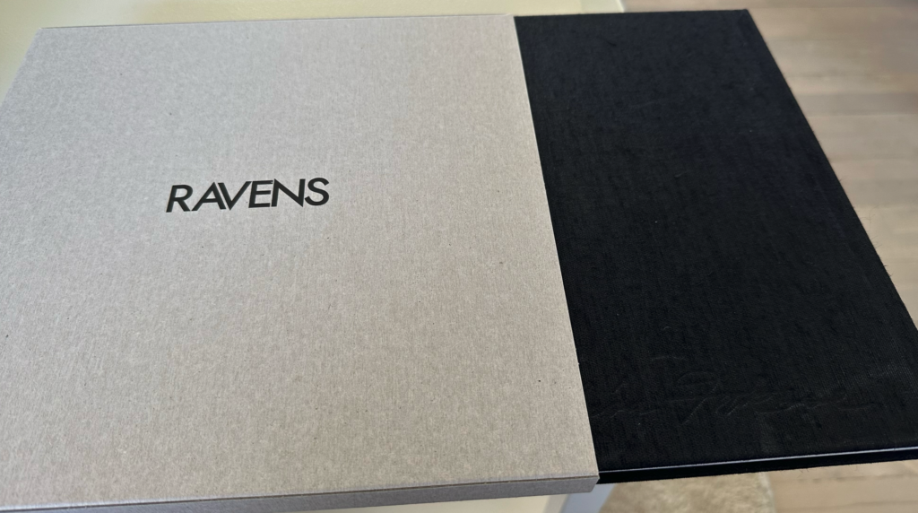
Ravens by Fukase comes in a grey cover to protect the black hardcover book.

Fukase’s life was certainly not an easy one and his studies of the ravens is all about solitude and feeling alone. So do not expect this book to be an easy read – it is as brutal and dark as it gets, and yet there is also a stunning beautiful side to these images. It is probably this stark contrast that makes this book so extraordinary. And of course the life of Fukase, which is the backdrop for the images presented in Ravens.

Ravens by Fukase
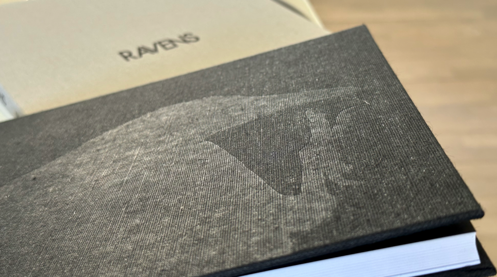
Ravens by Fukase – black hard cover.

Not everyone agrees that this is one of the most important photography books ever. Maybe it is because the book is more appreciated if you know a little about the life of Fukase? That Japanese mythology sees Ravens as omens of impending doom? That Fukase for many years photographed nothing but his wife? That his last 20 years was spent in a coma after an almost fatal accident? The saying that the photographs say more about the photographer than the subject is perhaps more true when it comes to Fukase than anyone else. Fukase said that he had become a raven himself.

Ravens by Fukase
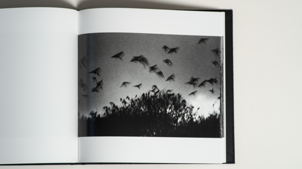
Sample image from the book. The flash light illuminates the eyes of the ravens.

All this is as dark as it gets. But there is also great beauty to be found in this book if you look for it, and hence this book comes with my highest recommendations.

Related reading

Review: Henri Cartier-Bresson Here and Now, by Clément Chéroux

Review: Josef Koudelka, Exiles

What is specular light versus diffused light

I must admit that I keep getting confused about specular light vs diffused light relative to soft light vs hard light. It is especially diffused light and soft light that I mix up, but let me give it a try.

If you see tarmac on a sunny day, the tarmac does not reflect very much light (it tends to absorb the light and get warm for that reason), but as soon as you have rain hitting the tarmac, the water on the surface will start reflecting the light and will do so in a way where the incoming light is reflected pretty close to how it arrived. So all of a sudden the reflections of the light in the water is very bright – I am sure you have tried this driving home late at night; the headlights from the oncoming cars is suddenly a nuisance because the rain set in.

So for me specular light is very much about the “dynamic range” of how the light is reflected on a surface. If the brights are very bright and the darks are very dark, then the light is specular. Remember here that the nature of the light is assessed looking at how it is reflected by the subject.

Diffused light however will have much less contrast between light and dark. It tend to be more “shades of grey” than black and white, to put it simply. The subject appears more evenly lit.

One of the tests that I often do when reviewing a lens is to shoot a piece of tinfoil curled up into a ball. Such a subject will yield specular light where the brights are very bright and the darks are very dark; excellent for revealing issues with chromatic aberrations, which you will often see where the contrast between bright and dark meet.

Related reading

What is fill light in photography?

What is a stop of light in photography?

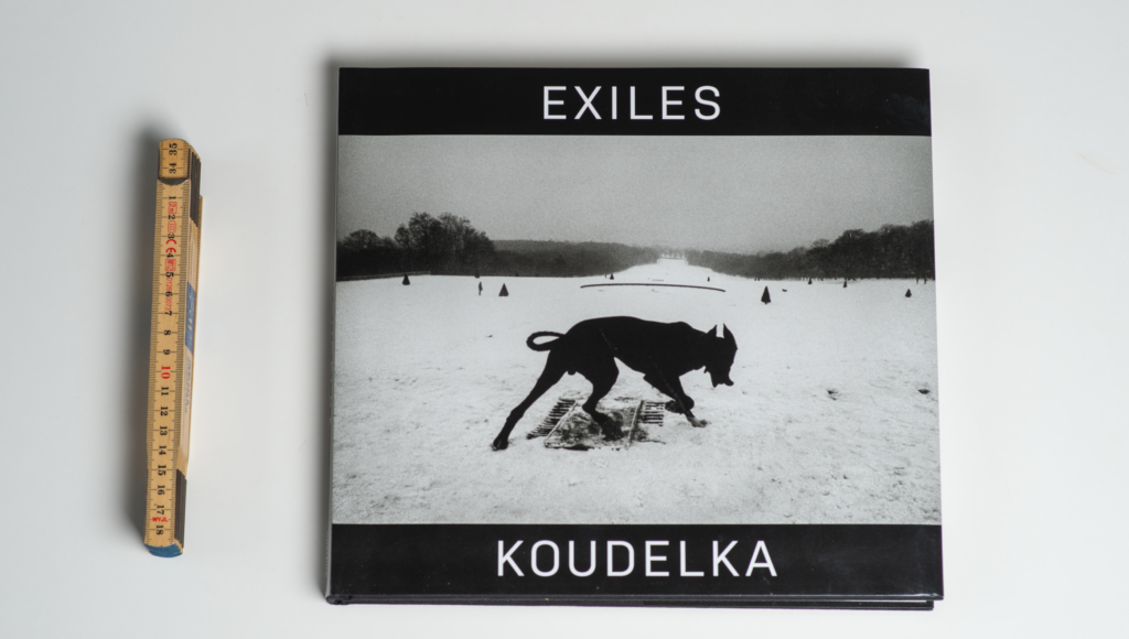
Review: Josef Koudelka, Exiles

Josef Koudelka, Exiles
Front page of Josef Koudelka’s book Exiles. The front page image is probably the most famous of all Koudelka’s work.

Koudelka is right up there with some of the biggest photographers of all time like Henri Cartier-Bresson, so if you are interested in photography and you have not enjoyed the work of Koudelka, you have something to look forward to! In the book by David Gibson with 100 iconic images, of course there is one by Koudelka, actually exactly the same as covers the front page of this book: Exiles.

Be aware that the book has developed since the 1988 classic was published, and more images have been added, so if you want the full monty, make sure to get the latest version of the book (shopping link right here).

Josef Koudelka, Exiles
Simple and yet very powerful. That is my best way of describing many of Koudelka’s images. “Simple” is not a good word as it may give the wrong associations, but is the best I can come up with.

Cornell Capa is quoted on the cover sleeve to say that “Koudelka’s unsentimental, stark, brooding, intensely human imagery reflects his own spirit, the very essence of an exile who is at home wherever his wandering body finds haven in the night.” So you can really put some serious words and analysis to Koudelka’s work, and curators and others absolutely love to add some of the most complicated words available to praise Koudelka’s work. I have no ambition to compete with all that.

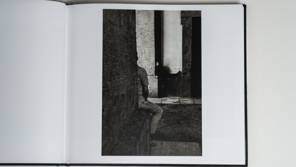
Josef Koudelka, Exiles
I’ll let the image speak for itself.

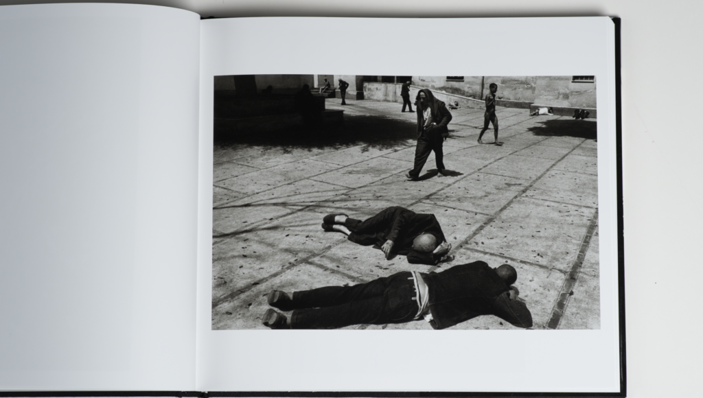
Rather, I would quote Leonardo da Vinci for saying something close to this: “Simplification is the ultimate sophistication”. I know wise men debate if it was actually Leonardo saying this and if these were the exact words, but the gist of it is what I want to get to, because it describes how I see Koudelka’s work. His images are so powerful and clear in their communication, and there is not a single distraction or any object in the images that do not aid the storytelling. The motto of photographer Joel Sartore is that if something in your frame is not working with you, it is actually working against you. It seems to me that Koudelka, who probably knows nothing of Joel’s motto, is the embodiment of working according to this rule.

Josef Koudelka, Exiles
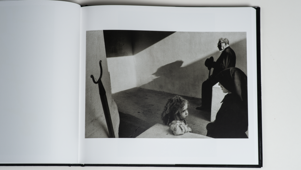
You can analyse this image from a composition point of view until you drop dead. Or you can just enjoy the image of a master.

So Koudelka is a big inspiration for my aspirations as a photographer. And for that reason and of course I can recommend this book about Koudelka. There are a few interesting introduction pages, but otherwise the book simply present 75 of Koudelka’s images (+ index). And what images! In this blog I have shared 3 examples beyond the front page, and I hope they will inspire you to seek out more of Koudelka’s outstanding work.

Video link

Related reading

Review: Photo basics by Joel Sartore

Review: Photography and the Art of Seeing by Freeman Patterson

What is DPI in photography?

DPI is dots per inch, and is often used to describe the (max) resolution a printer can offer, but it is also applicable for scanners. Contrary to PPI, the DPI for a printer or a scanner is not fixed but can vary subject to the print mode. So you can print and scan at different DPI levels, subject to your needs. The higher the resolution required, the longer the scan or print will take, so when you don’t nee the high resolution, it is nice to be able to prioritise speed over resolution.

When printing, the DPI needs to be significantly higher than the PPI for a screen, and this is because the printer builds a colour combining different base colours, and hence more base colour dots in combination are needed to make up for a similar dot on the screen. So when you read the spec sheet for a good colour printer, the DPI is often much higher than the PPI for a screen.

Related reading

What is the difference between resolution and bit-depth in photography?

What is banding in photography?


What is BSI in photography?

BSI is Back Side Illumination in a digital camera sensor.

It gets very technical very quickly, but the gist of it is that BSI is a new way of organising the layers in the digital sensor of camera. The new layering  allows more light to travel to the pixels that read the light.

The big benefit of BSI is more precise reading of the light. Some say that the signal to noise ratio is improved, others that the dynamic rang is increased. If you compare the spec sheet of a traditional sensor with a back side illuminated sensor, the difference should appear as better specs for the BSI sensor.

In my experience, the improvements are shallow. I have both the Nikon D750 and the Nikon Z6ii, i.e. one camera with a traditional sensor and another with BSI. For my style of shooting (outdoor photography), I can hardly tell the difference, and I think it is because we are comparing some very good sensors to some very, very good ones!

Related reading

What is a camera image sensor?

What is IBIS in photography?

What is IBIS in photography?

IBIS is In Body Image Stabilisation.

It is a stabilisation system in the camera body, opposed to stabilisation that you will find in a lens. Some camera systems allow both the in body and the in lens stabilisation systems to work together to maximise the effect.

The point with stabilisation is to mitigate camera shake. If you shoot with a slow shutter opening time, it is possible to move the camera a good deal while the shutter is open. This will be visible in the image; it may look blurred or not sharp.

The classic way to mitigate this is via the use of a tripod to stabilise the camera. An alternative is to follow the reciprocal rule, that says that the shutter speed should be equal to or faster than the reciprocal focal length. So if you are shooting at 100mm, you should not shoot slower than 1/100th of a second.

IBIS in the camera body allows you to shoot handheld at slower shutter speeds than what the reciprocal rule suggests.

Related reading

What is a camera image sensor?

What is banding in photography?