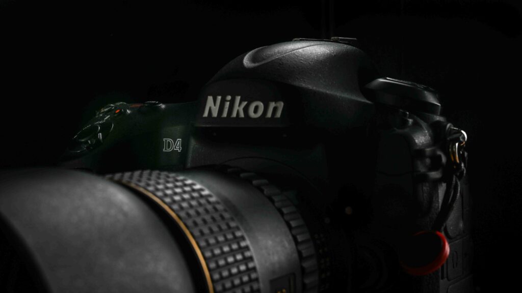
Some years back when I bought my copy of the Nikon D4, I did consider the Nikon D4s, but decided to go with the D4. I have since then made a few videos over at my channel about my experience with the D4 and over there I have several times got the question: Frederik, why did you go with the Nikon D4 and not the D4S? Clearly, the D4S is a better camera, seems to be the thinking behind the question.
Service
The D4S is a better camera than the Nikon D4, no doubt about it. It is also a younger camera, released in 2014 and produced all the way to 2016, when it was replaced by the D5. And this is probably one of the first differences between the cameras: because the D4S is younger, you can probably still get it serviced by Nikon. There is no official policy from Nikon on this matter, but word on the street is that Nikon will service and offer spare parts to cameras until they are 10 years old. And hence the D4S clearly has a better chance of being serviced today should something happen to it, rather than the D4.
The age is reflected in another difference: the price. At the introduction, the D4S was around 500 USD more expensive than the D4, but the relative difference now between the two is much bigger than that. The D4S price for a used copy is significantly more expensive, and I cannot imagine it is all related to the technical improvements. It has to be because photographers also factor in that if the camera breaks down or needs service, then the D4 is a dead end whereas the D4S still is “live”.
That said, with an expected shutter count around 400.000 and the knowledge that Nikon cameras often go way beyond the expected shutter count, I doubt that I will ever see the end of my D4. But it is of course a risk that I cannot get it serviced or repaired, if need be.
EXPEED
One of the major upgrades from the D4 to the D4S is the processor capacity, and the EXPEED 3 is replaced by the EXPEED 4 – about 1/3rd more computing capacity in the D4S.
I think this is one of the reasons why the D4S spec sheet wise is better when it comes to FPS and a more advanced auto focus system. The increased computing power simply gave the engineers at Nikon more headroom to develop the software in the AF system. And this could be important to you, but it is not important to me, as I am mainly an outdoor photographer. If portraiture or street photography is you line of business, then the improvements in the AF system could be vital for you.
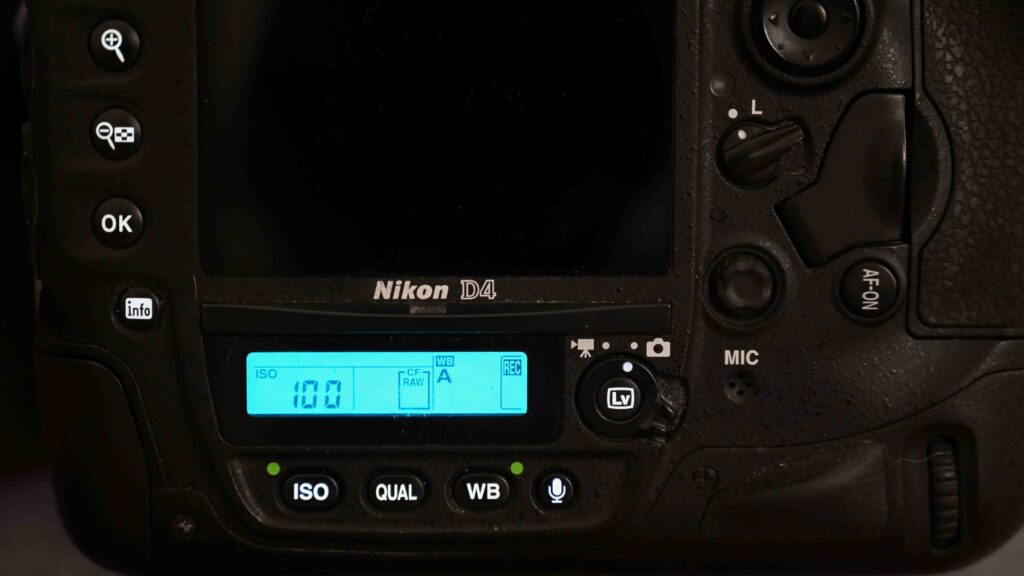
There are other updates like a wider ISO range, a stronger battery and slightly redesigned joysticks for better comfort. But again, I think I’ll be fine without these improvements.
Conclusion
There are other differences between the D4 and the D4S and the intention was not to list them all. If you want to see a full spec compare, it is right here.
The D4 was one of the very best cameras the camera industry could offer approx. 10 years ago, and to me choosing between the D4 and the D4S is a bit like choosing between Bentley and Rolls Royce. Both are amazing!
The point is that the improvements made going from the D4 to the D4S simply was not important to me, and with the (in relative terms) significant price difference between the two cameras, my choice was easy.
But this shoe fits my foot. That does not mean it will fit yours. Your criteria are probably different and hence you will need to make your own assessment when choosing between the D4 and the D4S. But I hope my story here has helped you get a little closer to making the decision that is right for you.
Video link
Related reading
Which enthusiast Nikon DSLR to choose?