Review: Timbuk2 Heritage Classic S Messenger bag multi-colored

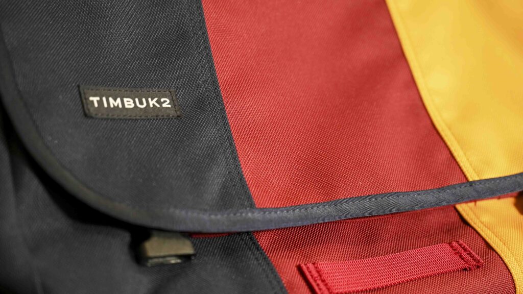
I was looking for a messenger bag (a sling bag), and after googling a bit the Timbuk2 Heritage Classic S Messenger bag quickly came out as the one that suited my needs the best: A basic bag, not too expensive (83 EUR) and solid build quality. The price varies a bit subject to the color chosen, but it is in the vicinity of 80 EUR here in Europe. (For the record: I am not sponsored by TimBuk and have bought this bag for my own money).

Timbuk2 Heritage Classic S Messenger bag multi-colored
The Timbuk2 comes in many different colors and color combinations. Here colors of the German flag.

It measures 37 x 26 x 10 centimeters approximately and easily holds my laptop, a X280 ThinkPad laptop (13″ approx). In addition I have a notebook and and a few pens, and that is basically it. I have both keyboard, charger, mouse and screen both at home and at my workplace, so I am so lucky that I only need to carry the PC itself and then a notebook. And for this limited purpose, the Timbu2 has plenty of room.

Timbuk2 Heritage Classic S Messenger bag multi-colored
There is no padding – your laptop is not protected if you drop the bag on the ground.

There is no padding in the bag and if you plan to carry fragile material in the bag, you’d better be sure not to drop it or put it down suddenly – there is only a thin fabric. The fabric seems solid and durable and I trust it will last for many years and also keep water out, but do not expect padding.

Timbuk2 Heritage Classic S Messenger bag multi-colored
There is a little net to hold a bottle inside the bag. My thermo bottle is a big too large for the bag to close properly, but a 1/2 litre cola will fit nicely.

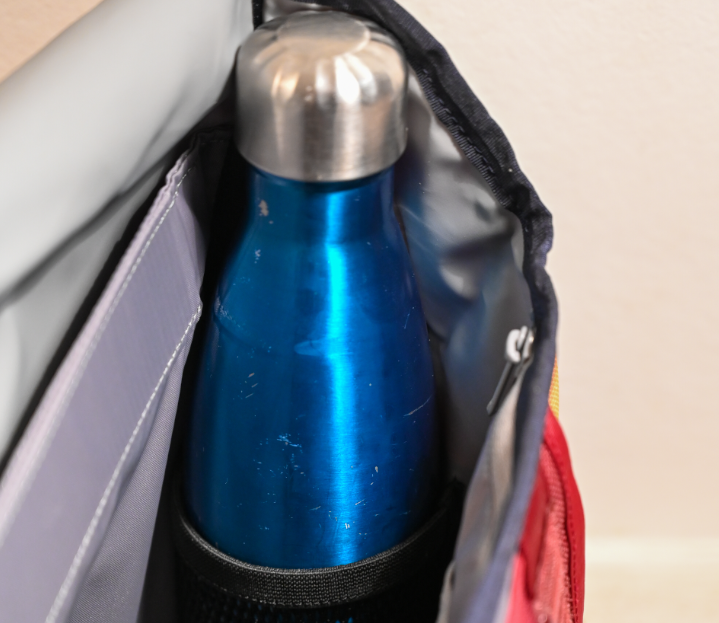
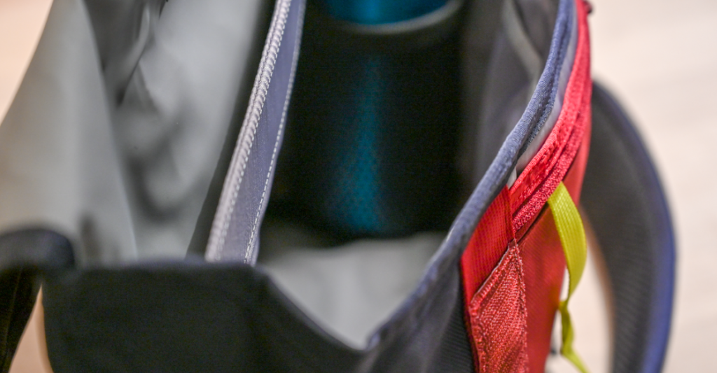
Inside the bag there are 2 large rooms. I use the inner room for the PC and the other room for my notebook and gloves. There is a little net for holding a bottle as well, but it will not hold a tall thermo bottle like above (the bag will not close properly) – but a 1/2 liter cola fits fine.

Inside the bag there is a number of small open rooms that I use for holding pens primarily, and there is also a larger room you can close with a zip.

Timbuk2 Heritage Classic S Messenger bag multi-colored
The 4 smaller open rooms inside the bag. And a larger one that closes with a zipper. Notice the inside of the bag is light grey – this is brilliant! If you have ever had a bag with black fabric on the inside, you know how challenging this can be sometimes!

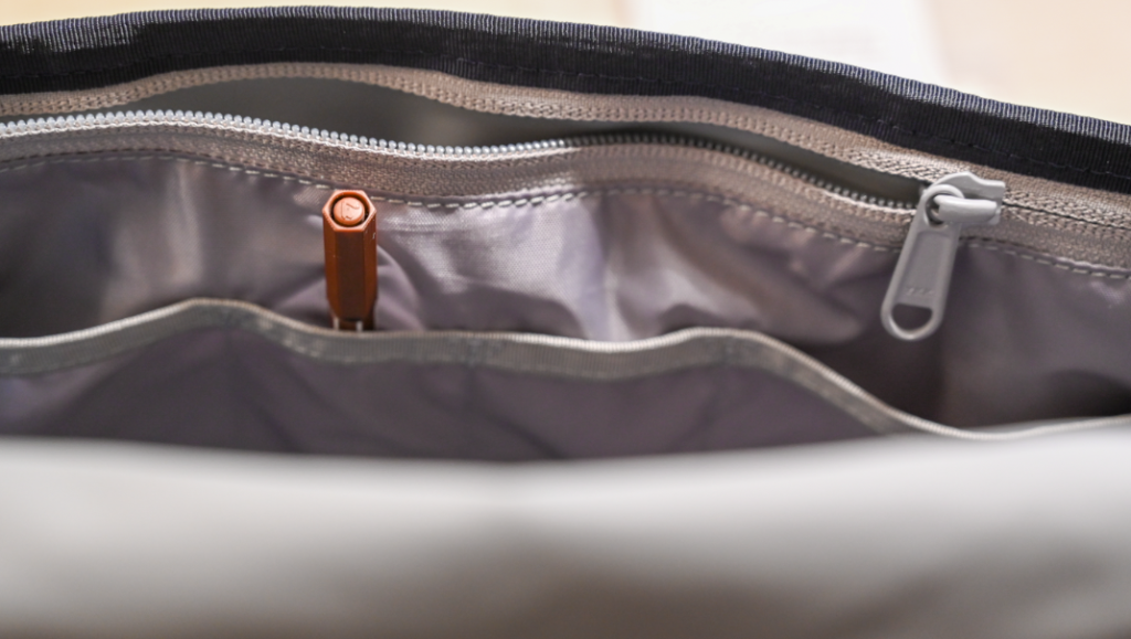
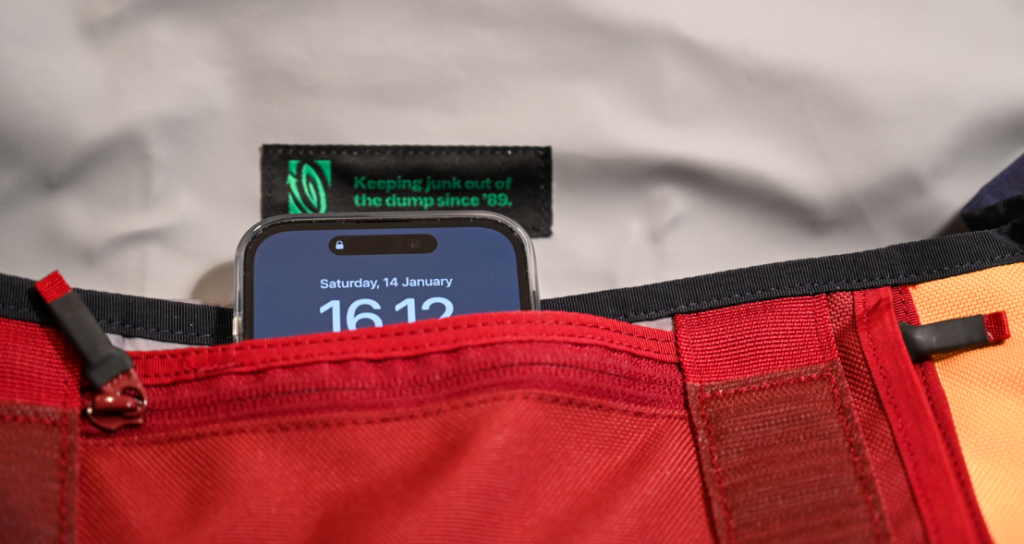
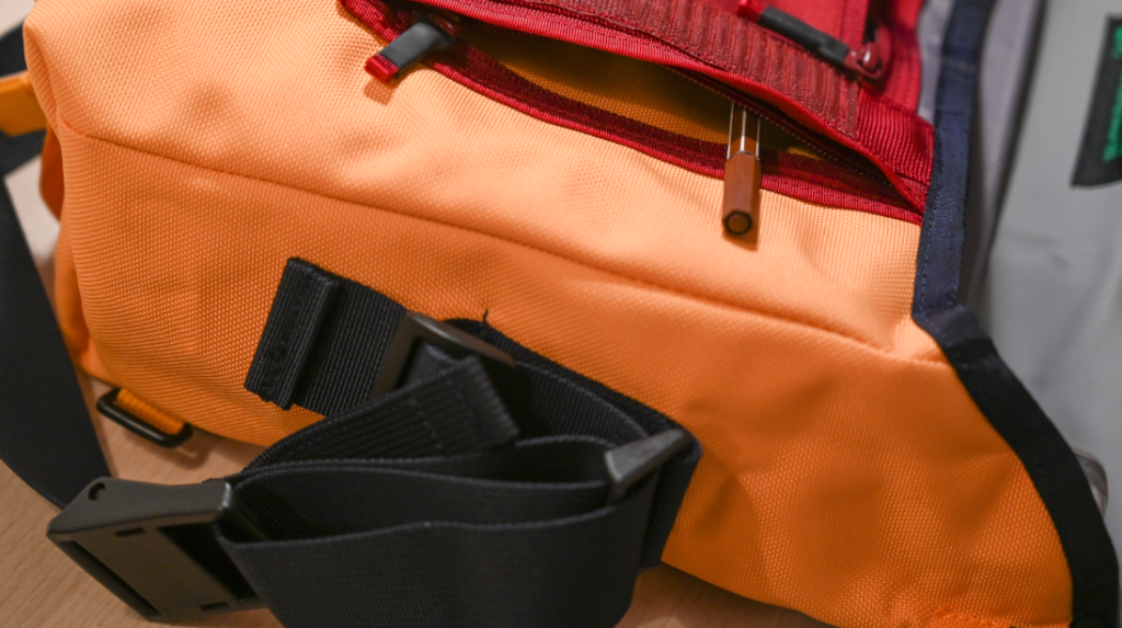
On the outer side of the bag there is one open pocket and two that closes with a zipper, and one of them has a string inside that allows you to attach a keyring so you can have your keys attached and stored safely.

Timbuk2 Heritage Classic S Messenger bag multi-colored
The iPhone here sits in the open pocket for illustration – I usually store it on the inside of the bag. Notice the horizontal zipper to the right – it gives access to a rather deep pocket that goes halfway across the bag.
Timbuk2 Heritage Classic S Messenger bag multi-colored
You can fit a lot into this little bag, even though it is only 8-10 centimeters deep. And if it is heavy things like books, I think the limitation will be more what you want to carry than what the bag can contain.

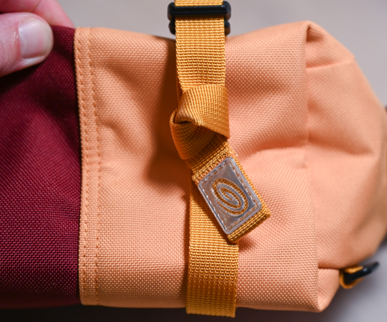
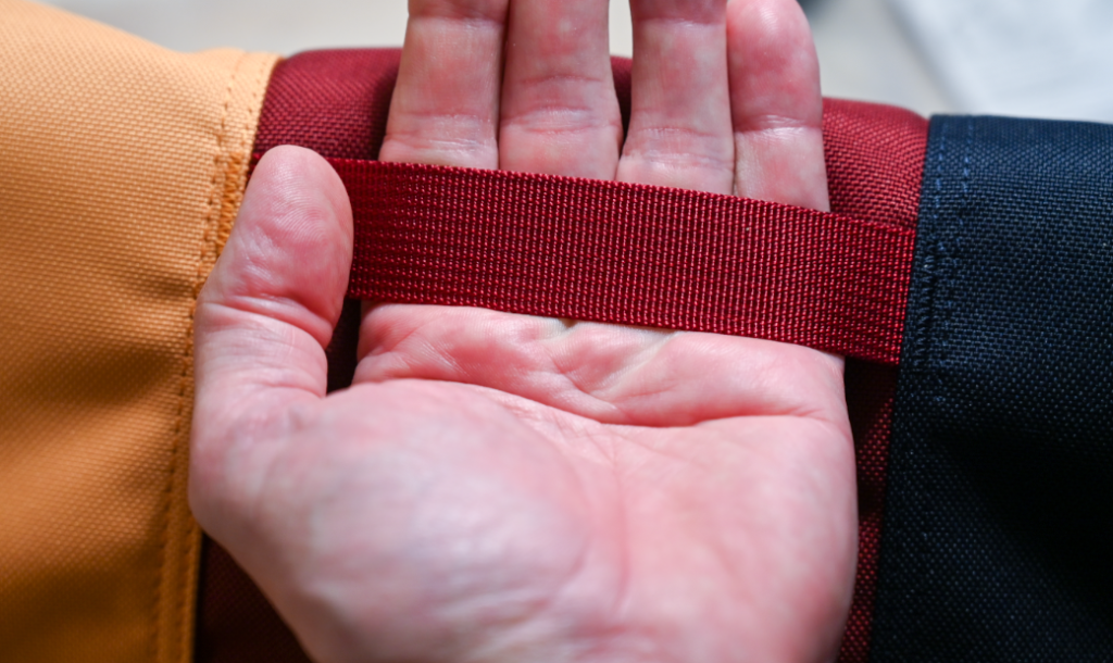
The thickness of the bag can be adjusted with two straps that also hold the locks for closing the bag. I don’t like to have the strings flapping around, especially when I am on the bike, so I have made a little knot to keep them at bay.

Timbuk2 Heritage Classic S Messenger bag multi-colored
The width of the bag can be adjusted using the two strings that also hold the closing mechanism. 10 cm is the widest.

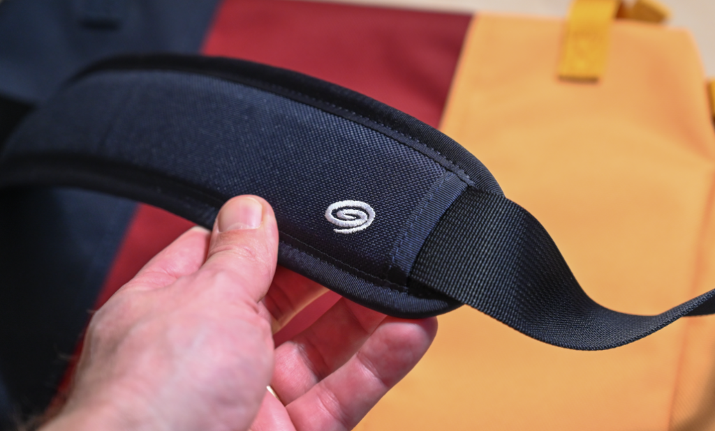
The strap to throw over your shoulder is nice and wide and well padded.

Timbuk2 Heritage Classic S Messenger bag multi-colored
Well padded, and the padding can be moved to sit exactly where it suits you.
Timbuk2 Heritage Classic S Messenger bag multi-colored
The length of the strap can be adjusted as you’d expect. It works really well and is easy to use.
Timbuk2 Heritage Classic S Messenger bag multi-colored
In addition to the sling strap to throw over your shoulder, the bag has 2 soft handles – one on the front and one on the back. Here the latter is shown. Notice the solid sewings.

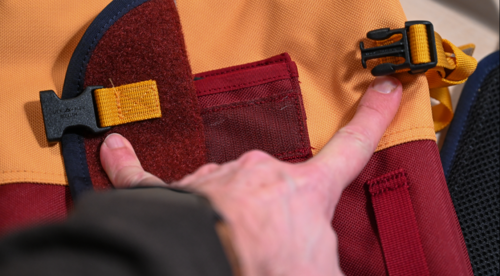
The flap that closes the bag is fitted with both velcro and buckles. When not out and about, the velcro is more than plenty to keep the bag closed, in fact, sometimes it feels a little to efficient when you just want to grab a pen quickly and the velcro does what it can to keep the bag shut! But you’ll get used to it.

Timbuk2 Heritage Classic S Messenger bag multi-colo
My fingers point two the two buckles that close the bag firmly. Between my fingers the velcro that also closes the bag.

Conclusion

If this bag will suit you and your needs of course comes down to your criterias and personal preference. It is a very solid built bag, durable materials and very convincing sewings everywhere. And they have clearly thought very carefully about many of the details such as the closing mechanism, the pockets, the strings, etc. In my humble opinion the design is spot on for a simple bag that will serve you for many years without breaking the bank.

However, the money has been spent on solid durable fabric, sewings and straps, and not on more luxury items such as padding, leather or other up-market features. It is a very basic bag, and if you want a little extra or a little luxury, this bag is probably not for you. This one delivers the basics only, but does so very well.

Related reading

Review: Hövding 3.0 – airbag protection for cyclists!

Review: Garmin Varia RTL516 Rearview Radar and Taillight


Review: Outdoor Photography monthly magazine

Before Covid hit us all and we could travel freely, my dear wife bought me a copy of the magazine Outdoor Photography in a UK airport somewhere. This was back in 2019 and the copy was issue 249 with a great article by Lee Acaster: His guide to black and white photography. I have read that article at least 20 times, and thanked my wife that she introduced me to Outdoor Photography equally many times.

Outdoor Photography magazine

Ever since colleagues gave me a copy of the Landscape Photographer of the year, I have been convinced that British landscape and outdoor photographers are amongst the best in the world. Carrying a Danish passport and having no relationship to UK other than a holiday now and then, I think I can say that this assessment comes with some level of objectivity! And the Outdoor Photography magazine has continued to confirm that my assessment is not half bad.

Outdoor Photography Magazine
Interesting and inspiring articles are at the heart of the Outdoor Photography magazine.

The table of content for the magazine has been pretty stable over the years:

  • Features and opinion
  • Learning zone
  • Location guide
  • Nature zone
  • Gear zone
  • Regulars (newsroom and books)
  • Your op (e.g. publishing readers work)

My favourite part is the Features and opinion, because you here get close to some of the really good photographers and their work. And there are lots of examples of images they have produced and the inspiration I have got from reading these articles and seeing their work is monumental.

Coming from little Denmark, the sheer amount of talented photographers that UK has is simply astonishing, but of course it has to do with the population of UK being 10-15 times Denmark. But even when factoring this in, I still think the UK on a global scale is in the top league, without having done any scientific assessment. Part of the answer probably also lies in the competition being so much more fierce in UK as you simply have to be good to make it, otherwise you will just disappear in the crowd of reasonably good photographers.

Outdoor photography magazine
My subscription secures that a copy wrapped in plastic arrives in my physical mailbox on a monthly basis.

I have now subscribed to the magazine, and as such a copy wrapped in plastic arrives in my physical mailbox on a monthly basis. It is not cheap but I find that the value and the pleasure of seeing these great images and articles by far exceeds the costs. Of course, should my economy get worse than it already is, this would be one of the first items in my budget to cancel, but as long as I can afford it, this is little photography luxury that I really enjoy. And it is one of the very few items hitting my physical mailbox that I enjoy (although when the competition is bills and dunning letters, it is of course easy to shine in compare!).

So bottom line: if you are interested in outdoor photography (landscape, nature, adventure, wildlife), then this magazine comes will my highest recommendations.

Related reading

Review: Photo basics by Joel Sartore

Review: Understanding exposure by Bryan F. Peterson

What are depth of field indicators on a lens?

Not all lenses have a depth of field indicator! It seems like it is a thing of the past, so you need a good old lens to find a DOF indicator! And that is not necessarily a good think, as it can be very useful!

The Nikon 70-200mm f/2.8
My beloved 70-200 mm lens has a distance scale, but no DOF indicator.

On older manual focus lenses there is a distance scale where a – typically – white marker shows what distance your are focusing at. The scale is often very detailed for close distances, and as you increase the distance the jumps get bigger and bigger: 5 meters, 7 meters, 10 meters, 20 and infinity. So it is like a hockey stick – when you get to the far end, things happen very fast!

In addition to the distance scale, you also select the aperture on an older lens by turning an aperture ring. Each of the f-stop values are color coded – if you see the image below, the f/16 value has a pink (?) color coding.

Depth of field indicators for two different apertures.

Now here’s the trick: On both sides of the white marker that shows the focus distance, there is a pair of colored markers that shows the near and the far end of the DOF. In the example above to the left at f/16, you can see the two pink arrows showing the DOF markers and in the example to the right it is green arrows doing the same for f/8. The image above is from the video that I have linked to below, in case you are interested in more details about manual focus.

As you can see on the colored pairs, the blue markes give a much wider DOF than the green markers, which is not a surprise as the blue corresponds color wise to f/22 whereas the green corresponds to f/8.

The DOF scale can be super useful to determine the circle on confusion, i.e. the range in which the image appears to be sharp. This for example enables you as a landscape photographer to put the focal plane so that the far end of the DOF just touches infinity on the distance scale, and hence you make the best use of the DOF at a given aperture. It can also be a group portrait where you want to select an aperture so that everyone in the image will appear to be sharp, and not just the front row!

Related reading

What is manual focus in photography?

Using a grey card and histogram to exposure correctly in Manual mode

Video link

What is luminance in photography?

You probably know the word lumen if you have been interested in the brightness of the light in a lightbulb or a flashlight. For my bicycle lights, I always study how many lumen they generate, as I want to be as visible as possible in the traffic. So the more lumen, the brighter the light is.

The luminance of the colors in an image is perhaps best illustrated using the sliders from Lightroom:

The luminance slider in Lightroom.

As you can see, the more luminance a given color has in the examples above, the more bright it appears to be.

The above sliders are “tweaks” you can make to the luminance in Lightroom, but in addition to this each color has an inherent level of luminance value. So blue is less bright than say yellow, just to pick two colors that luminance wise are at the opposite end of the scale. This is probably also why blue and yellow work well together as contrast colors – I often notice this when I see the Swedish flag.

Example with brightness changed in post processing.
Example with brightness changed in post processing. Before left, after right.

In the example above I have reduced the brightness of green and increased it for red, and as you can see it gives a very different expression. Had I reduced the exposure in Lightroom, the brightness of all colors would have been changed at the same time – here I can work with the brightness of each color and how bright they are individually.

Related reading

What is color saturation in photography?

What is hue in photography?

What is hue in photography?

To me hue is the same as color. It may not be entirely correct, but this definition works for me as a photographer using Lightroom and Photoshop.

The hue sliders in Lightroom.

To me hue is the color in its purest form. If you look at the sliders in the image above, I can take Magneta at the bottom to become red if I pull it to the right or more purple if I pull it to the left. This is changes to the color as such in its purest form. Notice that each color slider picks up where the previous left, if you go from top to bottom.

You can saturate the color more or less or change the luminance (add white), but this is a different dimension than the color as such. When you change the saturation or the luminance, the hue remains the same.

Related reading

What is monochromatic colors?

What are complementary colors in photography?

What is monochromatic colors?

Single

You probably think of monochrome as black and white and the shades of grey in between, i.e. that monochrome is the same as a black and white image.  This is how it is often used, but monochrome means that only one color or hue is present in the image.

“Chromaticism” is the greek word for color. So monochromatic underlines that only one color is present. You can of course have different versions of that color by having different tints (adding white) and shades (adding grey/black) to the pure color (hue).

I think of monochrome and monochromatic as being one and the same, but this is not entirely correct. However, for practical purposes working as a photographer, I think this assumption works just fine.

Not a monochromatic image
In real life the colors here looked amazing, but it does not really come across in the image.

You can work to achieve monochromatic images by using colored filters or post processing the image or a bit of both. Personally, I use Lightroom to tweak my images to a monochromatic look.

Using one single hue across the board in this image
Pulling a few sliders in Lightroom, it is possible to change the image to be (almost) monochromatic.

The reason for using a monochromatic color scheme is to simplify the image and take out some distractions. If you have a scene where there are many different colors, reducing the variety of colors down to monochromatic can help the viewer to see more of the structures and textures in the image, and help the scene appear more calm.

Related reading

What are complementary colors in photography?

What is color saturation in photography?

What is foreground attraction in photography?

3 dimensions 
Pictures are by nature 2 dimensional, trying to capture a 3 dimensional world. Thinking in foreground, midground and background (or distance) when you compose your image, can help bring the illusion to life that the image has a third dimension. So putting something in the foreground to give a bit of edge or contrast relative to the subject (typically found in the midground) can help make your image appear more 3D like.
Foreground attraction in photography
The moss and straws in the foreground serves as foreground attraction here. Some prefer the foreground to be tack sharp and have leading lines pulling the viewer into the scene – here it is more used as a way of framing.

Another role of the foreground can be to help bring the viewer closer to the scene.If you shoot a portrait of a person and the edge of the picture depicts a door, or if you shoot your subject through some vegetation, where the viewer almost feels like they are hiding somewhere and studying the subject.

Foreground attraction in photography
The brutal stem here in the foreground brings the viewer closer to the scene relative to a composition where only trees in the distance were in the frame.
Foreground attraction in photography
The stems left and right not only frame the scene, but gives the illusion that you as a viewer stand next to the stems and look at the bridge in the distance.
Foreground attraction in photography
A more “classic” use of foreground attraction where it almost feels like the foam filled wave is about to pull you into the ocean again!

The point is not to put something in the foreground each and every time. When shooting silhouette photography for example, the whole point is to play with the picture being 2-dimensional! But you can use it as one of many tools in your toolbox, exactly when you see the need to make your D2 images appear more 3D-ish!

Related reading

What is balance in photography?

Triangles as a way of composing and creating interest

What are complementary colors in photography?

Opposites attract

When put next to each other, complementary colors gives the biggest contrast and – for reasons beyond me – are an appealing combination to the human eye. You can use this knowledge if you work in a studio where the combination of the color of the models clothing and the color of the backdrop can be matched as complementary colors. Or you can use it in post to say do split toning to the highlights and lows using two complementary colors to do so.

The color wheel here as a screen shot from Lightroom.

Complementary colors sit exactly opposite each other in the color wheel, so if you follow the edge of the color wheel through all 360 degrees, you will find all the possible combinations. However, many of these are gradual changes from one color to another, so a more “black and white” presentation of the complementary colors could be:

  • Red and green
  • Yellow and violet
  • Orange and blue

Some photographers like Finn Beales are able to color grade their entire image portfolios in a consistent way and clearly using their knowledge of color science in general and complementary colors in particular. If you can follow this lead, it could be a way for you to develop a portfolio of images that stands out from the crowd and enables you to brand your work so it is easy to recognize.

Related reading

Color composition in photography

Why color temperature is vital in color photography

What is split toning in photography?

High and low

Split toning is simply to apply different colors to the highlights and lows in the image. You are changing the original colors based on the intensity of the light. Subject to the colors chosen, the emotional response to an image pre and post split toning can be very different.

split toning not applied
The original image without split toning.

I see many photographers using split toning to get a distinct look to their images so the color profile is consistent throughout their portfolio. I am no master here and my colors are all over the place, but when reading the book by Finn, I could clearly see how strong a tool color grading in general and split toning in particular is. So if you have the energy and the discipline, split toning is a great tool for making your images distinct and different than most of what you find on say Instagram.

split toning applied to highs and lows
Red-orange applied to the highlights. Blues added to the lows. Notice how especially the branch over the waster pops out much more in this version.

I apply split toning when working in Lightroom, and Lightroom even allows you to add 3 levels of toning: high, mids and lows. But in the example above I have just used highs and lows. The colors used are blue for the lows and a red-orange one for the highs.

It is not a coincidence that I have used orange and blue. These two colors sit opposite each other on the color wheel and are thus complementary colors. Complementary colors create the biggest contrast, and as you probably know, contrast draws attention. In addition, complementary colors apparently are pleasing to the eye – I have no idea why, but judging from my own experience it sounds about right.

Related reading

Color composition in photography

Why color temperature is vital in color photography

Nikon D4: Why not the D4S?

Some years back when I bought my copy of the Nikon D4, I did consider the Nikon D4s, but decided to go with the D4. I have since then made a few videos over at my channel about my experience with the D4 and over there I have several times got the question: Frederik, why did you go with the Nikon D4 and not the D4S? Clearly, the D4S is a better camera, seems to be the thinking behind the question.

Image of the Nikon D4
My beloved Nikon D4.

Service

The D4S is a better camera than the Nikon D4, no doubt about it. It is also a younger camera, released in 2014 and produced all the way to 2016, when it was replaced by the D5. And this is probably one of the first differences between the cameras: because the D4S is younger, you can probably still get it serviced by Nikon. There is no official policy from Nikon on this matter, but word on the street is that Nikon will service and offer spare parts to cameras until they are 10 years old. And hence the D4S clearly has a better chance of being serviced today should something happen to it, rather than the D4.

The age is reflected in another difference: the price. At the introduction, the D4S was around 500 USD more expensive than the D4, but the relative difference now between the two is much bigger than that.  The D4S price for a used copy is significantly more expensive, and I cannot imagine it is all related to the technical improvements. It has to be because photographers also factor in that if the camera breaks down or needs service, then the D4 is a dead end whereas the D4S still is “live”.

That said, with an expected shutter count around 400.000 and the knowledge that Nikon cameras often go way beyond the expected shutter count, I doubt that I will ever see the end of my D4. But it is of course a risk that I cannot get it serviced or repaired, if need be.

The Nikon D4 rear with backlit buttons.
If you shoot a lot in low light, you’ll love the fact that the buttons are backlit. And the small LCD enables you to see and set the ISO, white balance and image quality easily.

EXPEED

One of the major upgrades from the D4 to the D4S is the processor capacity, and the EXPEED 3 is replaced by the EXPEED 4 – about 1/3rd more computing capacity in the D4S.

I think this is one of the reasons why the D4S spec sheet wise is better when it comes to FPS and a more advanced auto focus system. The increased computing power simply gave the engineers at Nikon more headroom to develop the software in the AF system. And this could be important to you, but it is not important to me, as I am mainly an outdoor photographer. If portraiture or street photography is you line of business, then the improvements in the AF system could be vital for you.

There are other updates like a wider ISO range, a stronger battery and slightly redesigned joysticks for better comfort. But again, I think I’ll be fine without these improvements.

Conclusion

There are other differences between the D4 and the D4S and the intention was not to list them all. If you want to see a full spec compare, it is right here.

The D4 was one of the very best cameras the camera industry could offer approx. 10 years ago, and to me choosing between the D4 and the D4S is a bit like choosing between Bentley and Rolls Royce. Both are amazing!

The point is that the improvements made going from the D4 to the D4S simply was not important to me, and with the (in relative terms) significant price difference between the two cameras, my choice was easy.

But this shoe fits my foot. That does not mean it will fit yours. Your criteria are probably different and hence you will need to make your own assessment when choosing between the D4 and the D4S. But I hope my story here has helped you get a little closer to making the decision that is right for you.

Video link

Related reading

Nikon D700 vs Nikon D4

Which enthusiast Nikon DSLR to choose?