Opposites attract
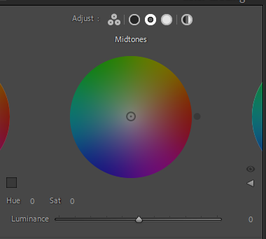
When put next to each other, complementary colors gives the biggest contrast and – for reasons beyond me – are an appealing combination to the human eye. You can use this knowledge if you work in a studio where the combination of the color of the models clothing and the color of the backdrop can be matched as complementary colors. Or you can use it in post to say do split toning to the highlights and lows using two complementary colors to do so.

Complementary colors sit exactly opposite each other in the color wheel, so if you follow the edge of the color wheel through all 360 degrees, you will find all the possible combinations. However, many of these are gradual changes from one color to another, so a more “black and white” presentation of the complementary colors could be:
- Red and green
- Yellow and violet
- Orange and blue
Some photographers like Finn Beales are able to color grade their entire image portfolios in a consistent way and clearly using their knowledge of color science in general and complementary colors in particular. If you can follow this lead, it could be a way for you to develop a portfolio of images that stands out from the crowd and enables you to brand your work so it is easy to recognize.
