High and low
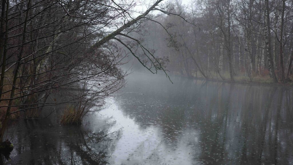
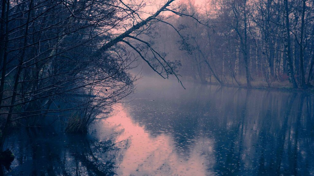
Split toning is simply to apply different colors to the highlights and lows in the image. You are changing the original colors based on the intensity of the light. Subject to the colors chosen, the emotional response to an image pre and post split toning can be very different.

I see many photographers using split toning to get a distinct look to their images so the color profile is consistent throughout their portfolio. I am no master here and my colors are all over the place, but when reading the book by Finn, I could clearly see how strong a tool color grading in general and split toning in particular is. So if you have the energy and the discipline, split toning is a great tool for making your images distinct and different than most of what you find on say Instagram.

I apply split toning when working in Lightroom, and Lightroom even allows you to add 3 levels of toning: high, mids and lows. But in the example above I have just used highs and lows. The colors used are blue for the lows and a red-orange one for the highs.
It is not a coincidence that I have used orange and blue. These two colors sit opposite each other on the color wheel and are thus complementary colors. Complementary colors create the biggest contrast, and as you probably know, contrast draws attention. In addition, complementary colors apparently are pleasing to the eye – I have no idea why, but judging from my own experience it sounds about right.
