I guess anyone can read the specification sheet for both the Nikon D700 and the Nikon D750 and come up with a list of differences. But another thing is working with both cameras side by side for a long time. Then you get to know the differences from a real world experience. In this blog I want to share how it is to live and work with these two cameras, based on a few areas that I have selected as they mean a lot to me.
The hype
The Nikon D750 is a much younger camera than the D700. It shows in many ways: the pixel count is higher, it does video, etc. But the D700 is a legend, and many consider the combination of sensor and processing logic to be unique, actually so unique that Nikon never since has made a camera with color rendition and micro contrast as good as the D700. Especially skin tones are known to be unrivalled and unique for the D700. I leave it up to you to decide if you want to believe the magic and hype related to the D700 – myself I have seen it periodically shine and have a 3D pop I have never seen with other cameras, and many of my landscape pictures look more like paintings than pictures, so yes, I can confirm there is something about the D700, but I am skeptical if all of the hype is justified.
Build quality
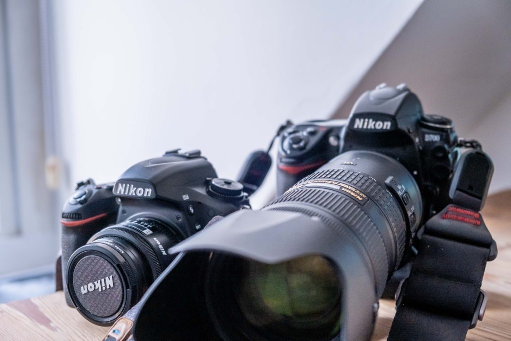
One of the things difficult to see from a spec sheet is the look and feel of a camera, and here the D700 and D750 are like night and day. Many say that the D700 is “built like they don’t make them anymore”, and I have to agree 100%. The D700 is – to use a cliché – built like a tank. A brick outhouse. You’ve heard the lingo. But it is. A Land Rover with a Range Rover on top. It is massive, made for endurance. If you don’t like a heavy camera and a bulky one too, then stay clear of the D700.
The D750 is more a camera like they build them today. It is more compact, lighter and has a much less solid feel to it. When you go from the D700 to the D750, you definitely feel like the D750 is more like plastic. Not that the D750 is of poor build quality – the D700 is just so much better. The grip on the D750 is deeper, but you quickly get used to the D700 if you – like me – have big hands.
Live view
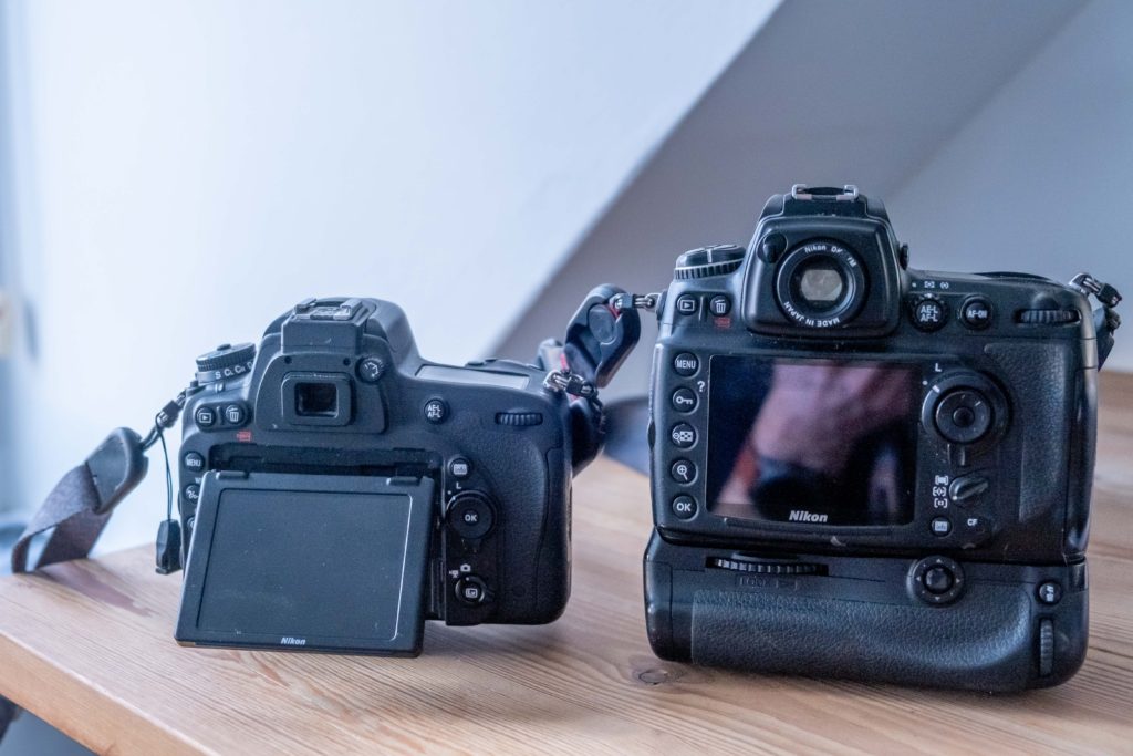
You may not use Live View much, but if you do, then this is one of the areas where the D750 shines relative to the D700. I think the Live View implementation on the D700 was one of the first implementations Nikon did, and it is a bit quirky. There is no dedicated Live View button and you have to select between two different Live View modes. And the auto focus is slow when you opt for the “Tripod” mode, as it is called. Add to this that the D750 has a higher resolution rear LCD screen that tilts, and you will quickly enjoy the Live View implementation on the D750 with a dedicated button.
Pixel count
Many shy away from the D700 when they understand it “only” has 12MP. But I say: fear not, it is plenty! Unless you want to make very big prints that needs to be viewed very close up, or you want to crop your pictures heavily. If not, then 12MP is more than enough. And when you load your pictures into Lightroom or wherever you do your post processing, you will enjoy the smaller file size. And storage wise you will find that the D700 files take up less space on your hard-drive and backup storage facilities. So I will claim that the smaller pixel count makes living with the D700 much easier than the D750. And you will most likely never miss the 24MP resolution of the D750.
Viewfinder coverage
You may not think that the viewfinder coverage is a big thing, but to me it is, and actually one of the few areas where the D700 annoys me. I love that camera, but the fact that the frame is slightly bigger than what I see in the viewfinder is a nuisance. When I shoot, I frame very carefully according to the viewfinder and when I then get back home and open the file on my PC, I find it truly annoying to start my editing by cropping as I saw it in the viewfinder. The D750 does not have this issue.
Dynamic range
The D750 if notorious for its ability to do auto focus in low light situations – it literally sees in the dark. Truly impressive. The D700 not so much, and the dynamic range of the D700 is not as good as the D750. This may not be important to you – the ability to have both very bright and dark areas in the same frame is not important to all, and with exposure bracketing you can compensate a lot for lack of dynamic range. But I will say that in a low light situation – for example shooting in a restaurant without disturbing the guests with a big fat flash, my choice is the D750. Every time. Don’t believe the D750 has better dynamic range? Head over to DXO mark and see for yourself.
What to choose?
If you are about to choose between the D750 and the D700, then you are in for a tough choice. Boiled down to one sentence? You choose the D700 with your heart and the D750 with your head. The D750 is a more modern camera, lighter and easier to work with. But sometimes that is not what counts. Love conquers all, as they say.
Shopping link
Affiliate link to the Nikon D750 (body only).

