Visual weight
Visual weight has nothing to do with the weight or the density of a given subject in your frame, rather it is an informal scale that tells how well elements in your frame manages to pull the attention of the viewer. So it is a different way of getting attention than say leading lines.
Some of the dimension often quoted in relation to visual weight are:
- High contrast
- Good sharpness
- Bright areas
- Saturated colors
- Visual size
- Recognizable (vs abstract)
So a subject in your frame that is sharp, filled with contrast, bright and colorful will simply draw more attention than out of focus areas with no contrast and desaturated colors. It is obviously a simplification, but I think you get the gist of it.
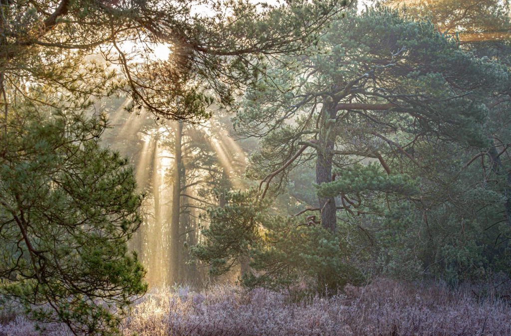
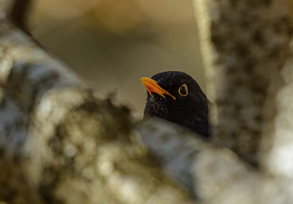
Best to look at a few examples. Brightness. In the image below, my guess is that you immediately notice the sunrays coming through the treetops as it clearly is the brightest areas in the frame. The rays hold a lot of visual weight relative to the subtle nature of the rest of the frame. Sharpness. The blackbird below is actually the only that is sharp in the entire frame. The out-of-focus stems are used to frame the bird, but they do not draw attention despite their size, as they are not in focus.
Color. The chest of the little fellow below stands out and draws attention, relative to the rather de-saturated background and the branch that is not exactly colorful! Also notice that eyes have great visual weight, as we tend to seek eye contact, irrespective if the subject is a person or an animal.
Contrast and brightness. You may notice the bright sun to the right as the first in the frame below (brightness), but my guess is that right after that you notice the backlit straws. The straws have a strong contrast to the dark background hence stand out with very strong contrast. Silhouette photography has the same ability.
Another example with brightness below. Again the strong sun in the top holds a lot of visual weight and it takes some time before you notice the leaves in focus and their structure. You could consider to crop the image so that only the leaves are there – I leave it to you to decide if that would yield a better image.
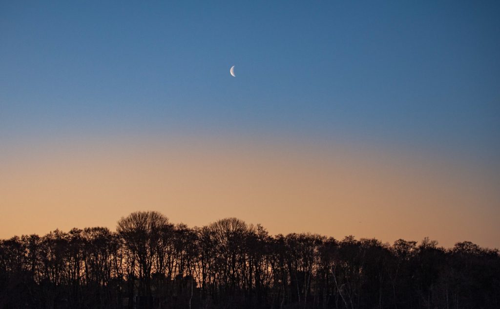
Finally, one of my favorite examples of visual weight below. Although both small and not especially bright, the moon draws attention being the only bright element in the frame, with good contrast to the blue sky.
Further work
The above was only intended to be an appetizer for visual weight. Once you start to notice, I think you will start to see images slightly different and hopefully also start using visual weight as a tool in your photography.
Thank you for reading this far! Comments and questions more than welcome!


