Intensity
I think the best way to describe color saturation is that a completely desaturated image is a black and white image! So the intensity of the color is the saturation. And a color that is completely desaturated is just a shade of grey.
The more grey you add to a color, the less saturated it is. (This is probably not technically correct, but I find it to be a good pragmatic way to think of it).

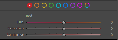
The saturation of a color in real life is a given, but you can tweak the saturation of a color in post processing. The above I have cut from the post processing tool Lightroom, where the slider in the middle – in this example – allows you to take the intensity of the red color from grey (all the way to the left) to a very intense red (all the way to the right).
As colors speaks to and invoke our emotions, desaturating an image can make it more subtle and calm. So if you want the structures and textures to play a bigger role in your image, taking the saturation down can change the balance in what elements in your picture that dominates.
You can also use saturation to change the balance between different colors, so if you have a red field of flowers on a green bed of branches and leaves, you may want to desaturate the green color a bit to give room for the red flowers shine (relatively) more.
