Visual balance
Balance in photography is about how you as a photographer choose to position elements in your frame, to either create harmony (balance) or the opposite (tension). If you want images that are pleasing to look at, obviously you should strive for visual balance in your images.
Symmetry is the classic way of achieving visual balance. It can be a reflection in water or a building that is symmetrical. You will find that many governmental buildings are symmetrical, as it signals power and being in control.
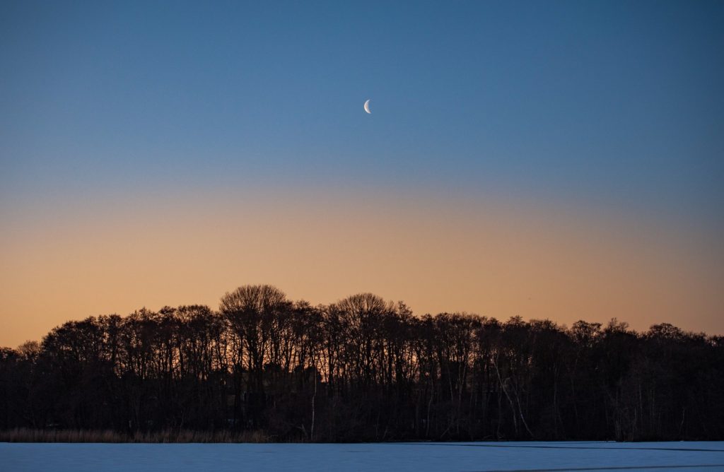
In the example below I have positioned the moon very much in the center to create an image that is symmetrical if you split it vertically. Not perfect of course, as the treed have different shapes going left to right, but close enough to create a good balance.
 In the image below from Louisiana north of Copenhagen in Denmark, the shapes are not in visual balance. The dark shape to the right dominates and is not balanced out entirely by the bright parts to the right, but it is not too bad either, as the visual weight of the shape to the left is reduced as we tend to be drawn towards subjects that are bright, sharp, colorful and recognizable. Instead, you probably see the dark shape as framing the rest of the image. And what is left is the red shape, the green grass, blue ocean and white clouds. These elements are well balanced in terms of colors, which is another dimension in which you can seek balance.
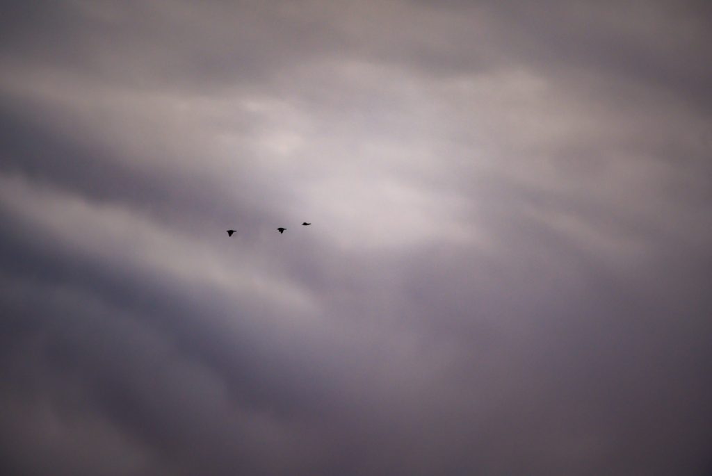
The size of the objects in the frame, other than color, sharpness and brightness, is hence an important aspect of creating balance. The three flying birds below are very small relative to the frame and the clouds. So there is obviously no visual balance here, and the imbalance tells a story of being small in a big universe, and how you cling on to travel companions. In terms of tonal values, the image is however well balanced as you have everything from pitch black (the birds) to bright areas (the area just in front of the birds) and most values in between.
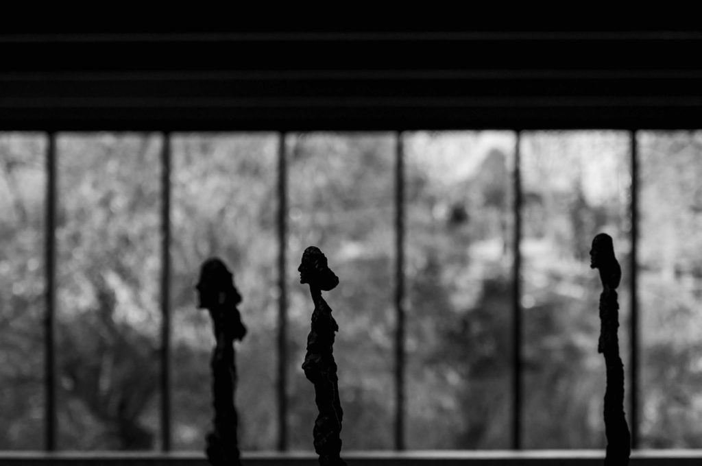
 The three Giacometti ladies below take up much more space in the frame than the birds above. The lady in the middle holds most visual weight as she is in focus and sharp, whereas the other two are less so. I was careful to position them so they got each a window frame, but clearly broke the rule that people should not look out of the frame but into the frame. But, as some say, you are remembered for the rules you break, not the ones you comply to.
The tree tops in the image below are sharp and in stark contrast to the bright background, and hence your eyes are lead in that direction. But there is a bit of visual tension in the dark and dominating clouds above, that take 2/3rds of the frame and almost seems like a threatening pillow of darkness working its way to the trees. So the image is an odd blend of symmetry (left to right) and lack of symmetry top to bottom. I could have cropped the image so the dark clouds were much less dominating – that would have yielded a very different balance and probably a more positively biased mood.
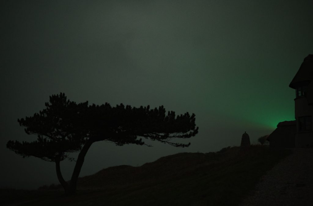
 A final example to illustrate visual balance is the light from the lighthouse below. I shot this image long after sunset and hence in almost pure darkness. The only light is from the lighthouse to the right, hidden behind the silhouette of the building. The silhouette of the tree to the left is balanced against the eery green light from the lighthouse in terms of brightness, and the dark triangle in the bottom of the frame is balanced against the heavy top of the tree. So despite the gloomy nature of the image below, I find that the visual balance is established.
I hope the above examples illustrated the idea of visual balance in photography. The point is that if you become aware of the visual balance in your images and start using them as part of your work with composition, then you will produce better images. There is no right or wrong here; it is all a matter of what works and what does not work, relative to what pictures you want to create.
Related reading
What is visual weight in photography?


