A MTF (Modulation Transfer Function) chart gives information about how a given lens performs when it comes to sharpness and contrast.
Indication, nothing more
It is by no means a perfect tool, but it does give some information that can be useful when you are in the process of selecting your next lens. There are many reasons why the MTF chart is not perfect, but here are some:
- For zoom lenses these are only tested at the wide and long end – how the lens performs in between is often not defined.
- Some lens manufacturer like Nikon only give data for the lens wide open. How the lens performs stopped down is not shown (Canon does better here). Compare of lenses with different speeds is hence not on a “level playing field”.
- The test is done on a lab lens with a close-to-perfect copy of the lens. However, during production, there will be sample variations between lenses and hence your copy may perform slightly different from what the MTF chart shows.
- Manufacturers do not test the MTF charts the same way, so you can only (meaningful) compare MTF charts from the same manufacturer.
- Lens performance is also a function of which camera the lens co-operates with. The MTF chart are produced in a camera agnostic way, so the performance of the lens tested and your specific camera may vary relative to the MTF chart
So, please, take the MTF charts as an indicator and not the entire truth!
The MTF chart
There are some technical aspects of the MTF chart that I will not cover here as it gets too technical for me and I also fear that we loose sight of the bigger picture. What I want to cover here is how to read the chart:
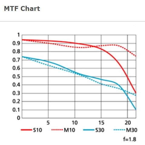
 Chart from the Nikon home page. The 50mm 1-8G lens.
The x-axis on the chart is the distance from the center of the lens. All the way to the left is the center point and going right it moves further and further away from the center. The point here is to test how the lens performs in the corners, which traditionally is the weak point for lenses.
Lets say the y-axis is an indication of how the lens performs (this is not the real story, but sufficient to read the graph). A value of zero is super poor performance, a value of one (1) is perfect performance. A perfect lens would hence have a flat curve going straight from left to right with all values on the y-axis reading 1. Or, as Nikon coins it: the higher and straighter is better.
The two colors show the sharpness (blue) and the contrast (red) respectively.
- Contrast, red: In the graph above the contrast is very good in the center of the lens, it stays good to around 17-18 mm from the center of the lens and then it drops.
- Sharpness, blue: The sharpness is really good in the center and then falls with an almost constant slope moving away from the center. The corner sharpness does not appear to be impressive.
Mind you that this is only a graph for the lens at full throttle (f=1.8) – you can see in the bottom right of the graph that Nikon has made a note to make us aware of this. The lens probably performs much better stopped down, but we get no wiser in this regard studying the graph, unfortunately.
You will also notice that there are two lines for both sharpness and contrast, a solid and a dotted. When they test the lens, they do so with small lines drawn very close to each other. The direction of these lines varies between the solid and the dotted graph. The point when it comes to reading the graph lines is that the closer they stay together the better the lens performs. You cans see that the blue lines indicating sharpness stays well together almost to the edge of the lens, whereas the contrast lines drift apart when moving towards the edge of the lens (some types of aberrations start to surface for example).
Even though Nikon says that higher and straighter is better, a good question is: What does good looks like? How high in the graph do you need to be in order to have a good lens? I think you get a feel for this when you have compared charts from a few lenses, but as a rule of thumb I think of anything above 0.8 as stellar, 0.6 to 0.8 as really good and anything below that as “I need to think about this before buying”.
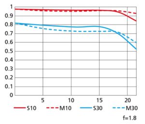
Mind you that no lens is perfect, so you will never get a straight line in the graph. But some do come close. Take a look at the f/1.8 50mm prime from Nikon for the Z-mount. What a lens! I think it makes sense to compare it to the graph above as it is same manufacturer, same focal length, both primes and equally fast (f= 1.8). I have no doubt that this lens technically a much better performer. I do say “technically” because some absolutely love the look of a Nikkor vintage lens, but then again I would assume they do not study MTF charts!
I hope this gave you a good introduction to what an MTF chart is and how to read it. Questions and comments are of course more than welcome.


One thought on “What is an MTF chart?”