You probably know the word lumen if you have been interested in the brightness of the light in a lightbulb or a flashlight. For my bicycle lights, I always study how many lumen they generate, as I want to be as visible as possible in the traffic. So the more lumen, the brighter the light is.
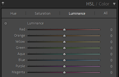
The luminance of the colors in an image is perhaps best illustrated using the sliders from Lightroom:

As you can see, the more luminance a given color has in the examples above, the more bright it appears to be.
The above sliders are “tweaks” you can make to the luminance in Lightroom, but in addition to this each color has an inherent level of luminance value. So blue is less bright than say yellow, just to pick two colors that luminance wise are at the opposite end of the scale. This is probably also why blue and yellow work well together as contrast colors – I often notice this when I see the Swedish flag.

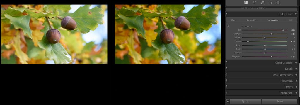
In the example above I have reduced the brightness of green and increased it for red, and as you can see it gives a very different expression. Had I reduced the exposure in Lightroom, the brightness of all colors would have been changed at the same time – here I can work with the brightness of each color and how bright they are individually.
