In this post I take you through some of the observations I have made during my first weeks of shooting with the Z6ii. I come from a long line of DSLRs including the Nikon D700, D750 and the D4 – all of which are still with me, so of course many of the things I observe are relative to these cameras. I only use the Z6 for photography, so I do not go into video shooting in this post.
Build quality
There is a lot of plastic in use when it comes to the Z6ii and you can get worried by that fact alone. Also, the camera is built in Thailand, and not good old solid Japan that we were used to, at least with some of the DSLRs back in the days. But I am happy to say that it to me feels and looks like a very solid built camera.
I don’t miss any metal anywhere. Command wheel and joystick works as it should, the same applies to the buttons on the rear of the camera. The rear LCD flips out without feeling wobbly and the rubber on the grip also leaves a good impression.
The only buttons that I don’t really like are the ones on the front right (FN1 and FN2) – I will return to these. You have to push them quite deep to activate them and they are a bit wobbly – like the manual gear shifter in a French car. But overall a very convincing first impression.
Deep hand grip
One of the first things I notice when I grab a camera is the camera body grip. I have fairly big hands, and if the grip is not deep, then this alone can be a reason to ditch the camera! Yes, I walk the talk: I sold the Fuji X-T3 because the ergonomics simply did not work for me. We are deep into personal preference territory here, but ergonomics is vital for me and I find that I simply leave a camera at home if the overall ergonomics do not work for me.
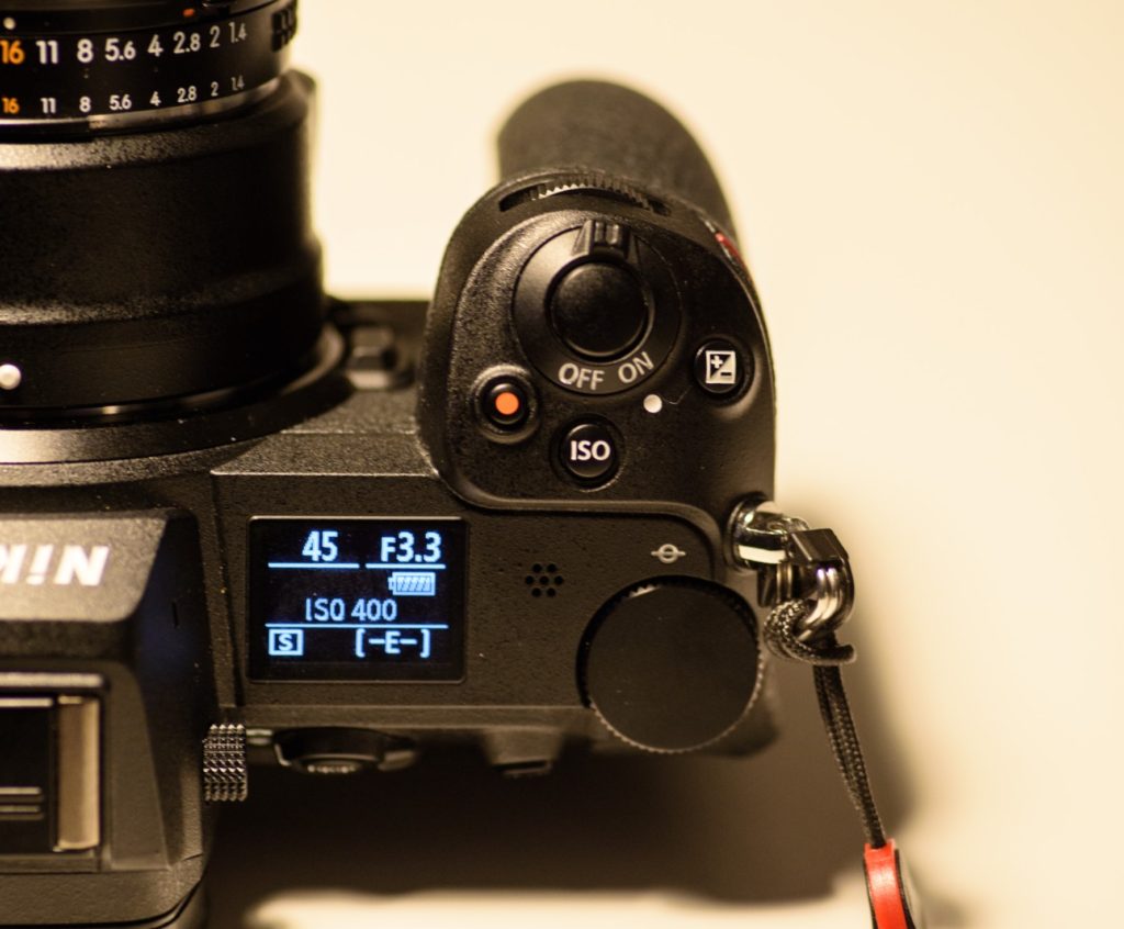
As I am a Nikonian, I am happy to report that the grip is plenty deep and gives me lots of real estate to hold the camera comfortably for extended periods of time. Phew – glad Nikon passed that showstopper with flying colors!
The button layout around the shutter release button is classic with both ISO, exposure compensation and a video record button. I am glad that ISO got its own button, so you can control the exposure triangle with buttons sitting on the top of the camera – that allows me to keep my eye in the viewfinder while adjusting the exposure settings at the same time. Brilliant.
Top LCD
When I first unboxed the camera, the top LCD was one of the first things that struck me as a surprise: It is much smaller than what I had expected.
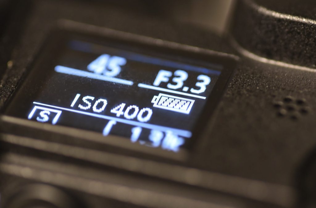
I think it is because I put the size of the LCD relative to the size of the Z6ii, but forgot that the Z6ii is a more compact camera than what I am used to – it takes up significantly less space than say my trusty Nikon D750.
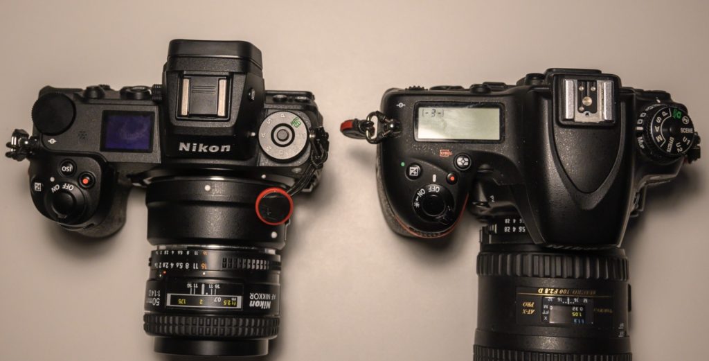
I have never considered the D750 to be a big camera, rather it is small when compared to say the D4. Yet, next to the Z6ii, it appears much bigger, both because of the built in flash and the room needed for the mirror just behind the lens mount. So the Z6ii truly is a more compact camera, and knowing this, I am even more happy to say that despite all this compactness, Nikon has managed to give us a good grip.
It feels different than a DSLR. The best way to describe it is if you have ever played guitar and moved from an acoustic guitar to an electric guitar . The Z6ii takes up less space, has less real estate and everything feels more compact (i.e. there is less room for your fingers).
So how is the top LCD? Excellent! It really is easy to read, also when shooting at night. But I really do miss my back lit buttons from the D4, so although the top LCD is easy to read, it is not always easy to find the buttons in the dark!
Buttons front right
The buttons front right don’t work for me. They are big and as such OK, but the position of the top one is so that I on a regular basis push this button without wanting to do so (brings up the white balance menu!). There is simply too little space between the hand grip and the top button for my fat fingers.
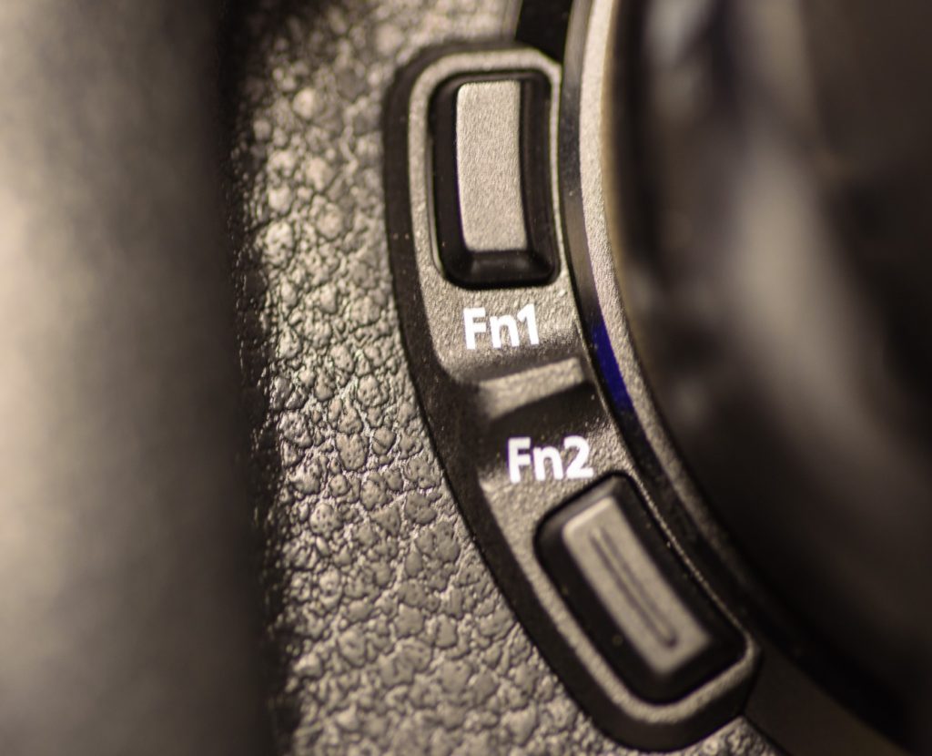
My second issue with these buttons is the feel. As you can see they are rather square and not round like in the good old days. I checked, and the equivalent buttons on my D4, D750 and D700 are round. The buttons on the Z6ii feels like I slightly cut my fingers on the buttons – or at least that they are simply not made for human beings. Do I dare say that it is the same feeling I get when operating the buttons on my Sony A7Rii? As you have probably guessed, I am not a big fan of these buttons.
Battery grip
One of the big changes from the Z6 to the Z6ii is the addition of contacts for the battery grip. The Z6 could take a battery grip, but there were no controls on the MB-N10 battery grip. That has now changed with the Z6ii and the updated grip MB-N11.
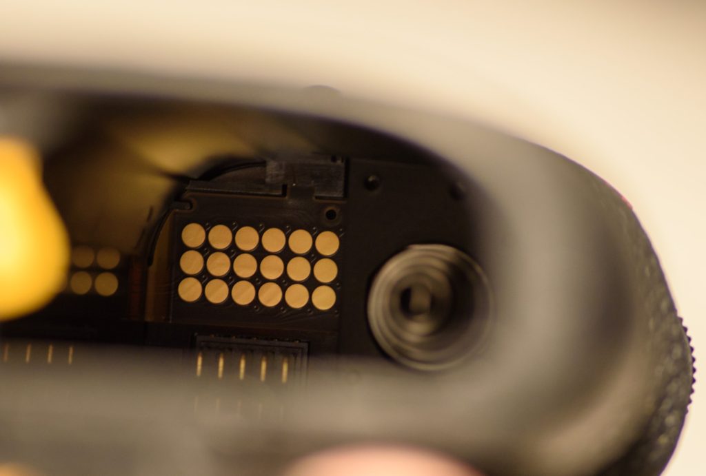
If you shoot a lot in portrait mode, then this is really good news and a vital update to the ergonomics. Many reviewers expressed very clearly their discontent with the lack of a battery grip with controls on the first version of the Z6, and the Z6ii clearly shows that Nikon has taken the feedback seriously and updated the camera accordingly.
USB-C charging
I am a big fan of industry standards, and hence I am a big fan of USB-C. I have so many chargers and battery types that it simply drives me nuts. Therefore I was so glad to see that Nikon with the Z6 added in camera charging. But it only works with the camera off, which will annoy some video shooters. Not me though, I am a happy camper: I can charge the camera on the go with my power bank. Wonderful!
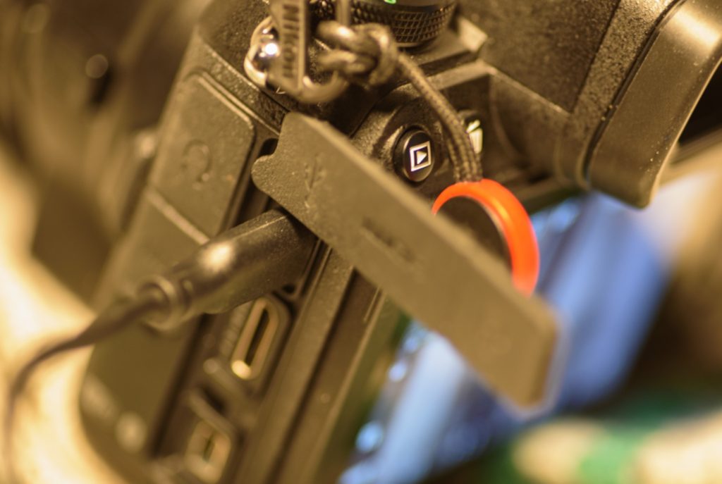
Rear LCD and viewfinder
The rear LCD only flips up and down. I think most photographers are happy with this solution and won’t miss a fully articulating LCD. Only if you are a videographer I think you may sometimes miss this feature.
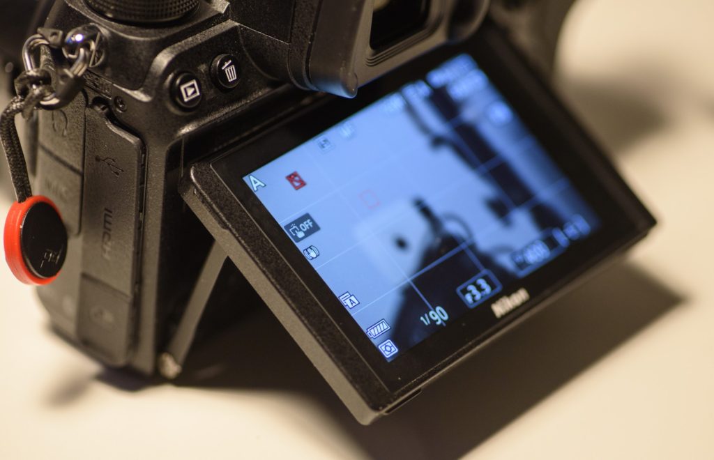
The screen is a pleasure to use. It is touch sensitive, and coming from an iPhone 12 I don’t miss any speed when I pinch, zoom, swipe and scroll through menu systems. It seems very responsive to me. I have not yet tested the LCD in bright sunlight – it is wintertime and here in Denmark we don’t see to much bright sunlight this time of year. But like most other LCD’s, I expect it to struggle in bright sunlight.
Relative to the mirrorless systems I have tried from Fuji and Sony, I’d say that the viewfinder is the best I have tried. Especially shooting at night, I find the viewfinder gives a very realistic image to work with. And the wonderful thing about the electronic viewfinder is that all the good stuff you are used to when shooting in Live View on a DSLR is available in the viewfinder now, e.g.:
- Preview of the image exposure when shooting in manual mode (turns dark when under exposed)
- Focus peaking highlights when focusing manually
- A real time updated histogram
- Ability to zoom in when focusing manually
Focus mode button gone!
On all my Nikon cameras, you will front left find a focus selector button. The design varies, but the basic function of that button is to switch between auto focus and manual focus, but moving the little pin driven by the AF motor in and out of the camera body. The secondary function is to select the focus mode and the focus area. This button is gone now – take a look below:
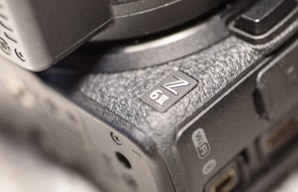
I think it makes sense not to have that button in the sense that there is no AF motor built into the Nikon Z6ii, nor the FTZ adapter, and hence the need to switch the motor in the body on and off is gone. However, the ability to change focus area and mode while keeping your eye in the viewfinder was a very pleasant side effect of that little button.
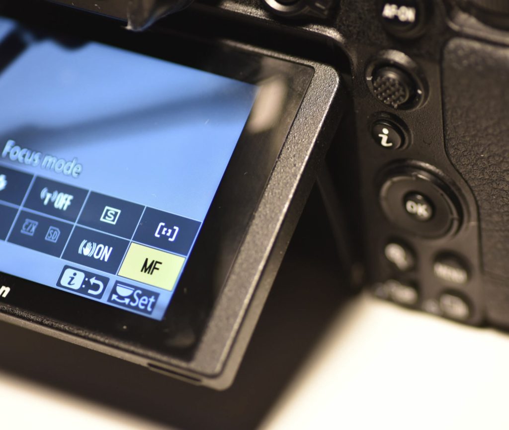
One way of changing focus mode is to hit the (i) button on the rear of the camera, and move the cursor to the rightmost options that gives access to the focus area and focus mode. In the image above the yellow cursor is over “MF” for manual focus, and just above that sits the focus area menu item. This is the cumbersome way. Alternatively you can hit the FN2 button, that works as the focus mode button did in the old days: you change the focus mode and focus area by turning the front and rear command dials.
When I shoot, my left hand holds the camera in the area of the now removed focus button used to be. Therefore it is super natural and easy for me to push that button with my left hand, and operate the front and rear command dials with my right hand. What I now have to do is to push FN2 with my right hand and then at the same time with my right hand operate the front and rear command dials. This feels awkward to me. It is as if Nikon has designed the camera to be right-hand operated only.
The button layout on the rear of the camera seems to confirm my suspicion – the most buttons are located to the right.
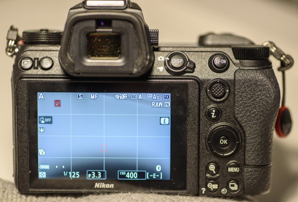
Another button that is gone, front right on the camera, is the depth of field preview button. I never use it to be quite honest, but you may, and then you will miss it. You should see the correct out of focus areas for wider apertures, but as soon as you stop down to and above f/5.6, then you won’t. Again, strange that Nikon removed this button if you ask me.
A third button that is no more is the bracketing button. It is on the left side of my D750 and on the top of my D4. Again, it seems that Nikon has really cleaned up most buttons to the left hand side.
Format shortcut gone!
I was really surprised that I could not find 2 red “format” signs on the Z6ii. That normally signals that if you push these two buttons for a few seconds and then re-confirm when the LCD flashes “format”, then the memory card is formatted. Super convenient. I use it very often.
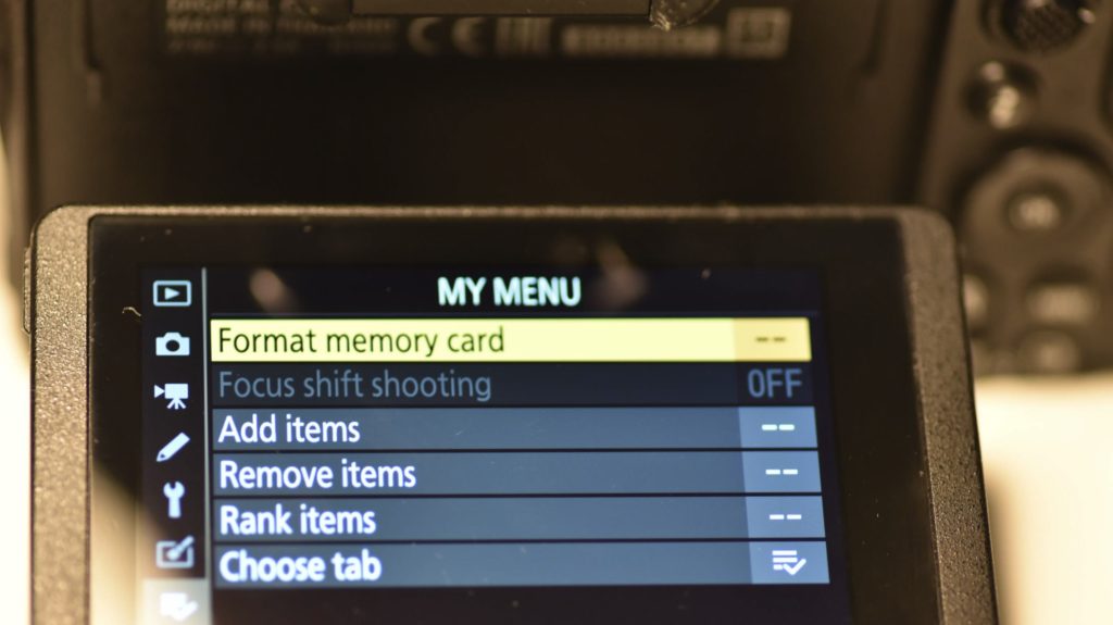
Ok, it is not the end of the world – I have set-up the “my menu” so that the first item is formatting the memory card. But it is not as fast as the button based shortcut on my DSLRs unfortunately.
Zooming is wonderful, but…
One of the great features of a mirrorless is when you shoot with manual focus, you can zoom in, both in the electronic viewfinder and the rear LCD. The latter you have probably tried in Live View on a DSLR, but the new thing is to be able to zoom in with your eye in the viewfinder. Great!
So how do you zoom in? Well, you use the zoom buttons located next to the rear LCD, at the very bottom of the rear of the camera:
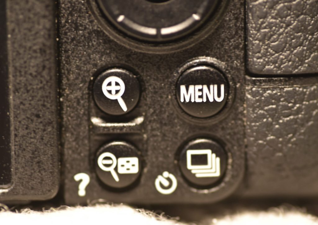
Now, I don’t know how you work your camera, but my thumb always sits and either pushes the AF-ON button (back button focus) or operates the joystick just below it. In other words, my thumb is at the top of the camera. The zoom in and out buttons are at the very bottom.
Maybe practice will make me better, but I find it very hard to find the + and – buttons when I at the same time look in the viewfinder. I could of course re-program say the joystick so that hitting it in the center would be the same as zooming in, the only problem is that I cannot find zoom as an option. So I am stuck with these little buttons at the bottom of the camera.
Now, the world does not end because if this. But it is super annoying when you for the 30th time that day hit the menu button in attempt to find the + button while zooming to get the manual focus just right. The camera design clearly works against me, and not with me.
Summary
Thank you for making it this far, either reading or scrolling through my nerdy observations above. Bottom line here is that all the vitals are approved: the build quality, the deep hand grip, the electronic viewfinder, the rear LCD and the overall look and feel of the camera. Add to that, that the camera charges via USB-C and that a battery grip with controls is available, and the ergonomics of this camera looks like a winner.
However, there are a few things that annoys me. I am not a big fan of the “right hand operation” philosophy that is behind the button layout, nor the removal of buttons and shortcut combinations. The effect of these changes it that I cannot work as fast on the Z6ii as I can on my DSLRs. And what strikes me as even more odd is that all the buttons and shortcuts I have talked about above, as far as I can tell, are still there on the Z9. I hope future versions of the Z6ii will bring back some of the buttons and shortcuts. Please Nikon, please.
Shopping link
Affiliate link: Nikon Z6ii.
