Simple or not?
Many years ago when I took my drivers license, my first thought after reading all the driving school theory was: this is not so complicated! I got this! And then I got wiser!
When you read this blog you may well think: Ok king obvious, haven’t you got something more interesting or challenging for us to read? But please remember that it is the appliance of the theory that makes photography so challenging (and fun!) whereas the theory itself may (sometime) seem so straightforward that it is pointless. But photography is often about making choices, not solving problems. So please read the following in that light: it is about making choices, not solving problems.
Portrait and landscape
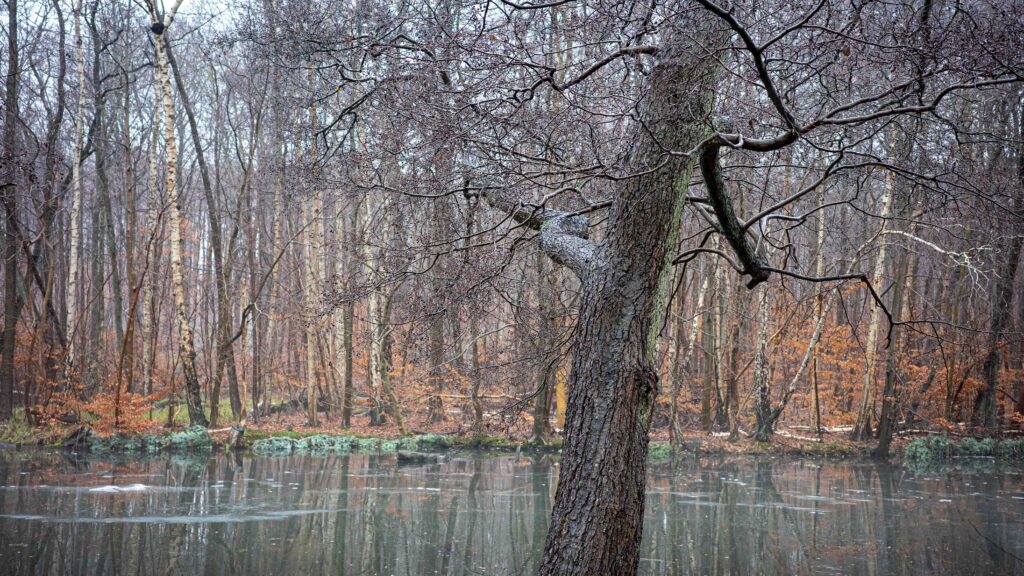
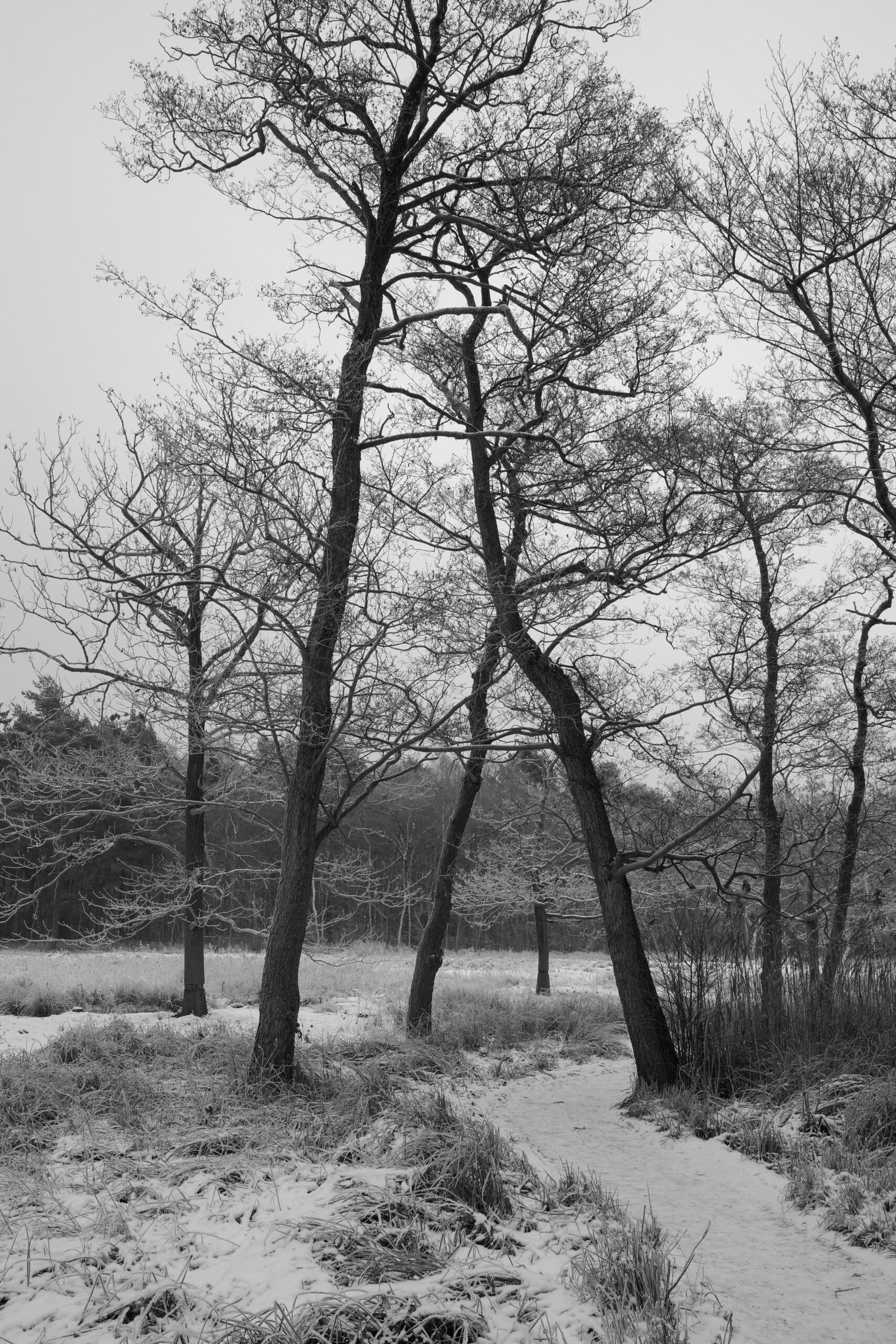
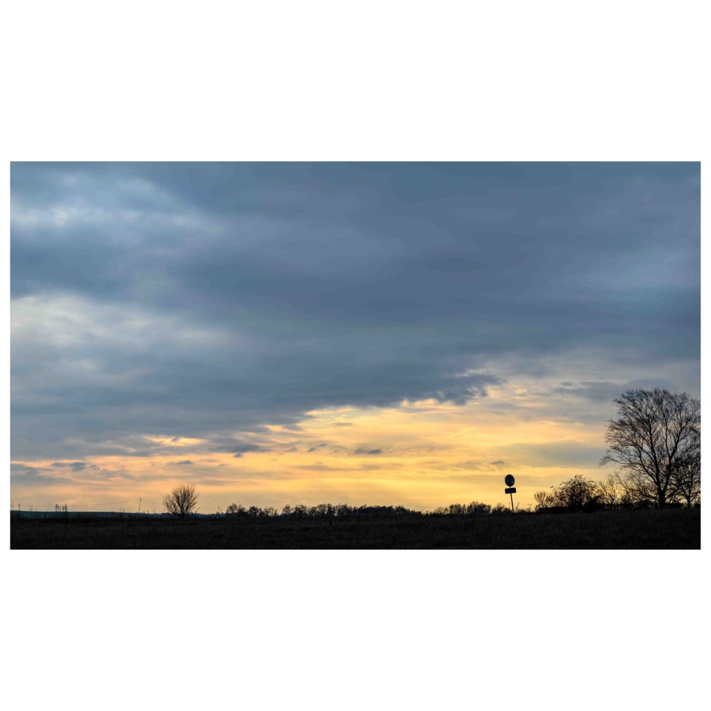
Horizontal and vertical is amongst photographers often referred to as landscape and portrait. If the image is wider than tall, then it is landscape (horizontal), if it is taller than wide, then portrait (vertical). The sensor in a digital camera is not square, but typically 3:2 or 4:3, so when shooting with the camera horizontally, you will get a landscape image, turning it 90 degrees you’ll get a portrait mode image.
Choosing
In theory, the “right” way to choose between portrait and landscape is to consider the composition and how the subject and scene works together with the oriententation. So wide subjects like a coastline would suggest landscape mode, whereas a tall subject like a tree or a skyscraper or a Giacometti statue would suggest portrait mode. And then of course you can go against convention (or what most would do) and thereby create some tension. There is no right or wrong here, only choices that work with you or against you relative to what you want to achieve.
When out and about with my DSLR or ML camera, I shoot in landscape mode 99% of the time. I think most do, probably because the way our eyes sit in our head makes us see the world in landscape orientation. But recently with my new Ricoh GR3x camera, I’ve found that I more often shoot in portrait mode. Maybe because the camera is so small and handy, that turning it falls more natural now. So a mix of convenience and coincidence can also be a factor in the orientation of the image.

Many images and video are shown on wide screens (TV and computer ) that typically are in a 16:9 format, and here obviously landscape images make a better fit to the format than portrait does. But if you read this blog on a smartphone, it is likely that the format is taller than wide. And in that case, portrait works better than landscape, unless you tilt your smartphone to become a wide screen. If you study people and how they use their smartphone, it is seldom the phone is tilted unless they play a computer game. So there is the use case to consider: in what format is the final image intended to be used? And that can drive your choice of orientation.

The square alternative

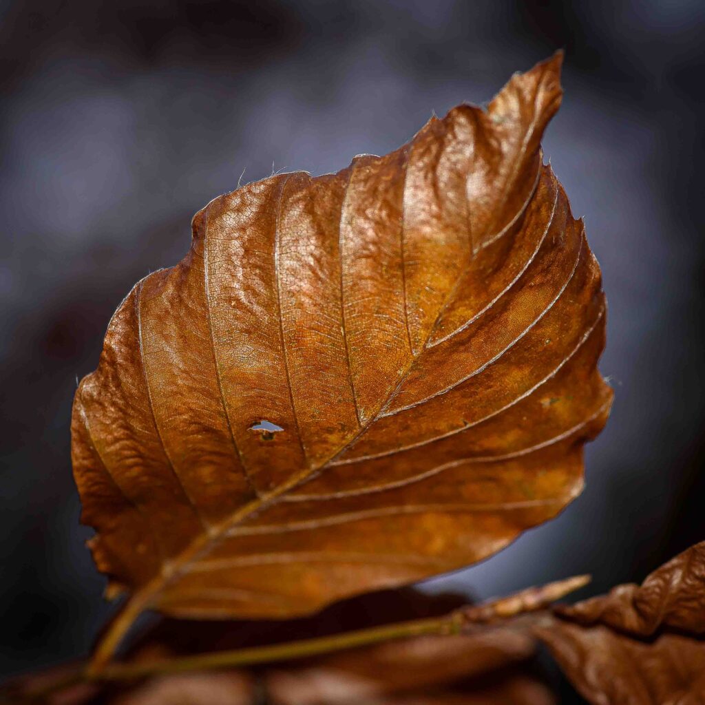
Post processing enables you to change the format into whatever you’d like and 1:1 is certainly also an option, especially if you post to Instagram, where 1:1 is the only format! And if you have made the shot sufficiently wide and with plenty of resolution, a portrait image can be changed into a landscape and vice versa. So post processing certainly gives a lot more options when the image is framed with this in mind.

Summary
It is my hope that you after reading this will give portrait mode a try more often than previously! And some “aha!” or “eureka!” experiences to accompany! There are plenty of blogs (including this one) that will tell you what the “correct” composition theory is relative to the image format, but if you ignore that for now and just go with your intuition and use portrait as you see fit, then I think you will find it rewarding. And if you also can muster the energy to think about the use case (is the image to be viewed on a smartphone or printed big for an exhibition) before you hit the shutter, well, then my day is made!
