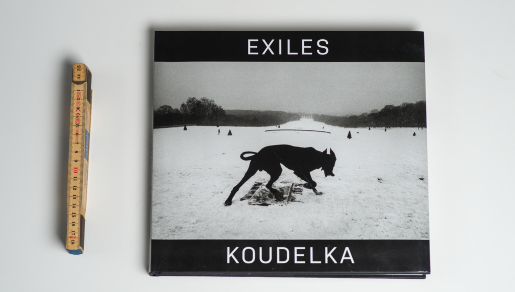
Koudelka is right up there with some of the biggest photographers of all time like Henri Cartier-Bresson, so if you are interested in photography and you have not enjoyed the work of Koudelka, you have something to look forward to! In the book by David Gibson with 100 iconic images, of course there is one by Koudelka, actually exactly the same as covers the front page of this book: Exiles.
Be aware that the book has developed since the 1988 classic was published, and more images have been added, so if you want the full monty, make sure to get the latest version of the book (shopping link right here).

Cornell Capa is quoted on the cover sleeve to say that “Koudelka’s unsentimental, stark, brooding, intensely human imagery reflects his own spirit, the very essence of an exile who is at home wherever his wandering body finds haven in the night.” So you can really put some serious words and analysis to Koudelka’s work, and curators and others absolutely love to add some of the most complicated words available to praise Koudelka’s work. I have no ambition to compete with all that.

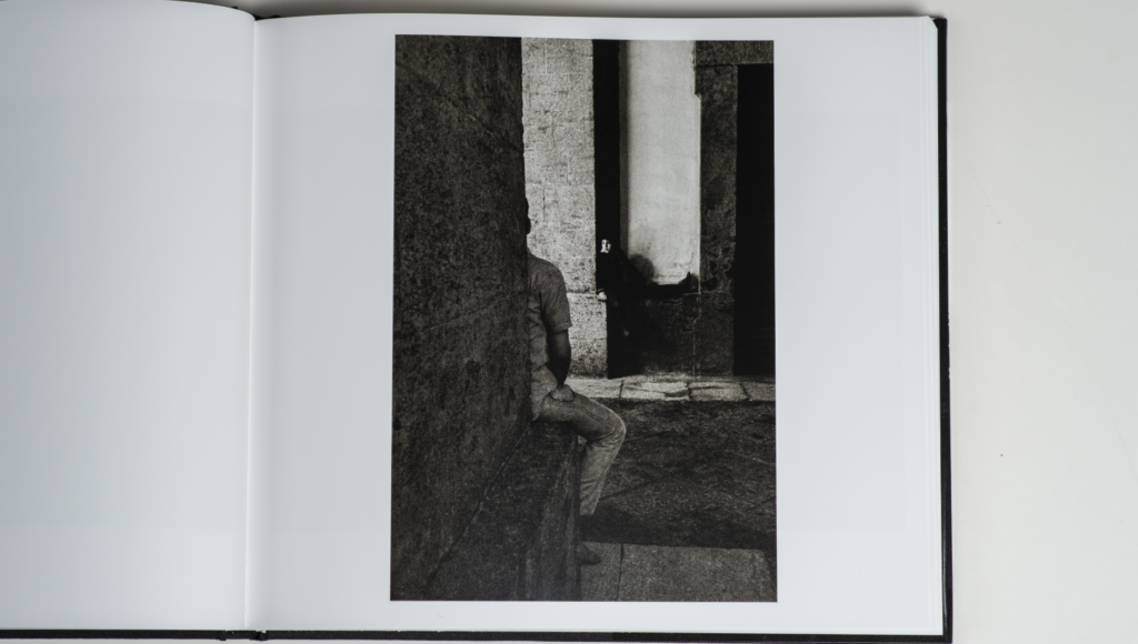
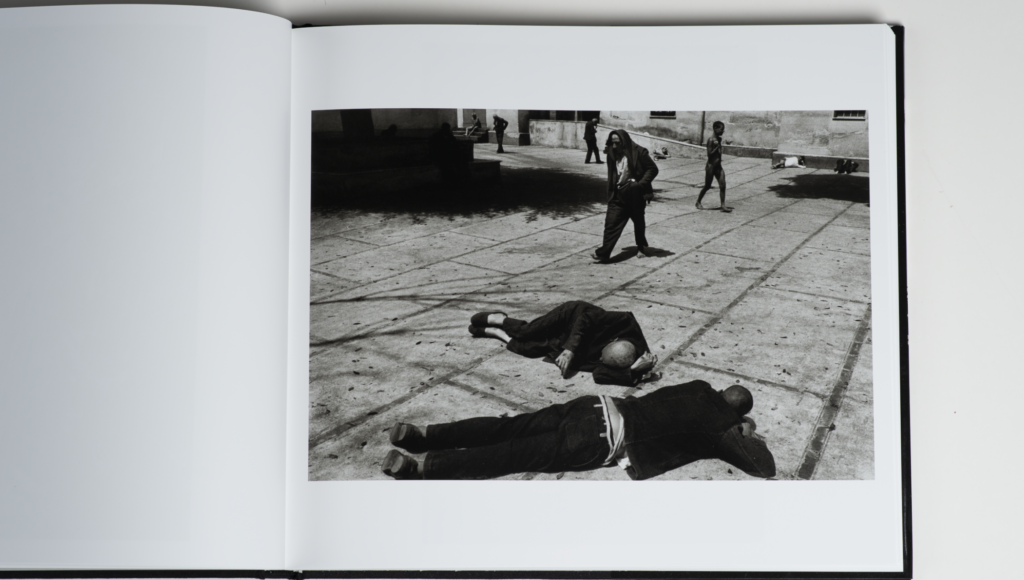
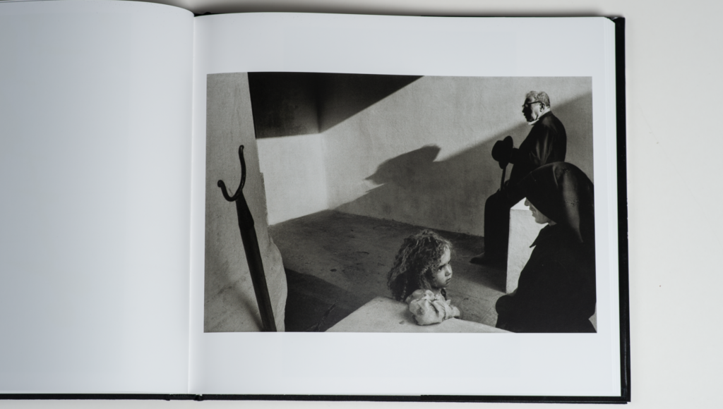
Rather, I would quote Leonardo da Vinci for saying something close to this: “Simplification is the ultimate sophistication”. I know wise men debate if it was actually Leonardo saying this and if these were the exact words, but the gist of it is what I want to get to, because it describes how I see Koudelka’s work. His images are so powerful and clear in their communication, and there is not a single distraction or any object in the images that do not aid the storytelling. The motto of photographer Joel Sartore is that if something in your frame is not working with you, it is actually working against you. It seems to me that Koudelka, who probably knows nothing of Joel’s motto, is the embodiment of working according to this rule.

So Koudelka is a big inspiration for my aspirations as a photographer. And for that reason and of course I can recommend this book about Koudelka. There are a few interesting introduction pages, but otherwise the book simply present 75 of Koudelka’s images (+ index). And what images! In this blog I have shared 3 examples beyond the front page, and I hope they will inspire you to seek out more of Koudelka’s outstanding work.
Video link
Related reading
Review: Photo basics by Joel Sartore
Review: Photography and the Art of Seeing by Freeman Patterson
